A Plethora of Pots for Plants

Indoor plants are now more en vogue than ever. And I wholeheartedly embrace this trend. I've always been a huge advocate of inserting plants to bring life and greenery into any room. 

What's just as important as placing plants throughout your home? As with everything, details matter, and the vessels into which you place each of your plants determine whether your plant family will shine and impress or fade into the background. Keep the aesthetic of your room in mind, but I generally gravitate towards more neutral colored planters with clean lines.  Below are some of my favorites. 

1/2/3/4/5

1/2/3/4/5

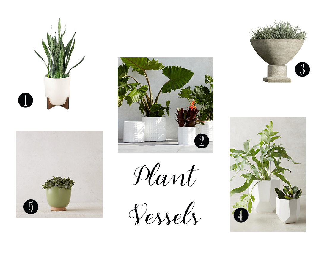
A couple of things to keep in mind if you are creating a plant collection. If you are keeping a simple color palette for your plant containers, there are a couple of ways to make each vessel stand out. Consider putting one or two plants in a vessel with a stand or maybe using a footed container to get some elevation. Using a container with some texture such as one made of concrete or a pebbled ceramic brings in something different while staying neutral enough to work with whatever else is going in your room.  

Amp up your plant game even more? Dress them up in their Sunday best by placing river rocks, gravel or moss on the top soil. Your plants will thank you and your house guests will steal this idea for their own home. 

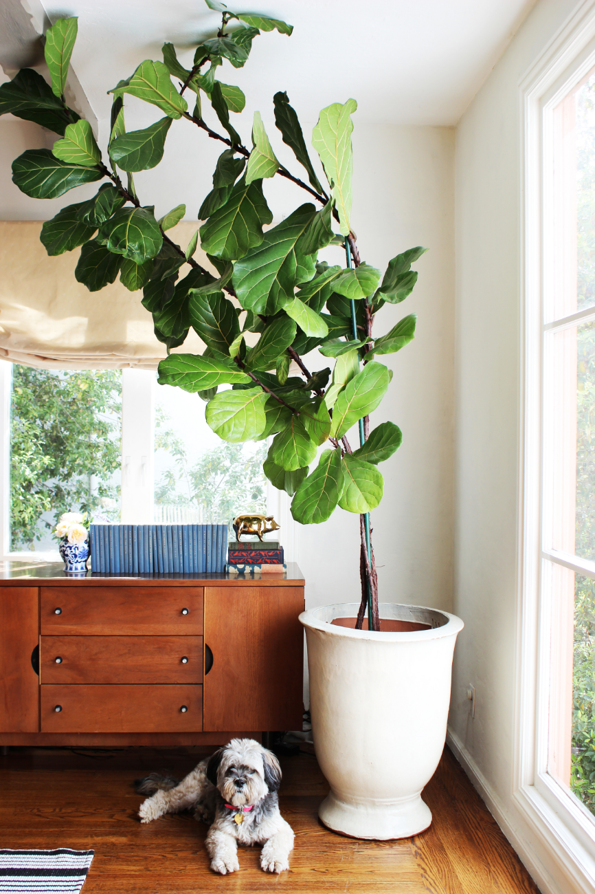
And sometimes you just need one really big vessel for that plant that won't stop growing...

Looking Lovely in La La Land. Part Deux.

If you have been following for a while, you may remember I finished Looking Lovely in La La Land (Part 1) almost a year ago. Thrilled with the final product, the clients kept me on to start work on the bedrooms and the guest bathroom. I was happy to oblige. 

What is the big takeaway from this project? Bringing character into any space can be done even if you're on a budget and even if your home isn't blessed with the many architectural details we often lust after. This home was built in the 1970's ranch style, complete with popcorn ceilings. The bedrooms are white boxes that were dying for some personality. 

Let's start with the guest room. Here are some before photos sent by my clients. 

Before.jpg

As you can see, the guest room was being used as an office. It was also a catch-all for leftover furniture throughout the rest of the house. In a smaller space, there was a ton of furniture in here. But I could see the potential. We removed the blue carpet for something more neutral and also removed the popcorn ceiling. 

Photo by Clara Jung

Photo by Clara Jung

The clients are considering renting out this room periodically so I kept that in mind when drafting the design concept for this room. I absolutely adore this tomato soup colored headboard. Everything else in the room is soft and serene, I wanted to put something in this room that made it memorable and fun so guests would want to return!  After the removal of the popcorn ceiling we painted it a very light blue to add another subtle but distinctive touch. 

There is a petite workspace that is functional and inviting. Since the window has a less-than-optimal driveway view, I installed this vibrant cactus print as an alternative. Also, because we had to squeeze in a work area and a queen size bed, there was little room left for a nightstand. It's true, a nightstand isn't a need to have item but it's definitely nice to have. This "nightstand" may only hold a glass of water and/or your phone but gets the job done. 

And for any guests who are lucky to stay in this room, also have the continued good luck to have the use of a renovated guest bath. Below is the before. 

A pretty drastic transformation. The clients really miss their seashell shaped sink . . . nope, that's not even remotely true. The freshly-painted blue walls capture the essence of what every bathroom should be, a serene and clean environment. We painted which made the biggest impact but we also replaced the vanity, lighting and fixtures which only helped. 

Moving on to the Sailor Moon room.  

20150303_205648.jpg

If you can look closely you can see at least three Sailor moon posters strewn throughout the walls. Many a girl growing up in the 90's can appreciate the power of Sailor Moon. And although I was sad to bring these posters down, they had seen better days.  This room was now going to be a game room for the hubby. A retreat for him to play board and video games with his friends. 

Playful and colorful, this room strikes the right tone for some long game nights with perhaps a finger of whiskey. Creating a design that was very "man cave" yet appealing to everyone was my primary focus. Do you spy the homage to some classic video games?  When I found those I was over the moon. These prints are simultaneously artistic and encapsulate the entire theme and purpose of the room. 

Last but certainly not least the master bedroom. Here are some before photos. 

There were some challenges to this space. The biggest one being the burgundy colored carpet. The clients had just installed it so weren't replacing it but coming up with a design scheme that downplayed the redness in the carpet took some creative thinking. Below is the Cinderella like makeover. 

Master Bedroom.jpg
Photo by Clara Jung

Photo by Clara Jung

Like all the other rooms in this project, this master bedroom was also a straightforward blank box with no details that immediately jumped out. To bring in character and charm, we used wallpaper with a subtle shimmer to bring in that bit of oomph every room needs. 

The natural jute rug breaks up that burgundy carpet a bit, softening it so it's not terribly obvious or dominant. The blue bedframe juxtaposed to the gold wallpaper is a classic color combination. The simple mid-century nightstands contribute to this sophisticated and curated feel.

When you're confronted with a room that has very little to say in terms of its architecture, take that as an opportunity to be a bit more adventurous than you normally would. Spin it, there are no historical details holding you back, it's literally a blank canvas and like some things in life, the bolder the better. 

Photography by Jen Sosa unless otherwise noted.

Palm Springs Mid-Century Mash-up

If you follow me on Instagram, you know I recently spent a week in Palm Springs. I spent the entire time absorbing the abundance of mid-century architecture and furniture, not to mention the sunshine! Even if you can't make a trip to Palm Springs, there is no reason why you can't infuse a bit of Palm Springs style into your home, just in time for summer. 

I was lucky to stay at the most tastefully styled Airbnb during my stay. Below are some photos. 

Living Room3.jpg

As you can see, there is no shying away from color, which I love.  And it's awesome how this house injected its own style and funk by adding so many patterns with the clean mid-century furniture as a canvas. This unique combination brings in energy and fun, the ideal feel for a Palm Springs home. One last takeaway is that there is a good mix of old and new in the styling of this home, which prevents everything from feeling one note. Instead, we have spaces that are eclectic, colorful and true to its mid-century roots. 

I get it, we all don't live within driving distance to Palm Springs. But people aren't just flocking to Palm Springs because of the warm weather. It exudes this vibe of fun, nostalgia and carefree spirit in its architecture and style. You can capture the Palm Springs spirit and bring it into your own home with just a few tweaks. Below are some suggestions! 

To complete this look, I would recommend inserting some vintage accessories to truly bring it all together. Yes, this look is very of the moment, but remove the rug and perhaps some of the throw pillows, and you're left with a very versatile blank slate that can be changed to suit your mood even 5, 10, 15 years from now!