Mill Valley Project, Part Deux

Finally here! Mill Valley Project, Part Deux. If you want the background, rewind and read all about it here.  It feels like we've been working on this project for a while, but not so. We tackled this large transformation and completed it about two months. Whew. Just tired thinking about it.

Quick recap? The family was moving into this new home within 30 days because the newest addition to the family was dying to come into this world, basically 2 weeks after move-in. We tried to accomplish as much as we could in a month despite a host of logistical hurdles. And for the most part we did! But as is the case with projects like this, we needed more time to perfect things. This post is about my second installation where we finished the rest of the rooms and put finishing touches on others. 

We saved the best for last, ready? Here we go. 

Let's start with the kids' rooms. Here is the before of C's room with the staging furniture. 

Granted this was with the staged furniture and staging is a very hard job, but I definitely wasn't feeling the curtains or the red pendant light, especially for the cutest girl I know. With good bones and a clean canvas, this room was relatively easy in terms of design. We wanted to make sure it was a room that C could grow into. So for curtains and lighting we chose items that were slightly more traditional. For accessories, we had more fun.  Below are the after photos. 

Decor above cribs can be challenging. I long to hang a gallery wall or even just a nice framed print but in California I would never dare. Earthquakes are a reality. A great solution? A colorful garland can cover that bare wall in a beautiful way.  Here, C can stand in her crib now so I hung it a bit higher so she can't reach and pull it down. Safety first. 

This guy's name is Floppy and he's just perfect. He was just a digital file that I printed out so nothing too valuable or precious. Floppy's monochrome colors tone down the cuteness level just a bit to the right level of sophistication. 

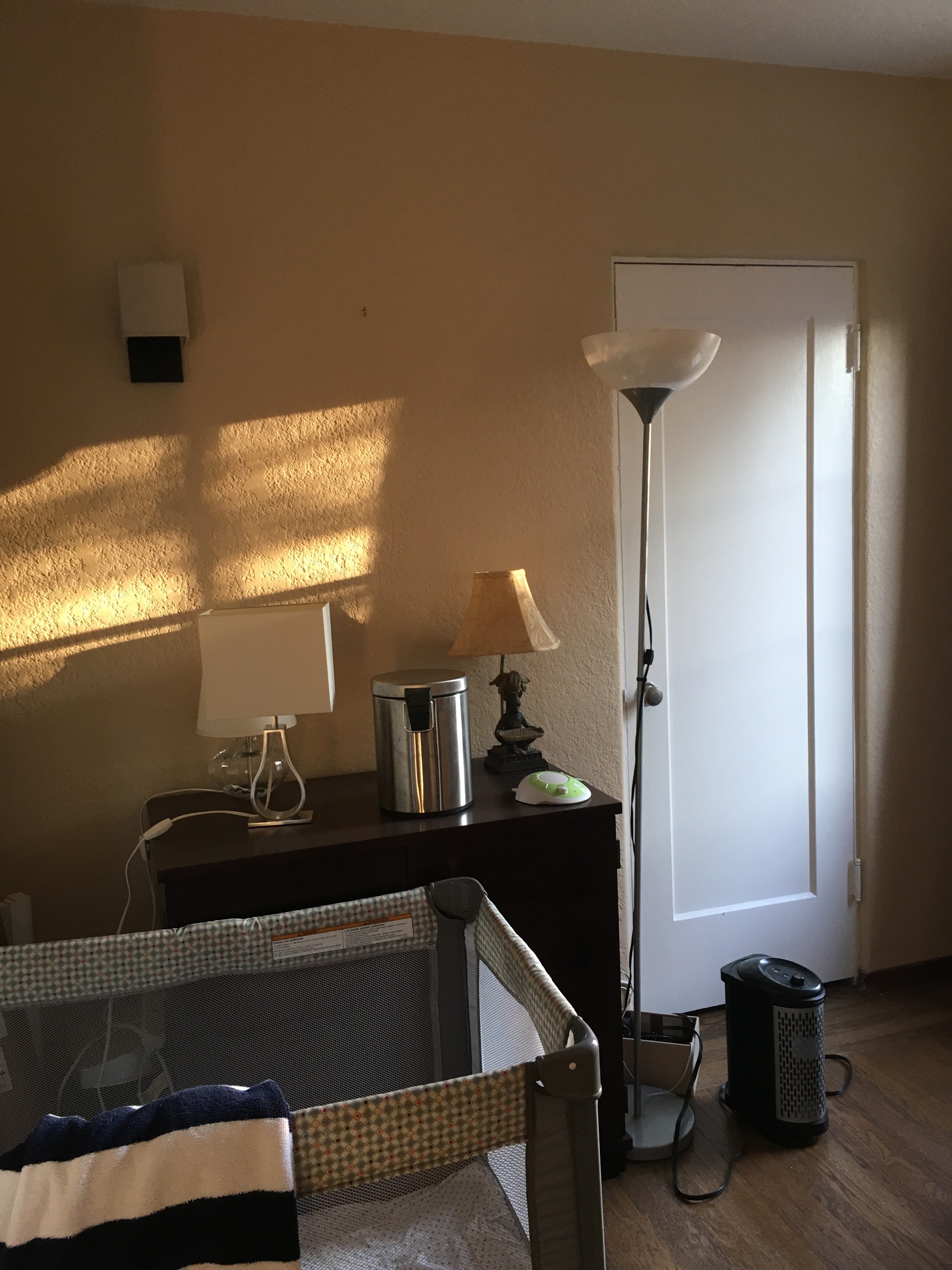
Onward! Let's move on to H's room. Below are the before photos with the staging furniture. 

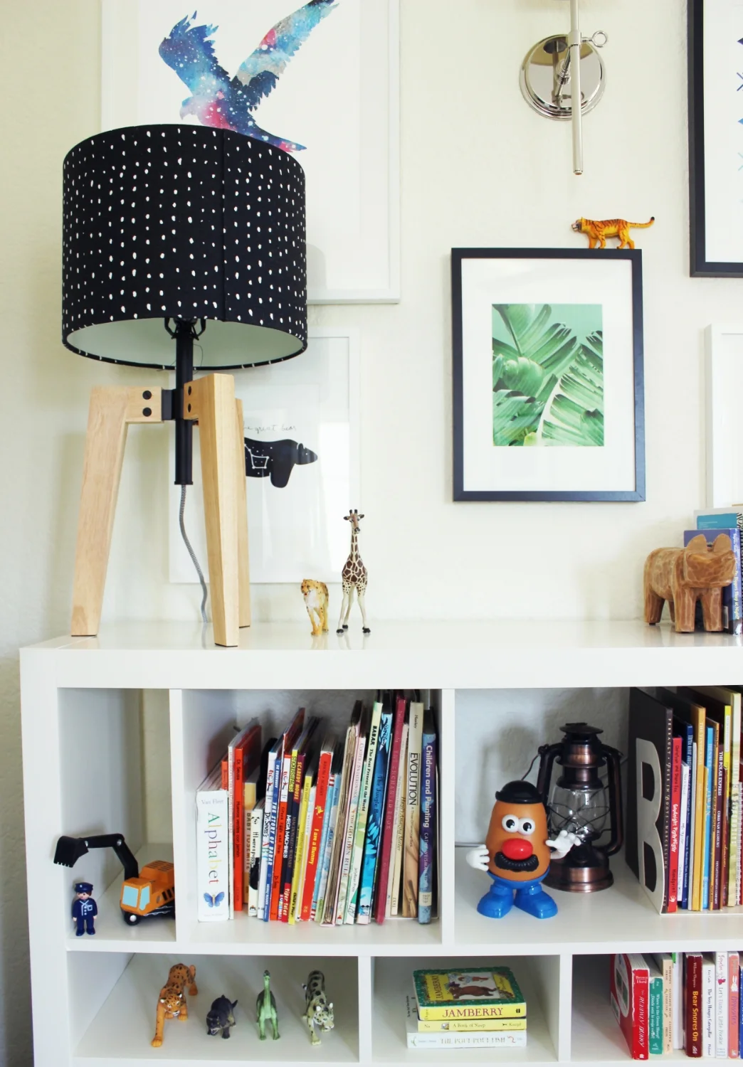
LIke C's room, very much a blank canvas that was crying for some fun and personality. Here are the after photos. 

As most of you know, for the first few months, a nursery may remain empty while the baby stays with mom and dad. I wanted to make sure H had a room he would enjoy and love when he was ready. Adhering to the minimalist theme throughout the house, I kept things clean, bright and modern. Mom and dad can fill things out with all the baby necessities when H is ready for his own room. 

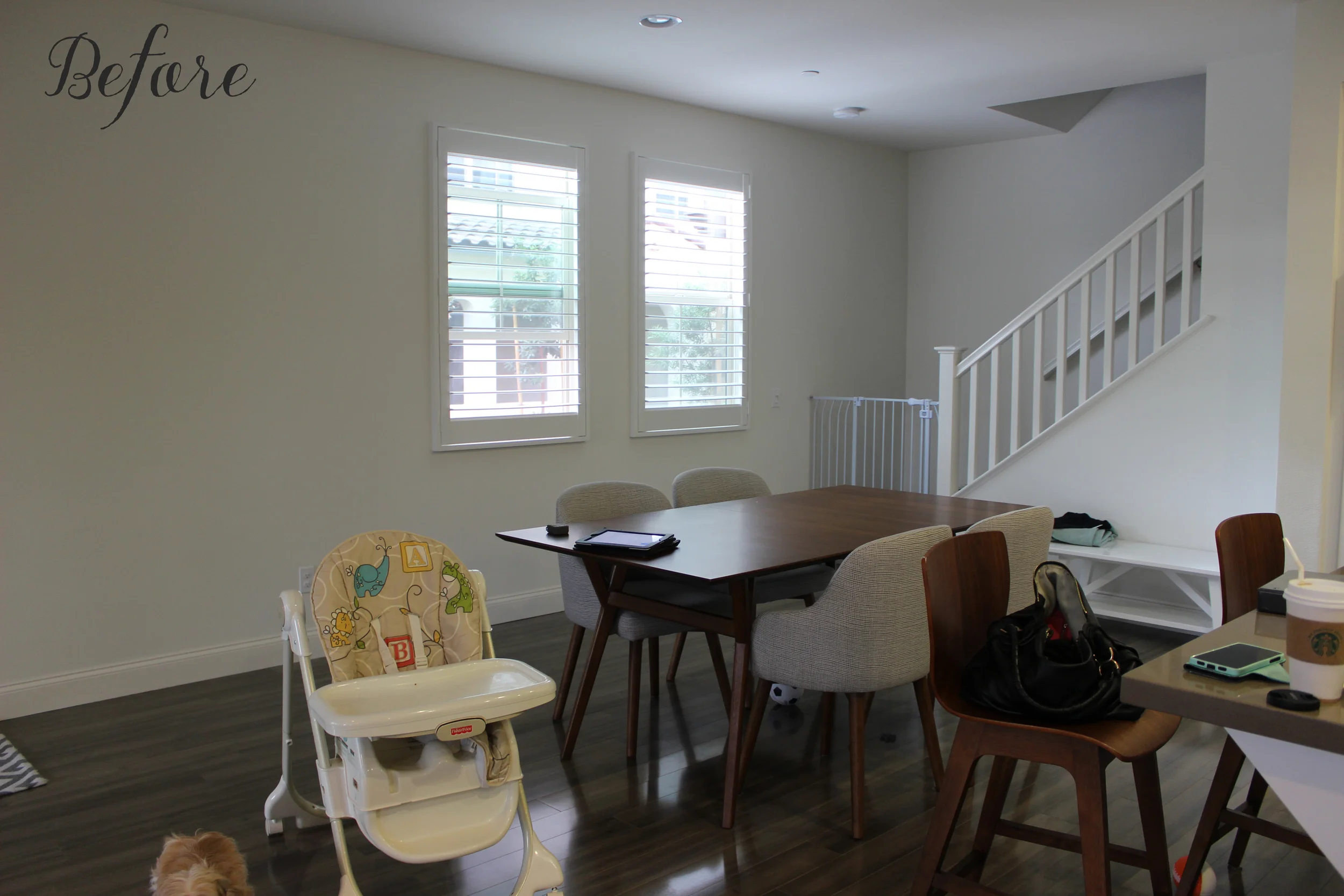
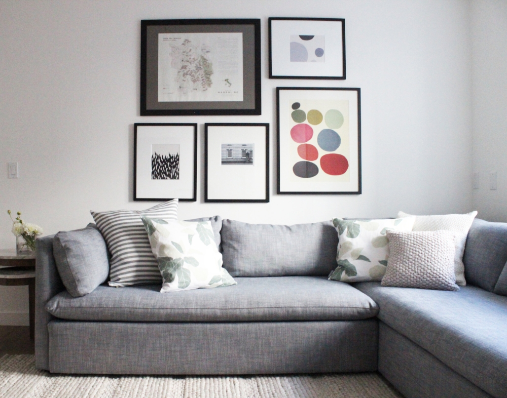
On to the TV room. This room sits outside the kids' room and will be primarily be used for family hangouts and play. Accordingly, we chose comfortable and kid-friendly seating along with minimal accessories to keep things clutter free. Here is the before again furnished by the stagers.  

We can do better right? We want a kid friendly lounge area but not one that is literally screaming that this is for kids only. 

The coziest corner. I kept everything neutral and soothing so that when there is a huge pile of toys on the floor, it won't be so bad. The long bench cushions also keep things visually clean and attractive. 

With no coffee table, it was important to provide as much landing spaces as possible for coffee, water and wine. These nesting tables were an ideal solution. A secret? These aren't actually marble but they look so real. Even better for a space dominated by kids, right? No need to worry about watermarks or etching. 

Last but not least, let's head upstairs to the master suite. Below is the before, again with the staging furniture. 

The clients were ready for a change. Their old bedroom furniture was dark wood that felt a bit heavier. We wanted to start with a clean slate, bring in some modernity with a mix of classic. Below is the after. 

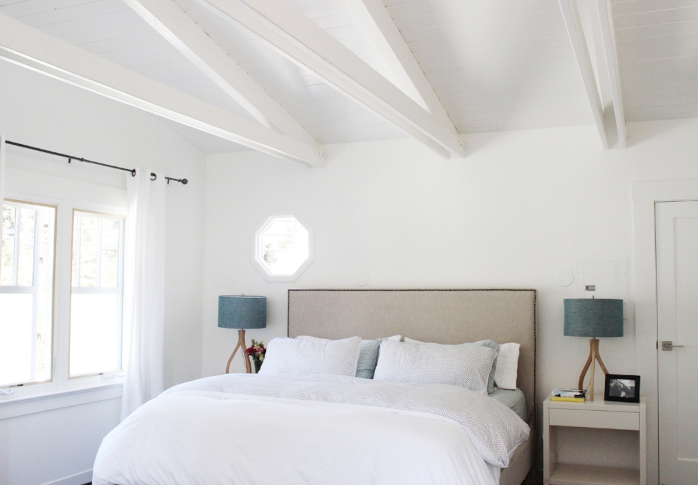
So fresh and so clean. That about sums it up. With those beams and all that natural light pouring in, I would never get out of bed if I lived here. The neutral headboard and nightstands are mainstays, a good foundation for any bedding. The lamps are different in both shape and color and add interest. The ideal sanctuary for busy parents. 

Thanks for joining me on this Mill Valley journey. Hope you had as much fun as I did!

A Bright and Cheerful Boys' Nursery

For a very long time while I was growing up, I shared a room with my sister. Some of my fondest memories are of us talking late into the night. So when a client approached me to help her create a nursery for her son and his soon-to-arrive younger brother, I was really excited. 

A bit of background: the nursery was originally in a smaller guest room. Since the nursery would be for two tots and not just one, we were moving everyone to the larger guest room. Challenges? There was a laundry list. First every single wall had windows and/or doors, making furniture placement difficult. Also, we had to squeeze in two cribs, which had to be placed out of reach of curtains and windows. A sitting area was a must for reading. And of course, a changing table was a necessity for when the newest member of the family arrives. 

The design plan was to keep things minimal and monochromatic for the most part. I wanted the room to be one that the boys could grow into. I was positive that books and toys would bring in enough color to make sure that this room didn't feel drab. And although this is an older home, I pushed for a bit more modernity in this room to keep things fresh.  Below is the design board. 

Here are a couple of before photos of the room. 

As you can see, the wall colors had yellow/beige undertones which made the room feel a bit heavy. The brown curtains with the darker wood flooring made everything feel one note. The hardware and the fixtures throughout the room had to be updated. And the curtains were hung too low, making things feel a bit stuffy. Let's move on to the fun stuff. 

Yes, I promise you, this is the same room. As you can see, we deviated slightly from the original design board but generally the plan remained the same. 

 Let's start with the big changes we made. First, a big one: the clients replaced the windows. We also painted the room a lighter cooler color, Behr Lunar Light. We upgraded the sconces and the curtain hardware to polished nickel. Also, although we were on a budget, I thought it was very important to raise the curtain rods and get longer curtains. You can see how much of a difference this small change makes, it's almost like magic. It seems the room has grown taller! No Alice in Wonderland magic here, just curtain rods installed at a higher height. And yes, these are blackout curtains to create the ideal sleeping conditions for tired young boys. 

The perfect reading nook? Right here. 

This accent chair was repurposed from the master bedroom. It brings color into this otherwise neutral room. The gold accent table adds shimmer and light, also a great landing space for drinks and/or books. The changing table is just a dresser from Ikea that is perfect for a nursery, a workhorse furniture piece that should last for several years but can handle some dings and scratches. 

Where is big brother sleeping? See below. 

Yea I know, I want to move in too.  I'm obsessed with this graphic rug. It's also really thick, ideal for a bit of roughhousing. Since this is California (earthquake country), I rarely place anything framed or sharp above a bed and that includes a crib. This beautiful yak print is unframed and still looks beautiful. 

Look up, it's a ceiling fan that doesn't remind you of the 1970's. I don't have a before photo of the original fan fixture but I promise you that this is a good upgrade. It has clean lines, wonderful color and circulates air in the room, what more can you ask for?! 

Where is soon to arrive little brother sleeping? Take a look below. 

Yes, younger brother gets Mr. Buffalo to watch over him. Adorable. We kept things cohesive by purchasing the same Ikea crib that is on the other side of the room. 

But Clara, where are all the toys?! Follow me. Here is the before of this sad corner. 

And below is the after!

The gallery wall brings in so much color and life into this room. The cutest table lamp with the black and white shade touches back to the main colors of the room. It also brings in another source of lighting. These boys have their own little library and baskets interspersed throughout corral the smaller toys. I like how everything is consolidated into one side of the room, keeping the room visually clean and airy. 

I loved how this room turned out. It's bright, cheery and modern. Most importantly, we've carved out a space for play and sleep which is important for every nursery, especially a shared one. I hope you enjoyed it too. This transformation is just a reminder that even if you're confronted with a challenging space, even the smallest changes such as paint and longer curtains can make a world of difference. Thanks so much for reading!  

A Fast Fix and a Throwback to the 90s

We all have a love/hate relationship with social media. Admit it. But the one indisputably great thing about it is the ability to keep in touch with old friends and immediately make contact.  A friend who I hadn't seen since our high school graduation in 1999 reached out to me for help after seeing some of my blog posts!  The 90s, yup, the era of flannel shirts and baggy pants, dark lip liner (let's hope that never comes back in style) and K-Ci & JoJo. Is the melody of "All My Life" running through your head right now?  It should be.  Anyways, I digress. 

Since I've known her (starting in middle school), this client has always been immaculately clean, and when I went for a site visit in October, I realized that nothing had changed.  Having recently purchased a new home and with two very rambunctious young boys, she needed to figure out a kid friendly way to bring some warmth into her home.   The challenge was to create a stylish adult living/dining room, while also making sure anything within arm's length of her boys was not fragile. Further, since the main living areas were connected, we needed to make sure the rooms remained cohesive. 

As you can see, the living room was fine as it was but an injection of warmth, color and texture was needed. Further, my client wanted more storage for media and other miscellaneous items.  And lastly, since she was hosting large family events for the holidays, she wanted the room to be welcoming to adults as well as children. 

Nice, right?  It's so much homier.  It's difficult to see but the TV wall is a nice blue-gray color which gives immediate impact.  The walnut colored media console, vibrant rug and throw pillows give so much warmth and texture to the room.   The standing plant stand extends the visual length of the media console which is great, tricking the eye into seeing a longer console than is actually there.  Often, parents with young kids forgo the coffee table.  Safety first, I get it, but parents also sometimes need to put a drink down while watching TV.  The compromise?  This tufted coffee table ottoman. Placing a tray atop this coffee table offers a landing space for beverages, laptops, etc.  No sharp corners and it can also be easily moved to the side when additional space is needed for the kids to play.

The dining room and entryway area also needed some sprucing up.  Again, the space was totally fine and it's amazing with two young boys how this client manages to control the kid debris.  Yet, somehow the space didn't feel finished, it needed color and vibrancy.   

Breath of fresh air.  The console table is adjacent to the front door to provide a landing zone for keys, mail, etc. The client chose some affordable prints which I then had framed to create a gallery wall.  The prints provide the needed color to the space.  Like the living room, the dining room is modern with clean lines, styled but not over styled.  It's real life people, kids have toys, but that doesn't mean they have to overtake your home.  We tucked the cutest basketball hoop and toy kitchen under the staircase instead of the living room where it dominated the common space. 

Although colorful and vibrant the dining room remains neutral, keeping things cohesive with the adjacent living room.  Take a look for yourself below. 

Combo.jpg

And lastly, a fun look at the styling process for the living room.  All accessories atop the media console had to be sturdy and kid friendly.  From the resin elephant bookends and wood candle holders to the canvas storage box, all can survive young hands and some wear and tear. 

One final note, the multiple remotes that are laying around? Not fun to constantly corral or look at.  The look like a book canvas box below is the perfect solution, easily accessible but as easy to tuck away when you're done with your shows!

So fun to do this fast fix and reminisce with an old friend and recent client. December can be daunting with all the holiday events and obligations, but that shouldn't stop you from sprucing up your home so you can host in style.