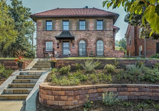
I finished this project last year, which feels like forever ago, but went back and had it shot in September of this year. It's very much a classic house, a home you want to visit for a holiday party, so I think it's especially apt to share it now. Plus it's in Denver which reminds me of snow and seasons . . . things we lack in California, not that I'm complaining. It's always nice to VISIT snow, anyway.
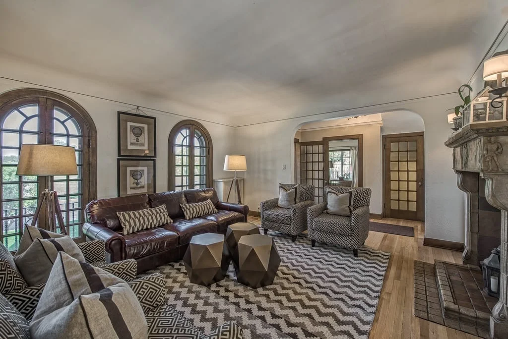
These clients recently moved from Manhattan to Denver. Not only were they dramatically changing their scenery, they had also purchased a new house and needed help with decorating and furnishing. Their aesthetic preferences leaned a bit more traditional than what I usually do, but I was more than up for the challenge. Ready? I apologize in advance, I only have grainy real estate before photos of the home since I didn't do an initial site visit. Here we go. Below is the before/after of the living room.
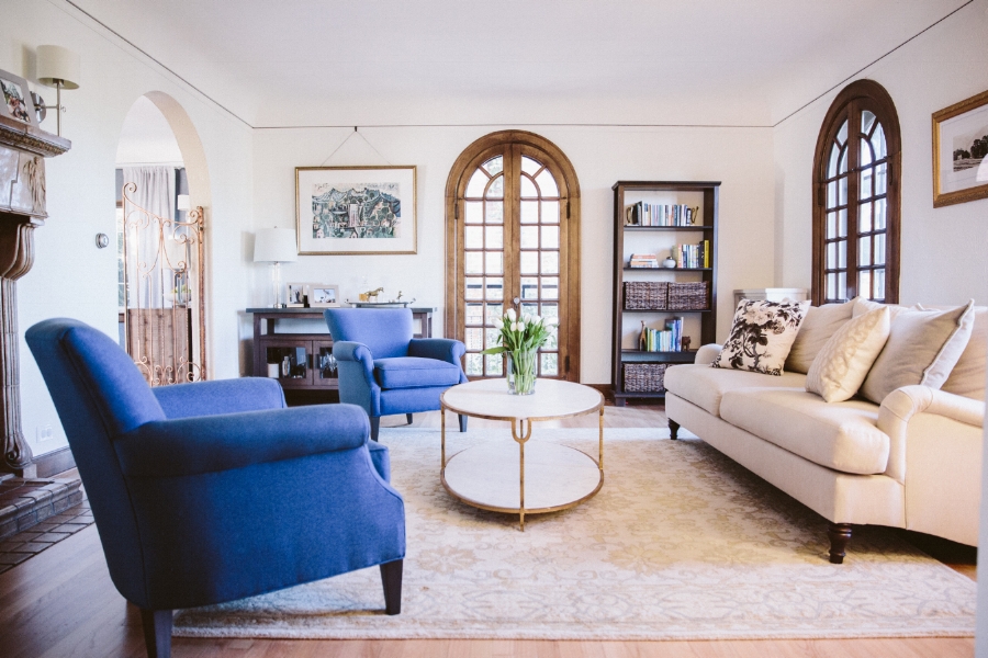

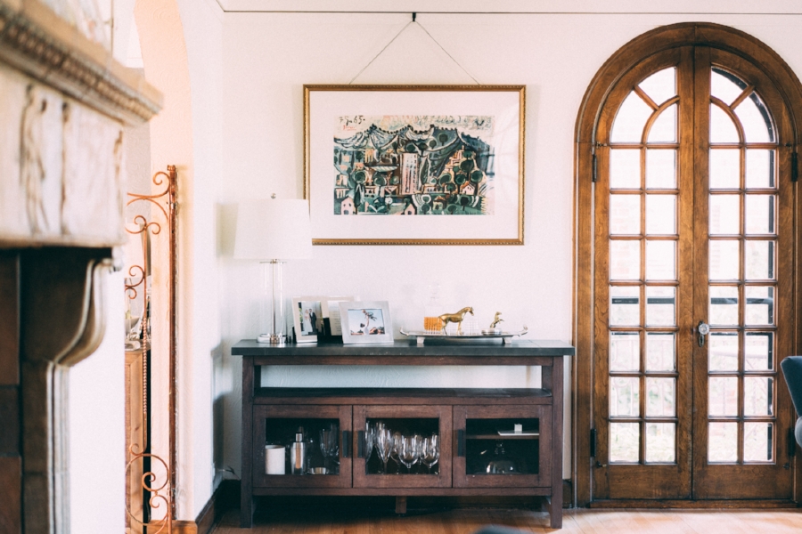
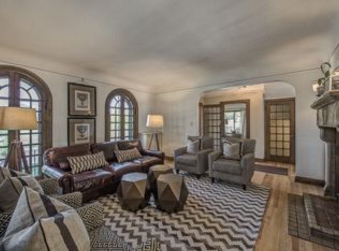
As you can see, although we adhered to a more traditional style, we lightened everything up. The beautiful woodwork framing the doorways and windows in this room are the highlight and we wanted to make sure nothing detracted from that. Since this also serves as the formal living room and the family room, it was important to keep toys hidden but easily accessible. Do you spy those baskets in the bookcase? A bounty of toys lie just behind that wicker, which makes everyone happy.
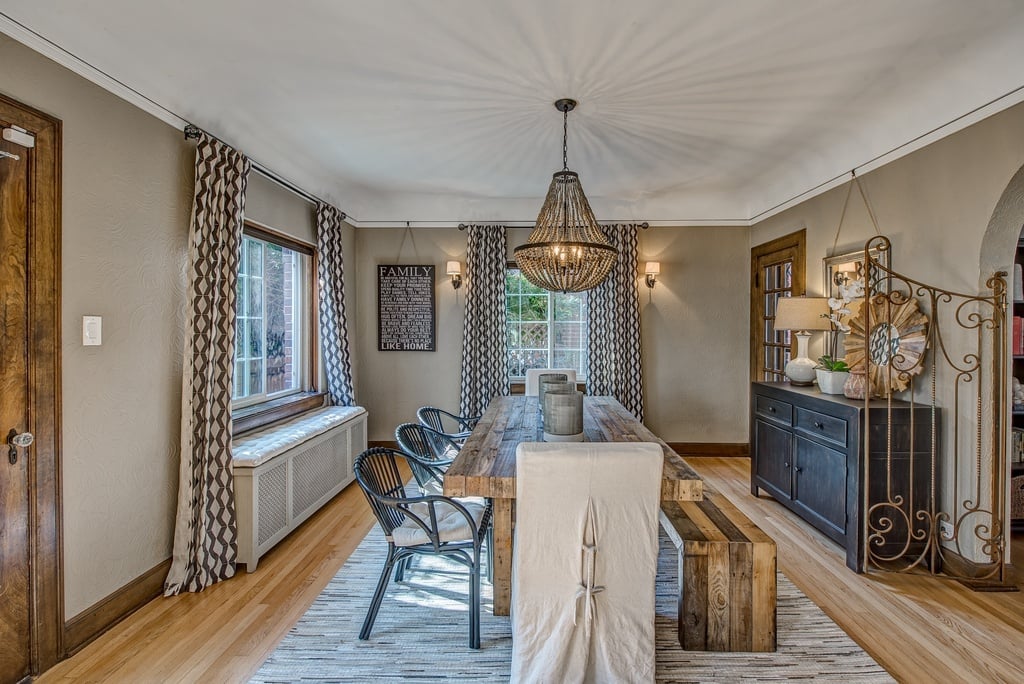
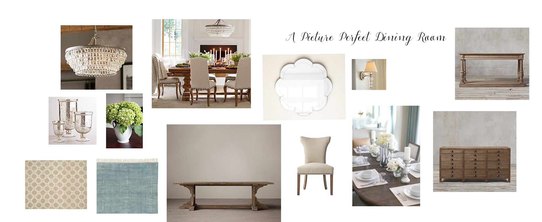
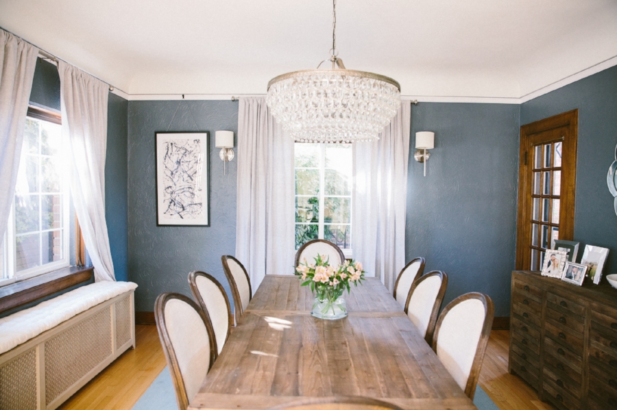
Paint does wonders, right? Before, it was very much a beige box with layers of neutrals that didn't really allow this room to shine or allow the special details such as the gilded iron work to stand out. A coat of gray paint with some weathered yet elegant dining furniture transforms this room into one made for holiday dinners and celebrations. The chandelier is statement-making and shimmers so nicely when turned on. My favorite touch is the abstract art, something unexpected that elevates this room nicely.


Paint does wonders, right? Before, it was very much a beige box with layers of neutrals that didn't really allow this room to shine or allow the special details such as the gilded iron work to stand out. A coat of gray paint with some weathered yet elegant dining furniture transforms this room into one made for holiday dinners and celebrations. The chandelier is statement-making and shimmers so nicely when turned on. My favorite touch is the abstract art, something unexpected that elevates this room nicely.
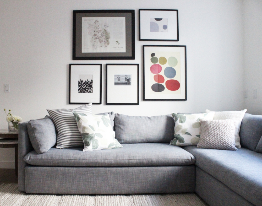
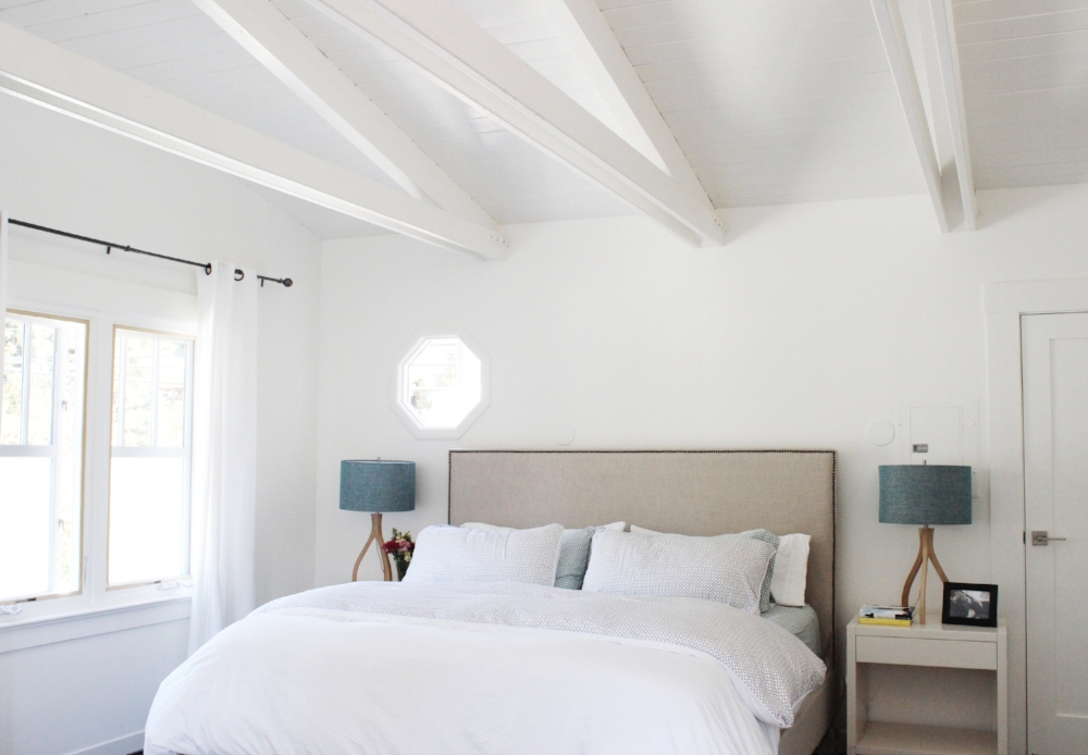
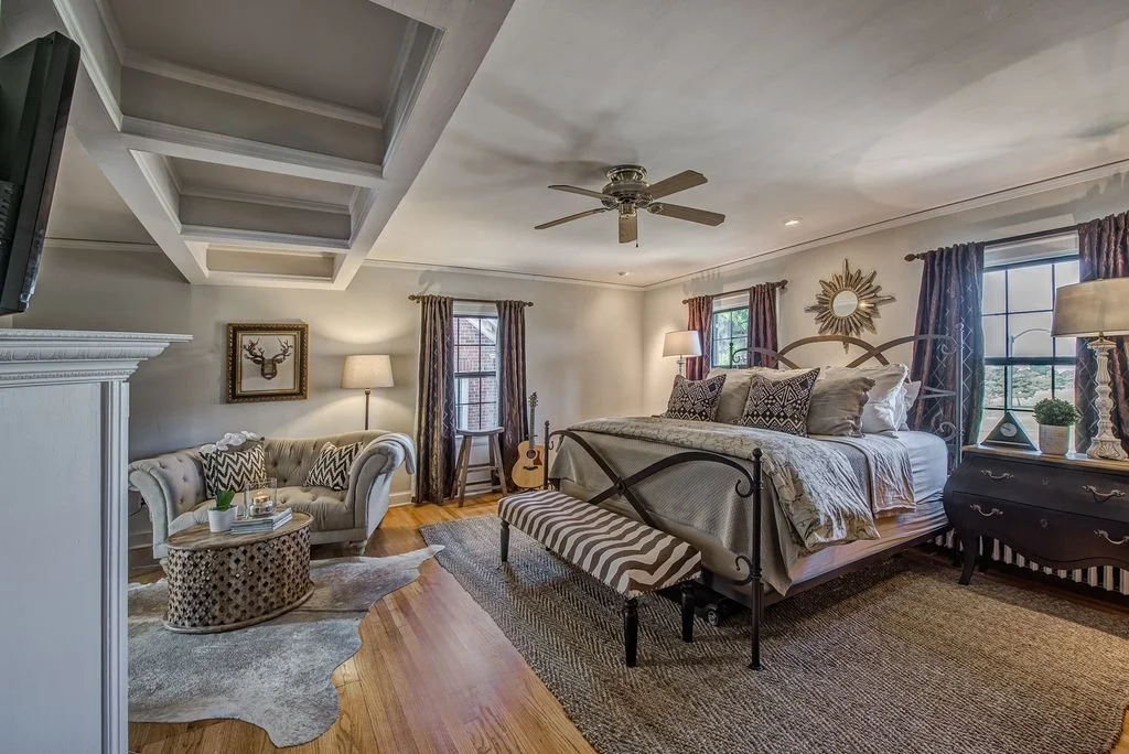
For our last room, let's head upstairs to the master bedroom.


Photography by Chandler Kim
Moving on to the dining room. Below are the before and after photos.
A true master retreat, complete with a sitting area! It's interesting to see the staged photos of the room and compare it to the current state. The traditional style was implemented in both instances. However, you can see how different the room looks from the before/after photos. It illustrates how interpretations of a style can vary widely. With a soft palette of neutrals and tufting, we've created a master bedroom that is romantic and serene.
I hope you enjoyed this before and after and I hope you have a great holiday season!