A Light Filled Sanctuary

It's still early in October but already this month has proven to be crazy busy. When it starts to feel a little overwhelming I conjure the image of this home I just finished. It's the epitome of serenity.

The client's home was a wonderful canvas to work with. It had an abundance of natural light, rich wood ceilings and beams. Even the entrance to the home was enchanting. 

Background. The client and her husband and moved from Brooklyn into this adorable Bay Area cottage earlier this year. She sought my assistance for her home because she just couldn't figure out how to bring it together. I do have my own personal style, but I sincerely believe that when I'm designing for a client, my job is to help guide and edit my client's style. That is what I have done here. This client is a true minimalist, and preferred to bring in color through plants and accessories. The less there is in a room, the better it has to be since the eye will easily pick out flaws. Here we go! Below is the before of the living area.  

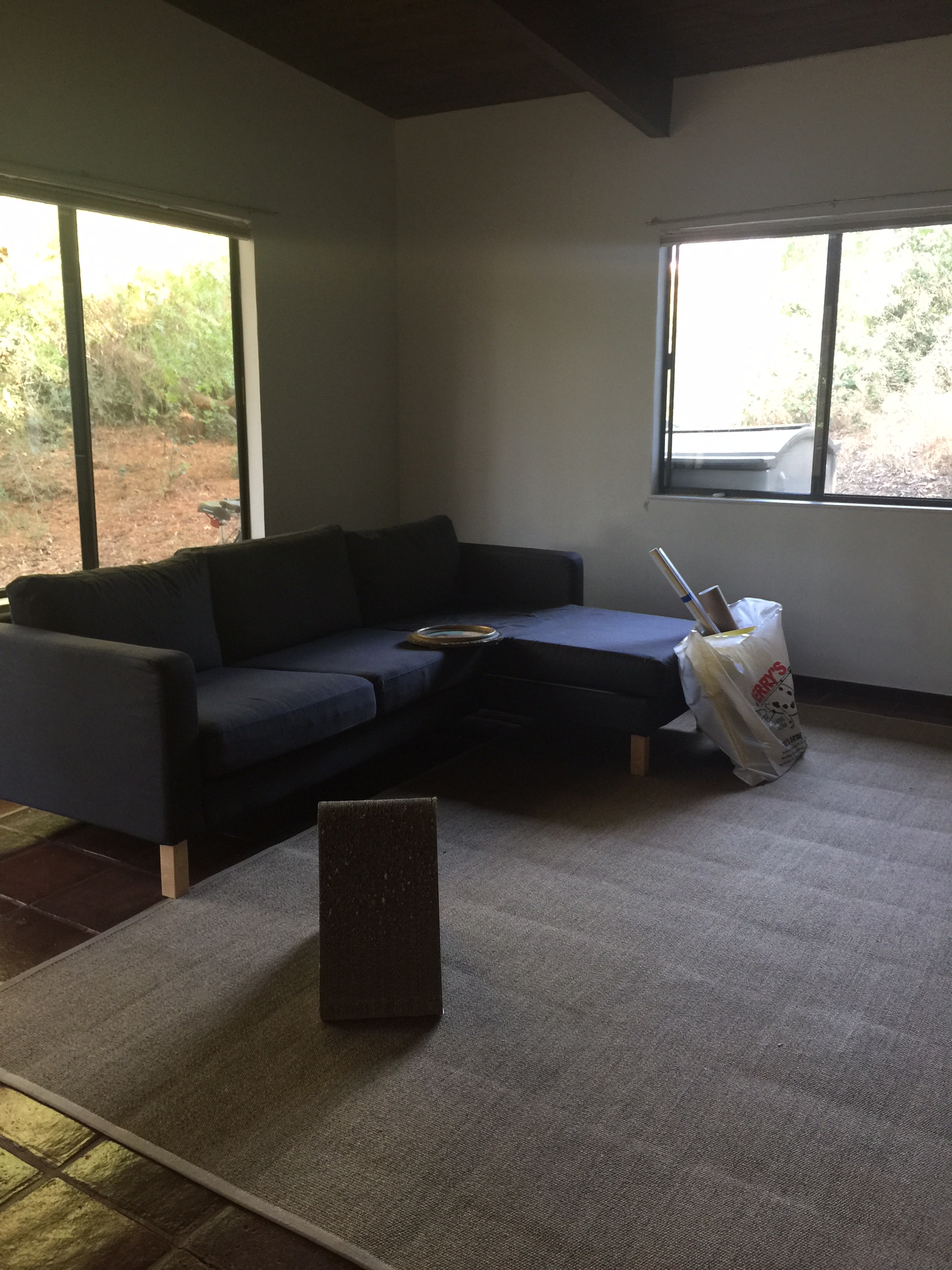
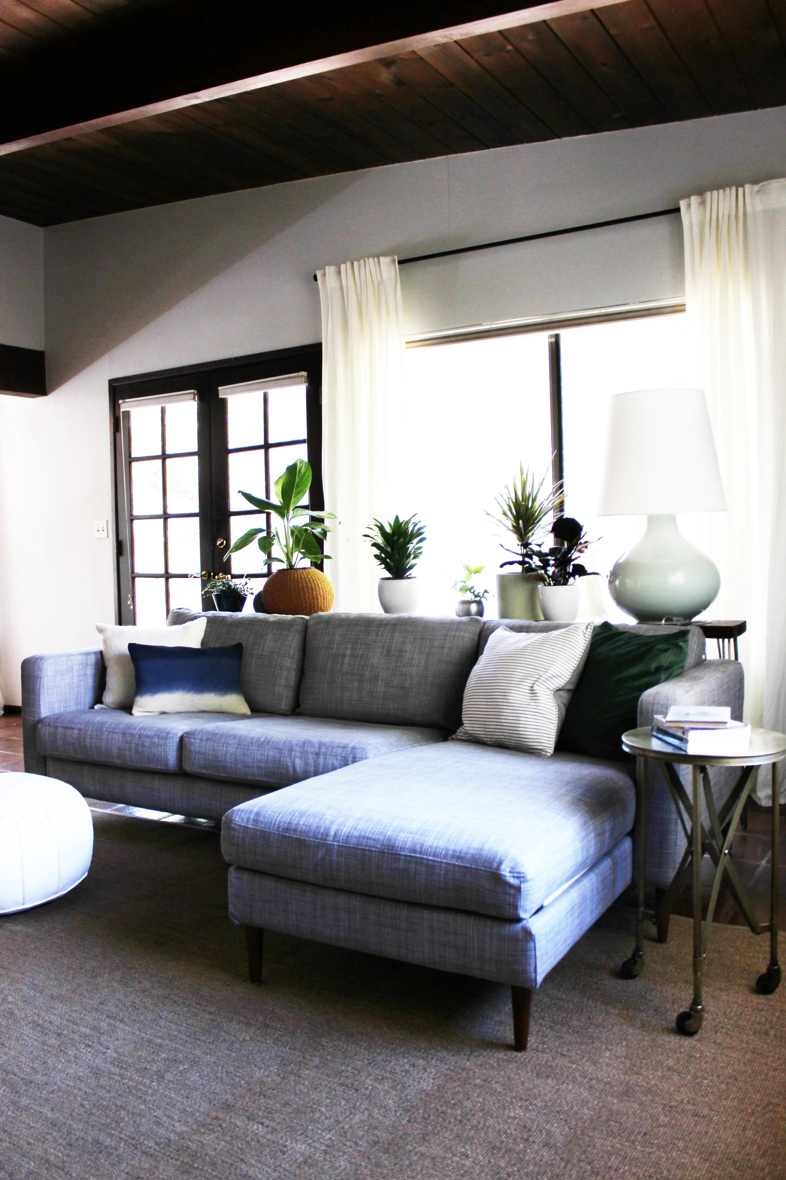
This home has so many windows and gets the most lovely natural light throughout the day. The original plan was to replace the sectional. However, in the end, the client decided to get the existing sectional a facelift with a new cover and legs. Here is the after! 

The real challenge for me was to adhere to the client's minimalist preferences while making sure the house felt like a home by bringing in warmth and life. To achieve this, my plan was to bring a healthy number of plants, a variety of different textures and a neutral foundation. Like many of my clients nowadays, this client decided to forgo a traditional coffee table and instead opted for a fun pouf. The console table behind the sectional can also serve as a landing space for beverages. And there can never be enough plants - here is a closer view. 

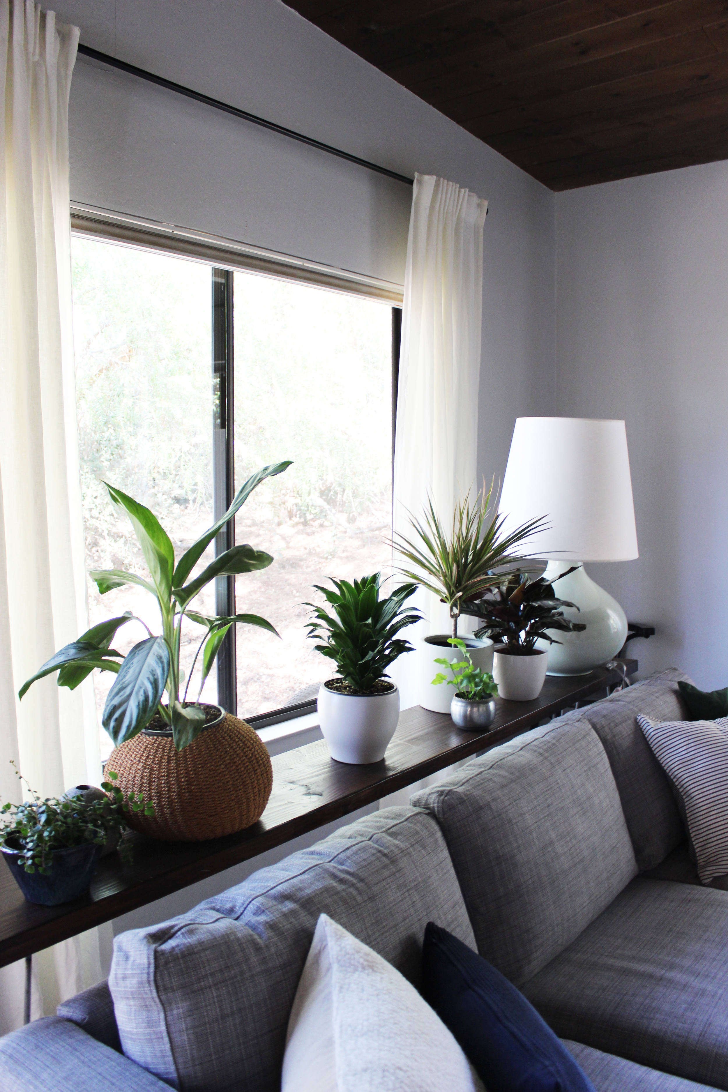
When a room has a neutral palette, one way to draw the eye's interest is to diversify the textures in the space. This is something that is often overlooked in most homes. Look closely at the plant containers, we have many different kinds of containers (woven, ceramic, metal, etc.) all in the same color palette to keep things cohesive. I've done the same with the throw pillows on the section by including a number of different fabrics (velvet, textured wool, silk, cotton). 

Since we didn't have a coffee table in the space, I found this great side table ON WHEELS! So the client and her husband can move this around as needed, this table is functional and beautiful! 

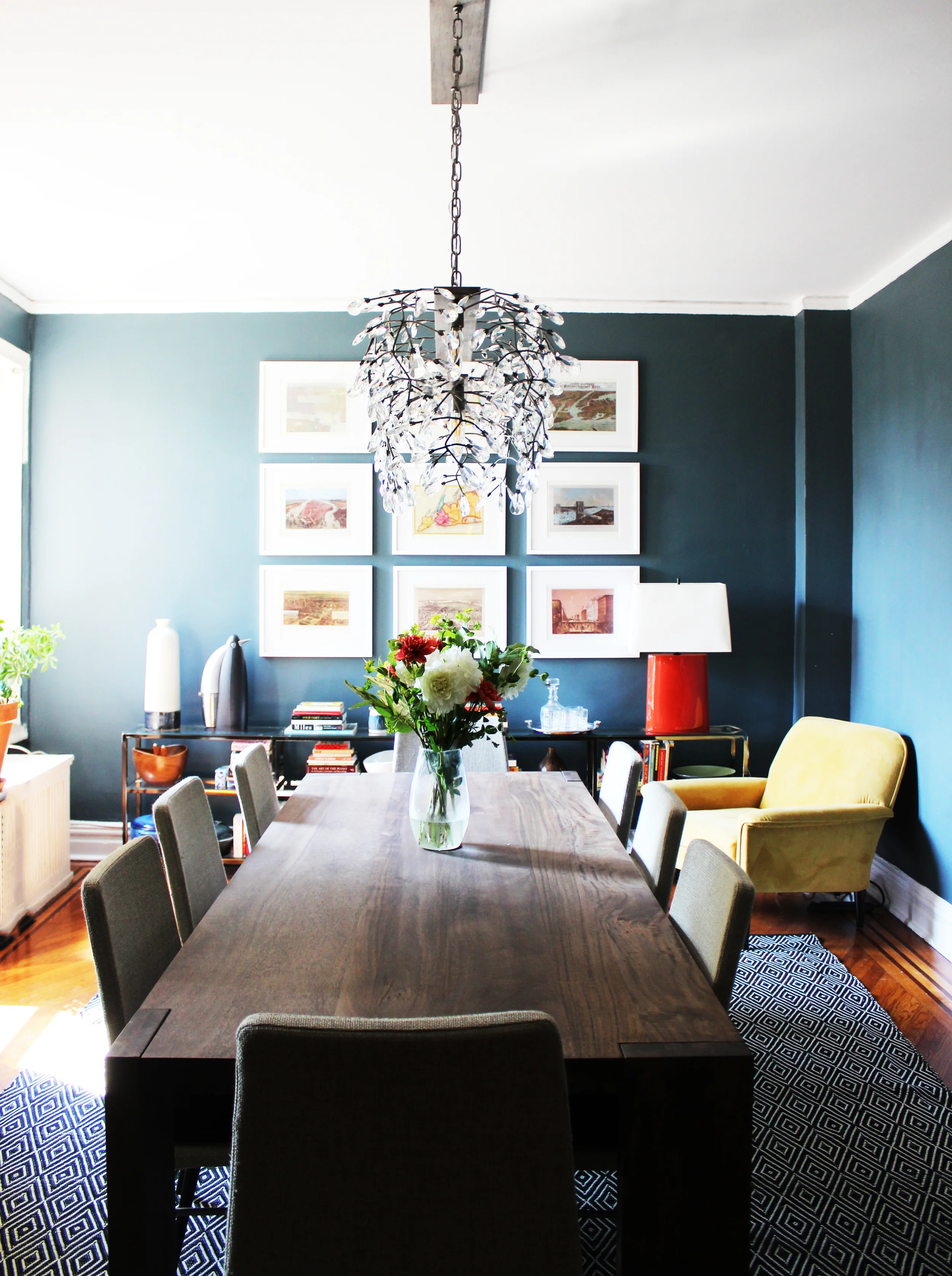
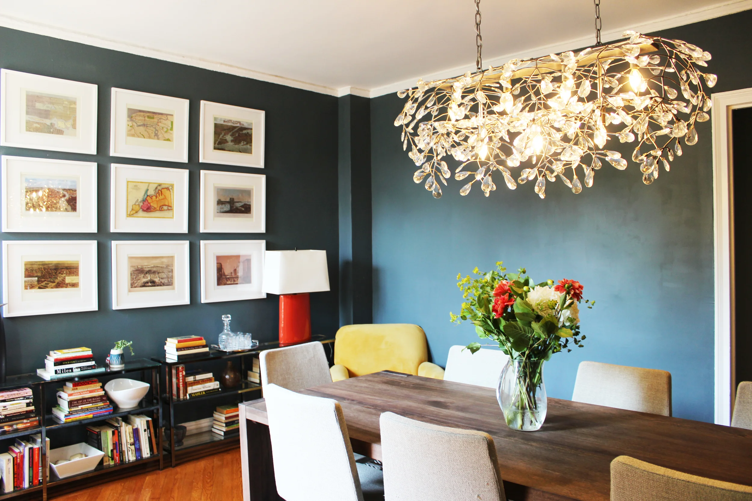
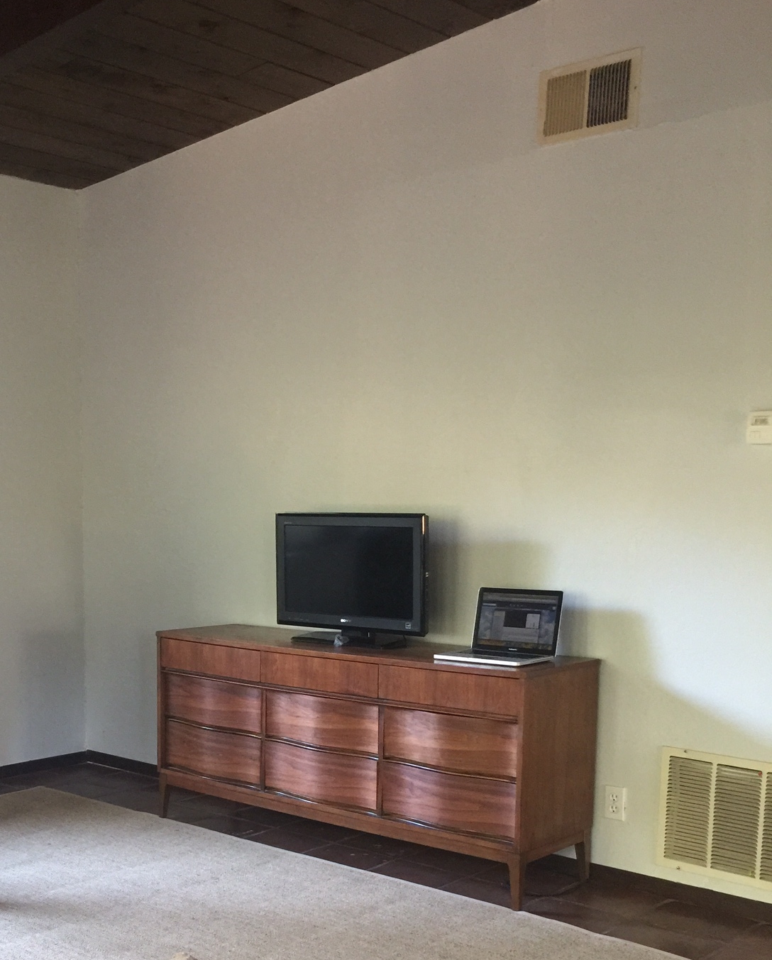
On the other side of the living room is the TV area. The client already had a vintage dresser we were planning on using. To complete the area, we decided on a gallery wall which I installed. See below for the before. 

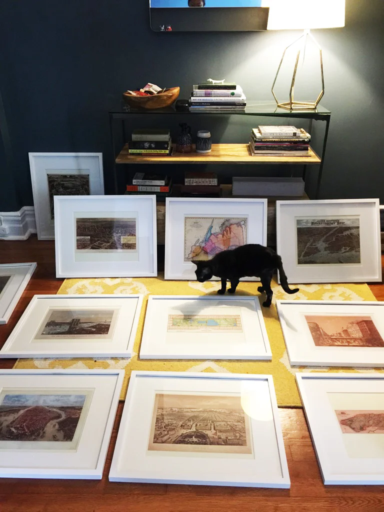
I've said it before and I'll say it again, installing gallery walls are difficult and painstaking. But I've never been disappointed after finishing one, you can achieve so much impact at relatively little cost. Scroll down for the after! 

It's the ideal blend of vintage and modern. You may notice something different with this media area compared to most you see on the blogosphere where gallery walls are used to "hide" the TV. The TV here is not centered. The clients are not big TV watchers, actually they rarely use this TV. Instead of building a gallery wall around a permanent fixture in their room that they rarely use, I gave them the option of moving the screen completely when not in use. If I had hung the gallery wall solely around the TV, there would be large unattractive wall space when the TV was removed. 

The lamp was from a pair that the client had on her nightstands. The black frames allow the colors from the prints to jump off the wall and catch your eye. 

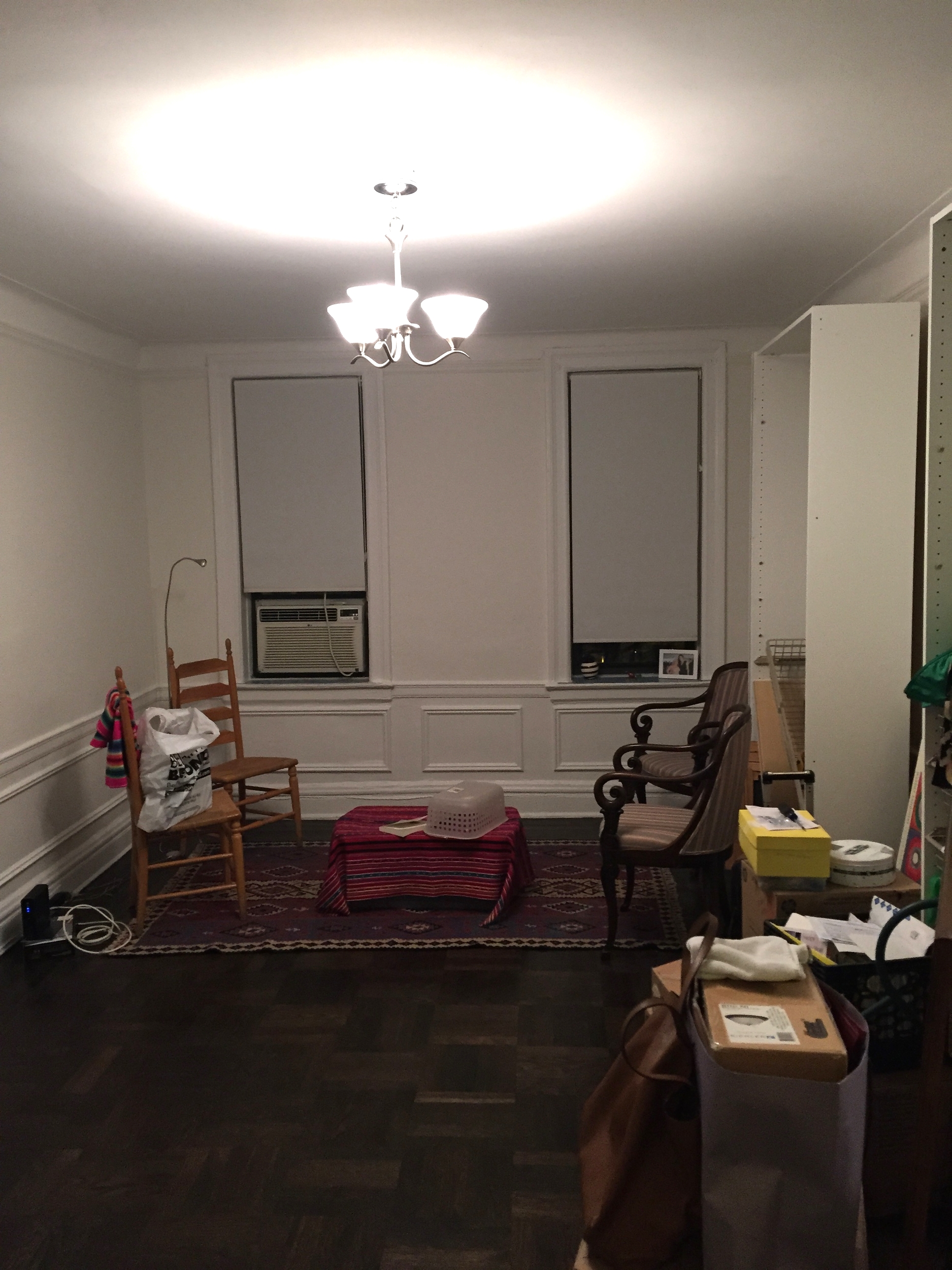
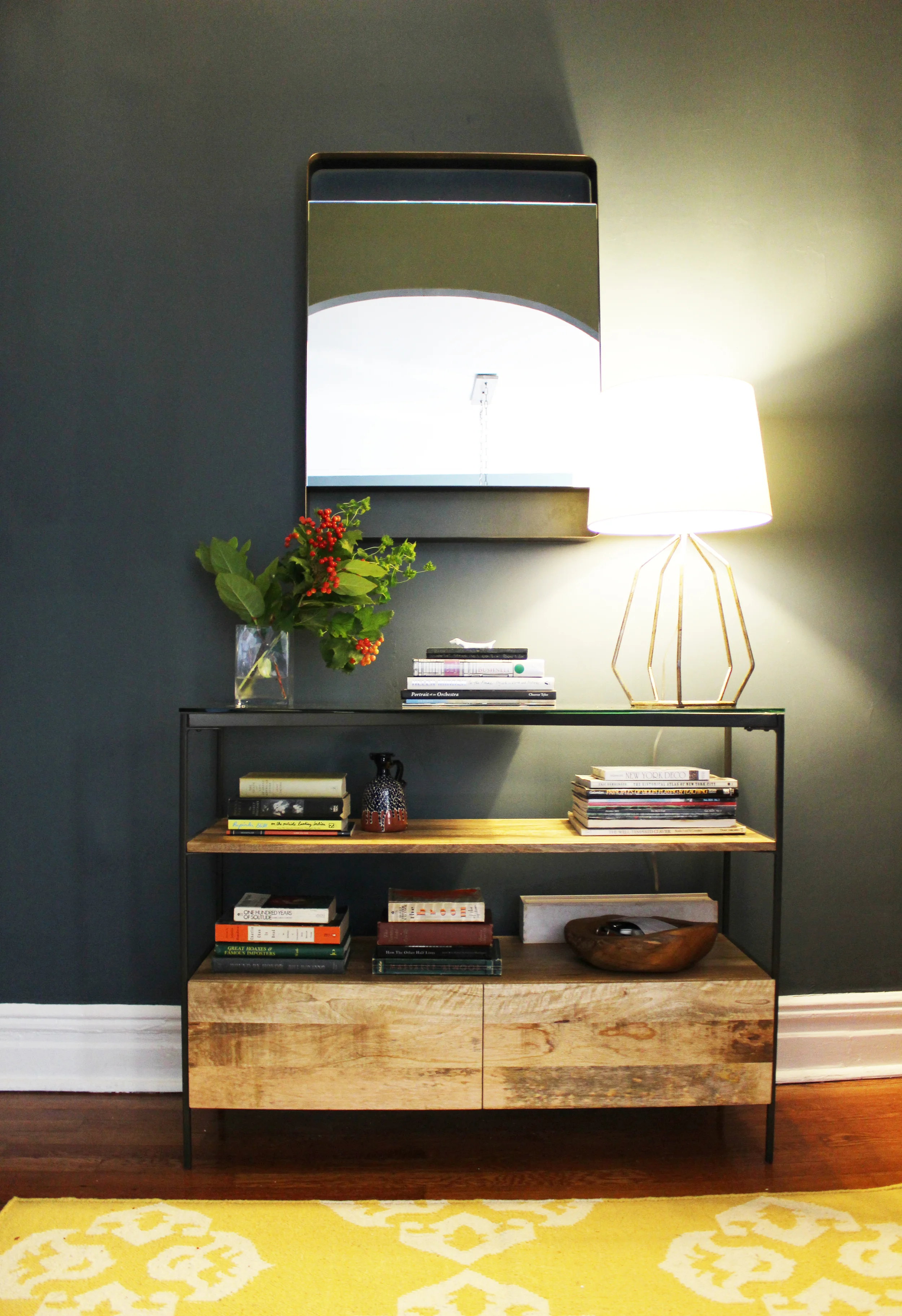
Let's move on to the console area. Here is the before, basically an empty canvas waiting to be filled with something great! Here is the before. 

Yup, a sad empty corner. Nothing really to say. Here is the after!

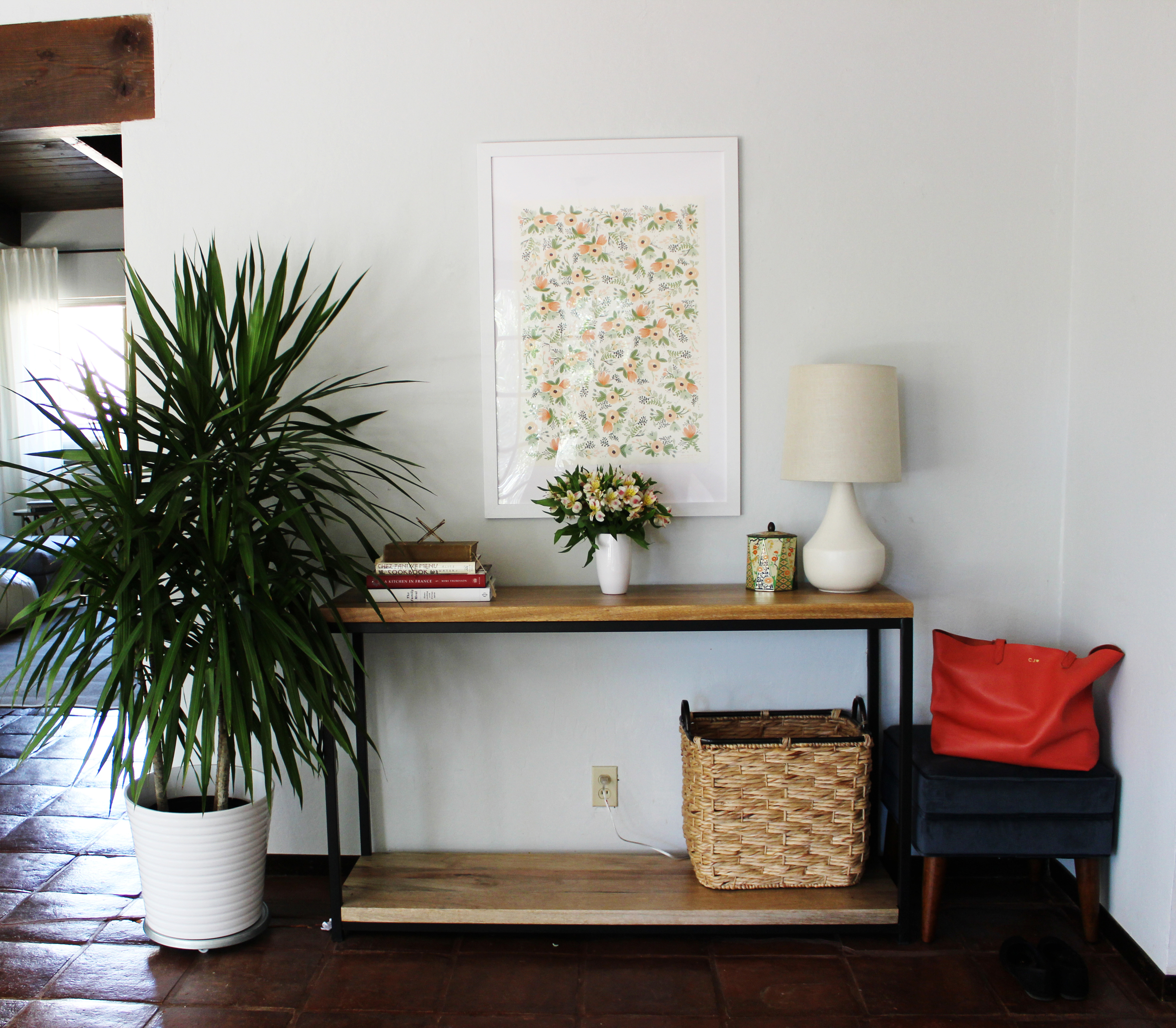
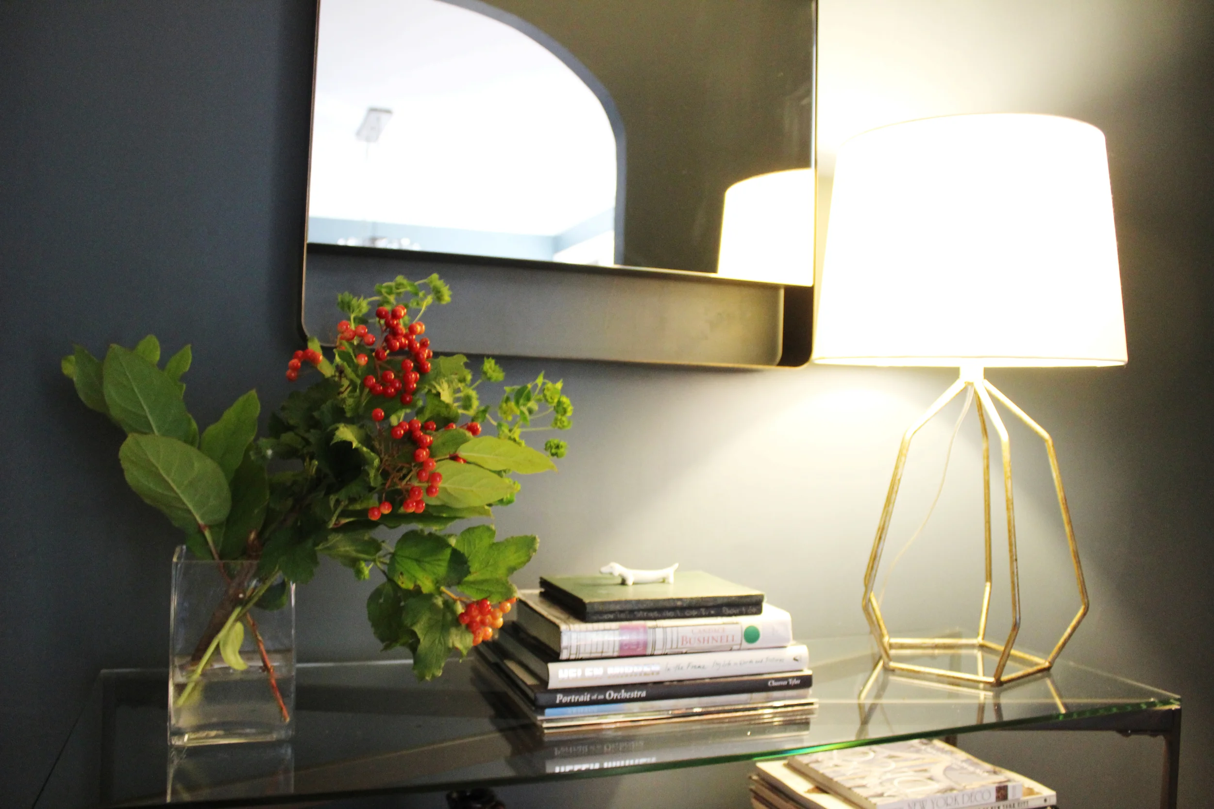
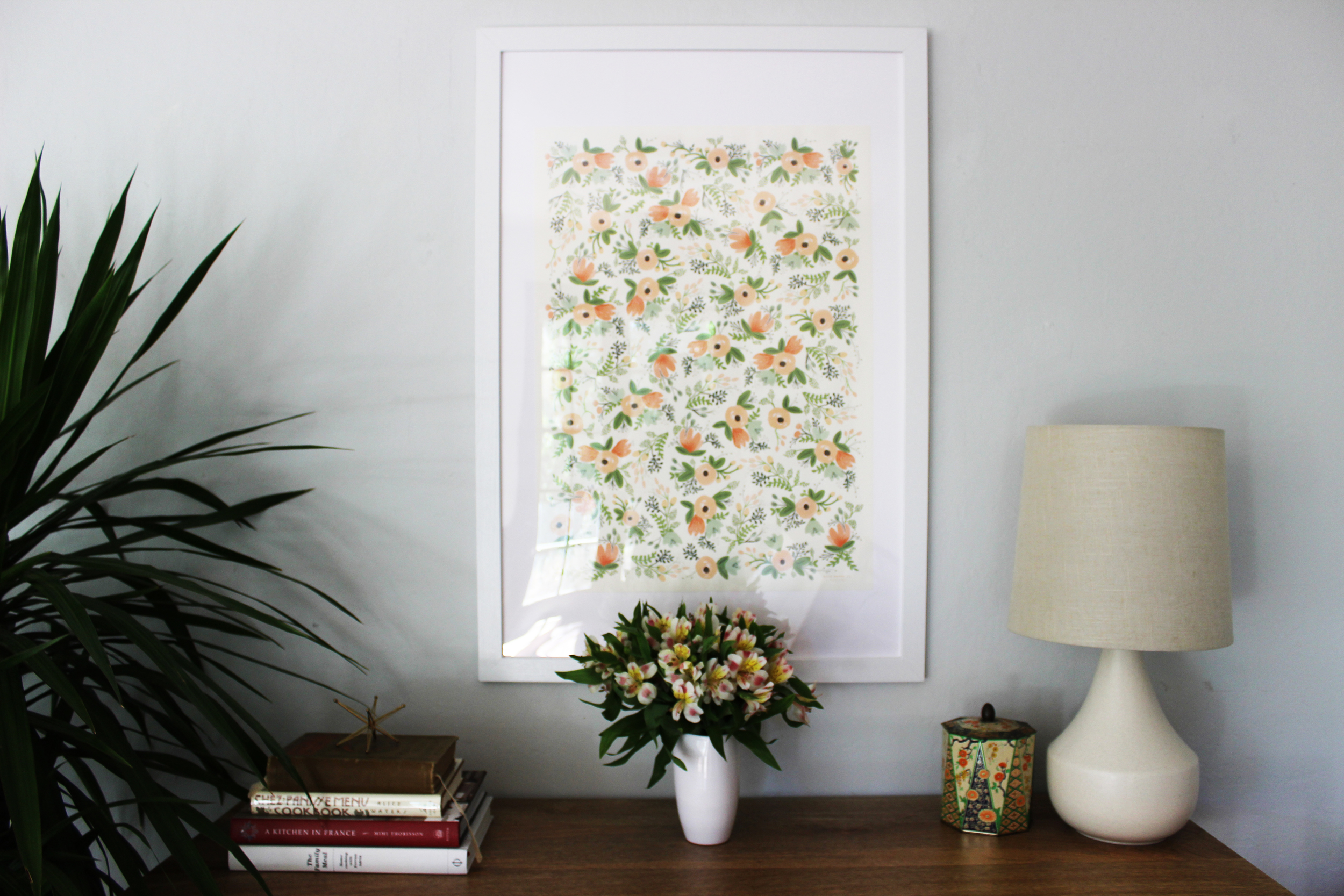
I love this landing space, it's practical and beautiful. The basket to hold whatever you need on hand. The blue velvet ottoman is perfect for taking your shoes on/off or plopping down your bag after a long day at work. We reused the second lamp from the bedroom here. A closer look below. 

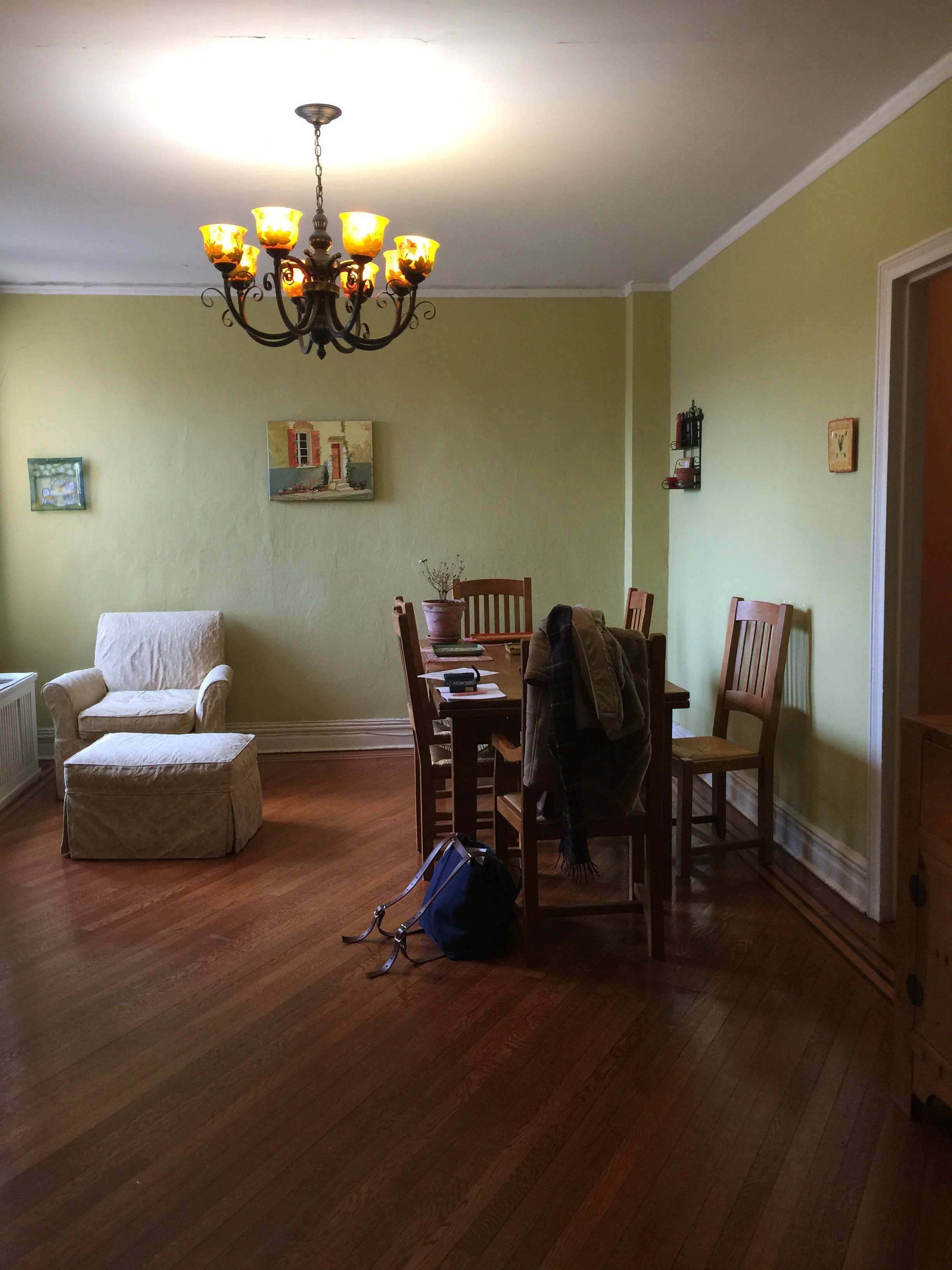
And finally our last stop, the bedroom. If it's chaos everywhere else in your home, at the very least, your bedroom should be a sanctuary. I am a believer that your atmosphere truly affects your productivity and well-being and that rings true especially in the bedroom. Here is the before.  

Excuse the extra fabric on the bed, the client was showing me some additional bedding. As you can see, this room was craving for just a hint of color, a bed frame and a little bit of polish. Like magic, we were able to make things happen, see below! 

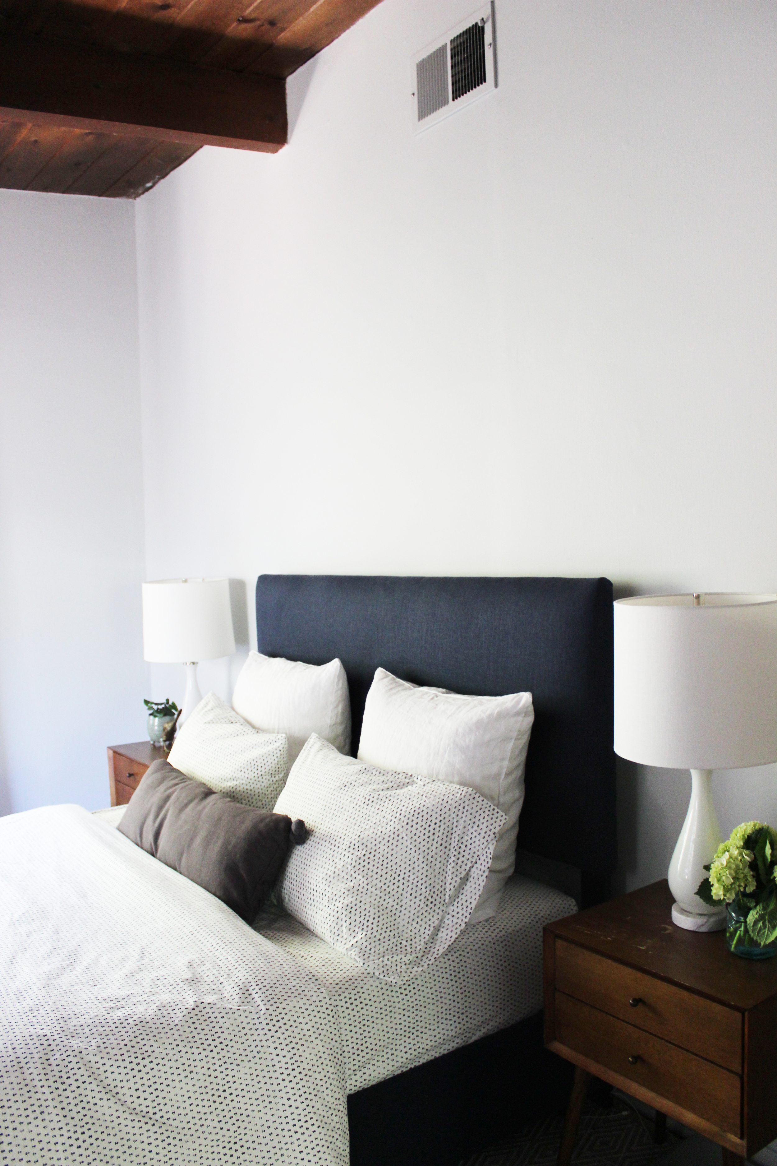
You can't go wrong with that rich navy bed frame, especially against the warmness of the wood in the nightstands and ceiling. The small bud print on the sheets bring in that little something, the extra detail that makes a room from good to great. To keep things airy and simple per the client's wishes, I chose prints that were smaller in scale as can be seen in the bedding here and the rug below. 

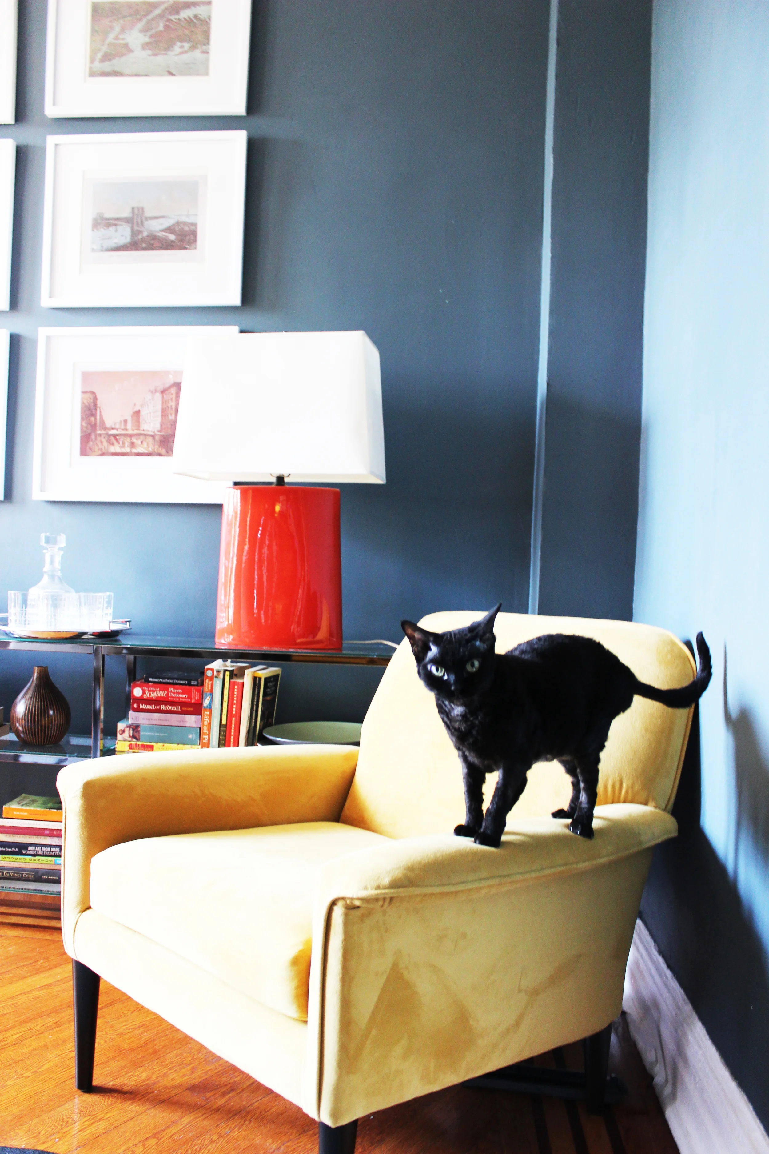
I know, how cute is this kitty? I believe his name is Crispy. His face may not say it, but he's a fan of the new bedroom. 

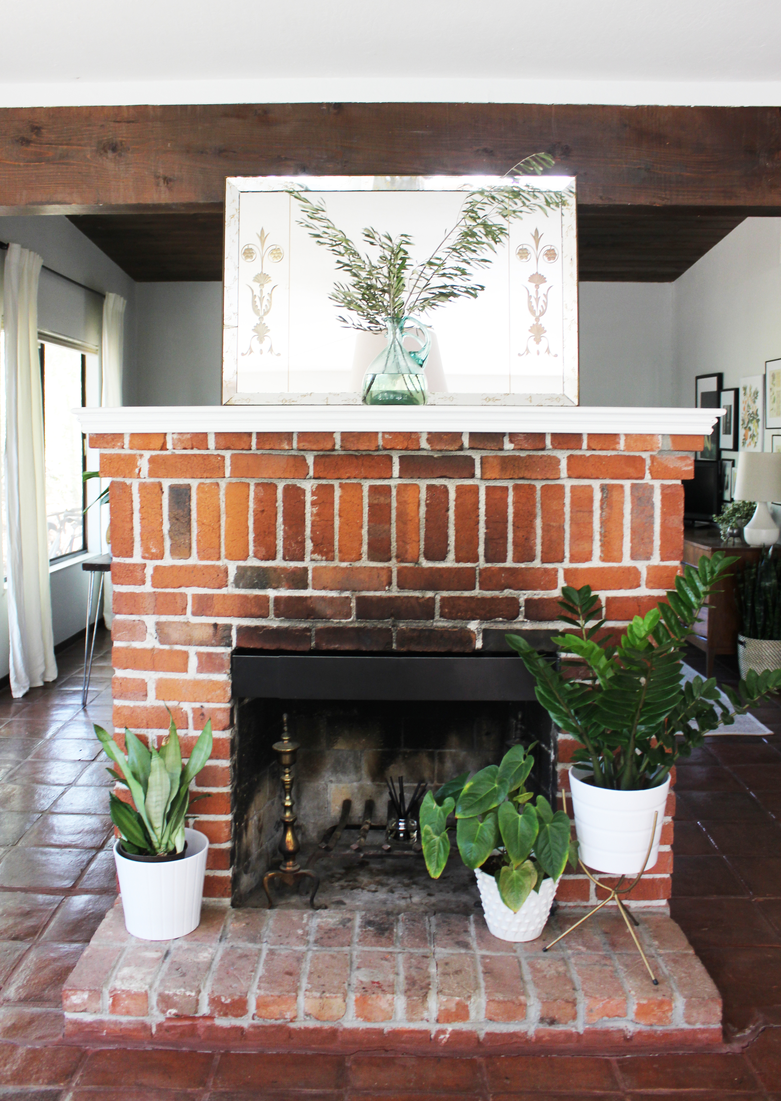
And one of my favorite parts of this house is this hearth. I added some plants to border it, bringing in some green.  I absolutely loved worked with this client and her home. In some ways, going over the top can be easy, there can be so much going on there is more to hide behind. When designing with the utmost restraint, everything must be placed with intention and thought. which is what we did for this light filled sanctuary.

Thanks for reading!


A Brooklyn Heights home with inherited charm

I had mixed feelings about offering eDesign services. On one hand, a number of industries are moving towards offering remote services these days, and more and more design startups are at least offering eDesign as an option. On the other hand, I was skeptical. For me, standing in a space that's waiting to be designed invokes a visceral feeling that inspires me and helps me execute the client's needs and desires within the room in full context of the rest of the house. No room stands in a vacuum and when designing, I always want to make sure that the room fits and flows with the rest of the house. My biggest concern was that it's difficult to create, implement and style a room without ever visiting the home! 

With some resistance, I finally decided to try it out. This client in Brooklyn Heights was one of my first eDesign clients, and by all accounts it's been a success! A bit of background, as a first time homeowner she was confronted with a combined living/dining area with a small footprint. She also had a number of inherited pieces from her family that she wanted to integrate with some new mid-century pieces. And as an avid hostess, she needed plenty of room for entertaining. 

This home is located in a pre-war building. The prior owners went a little too modern with the decor. We wanted to bring back the old world charm of this home while infusing it with the client's eclectic sensibilities. So here we go. The below is the before of the space, right after the client moved in. As you can see we were starting from scratch. 

There is a short hallway on your left that leads to the bedroom and bathroom. To the immediate left is the kitchen that constitutes one wall. So this room you're seeing now had to be everything else: a room for lounging, TV watching, entertaining, dining, etc. The room is on the smaller side, although large by New York standards. My client was gracious enough to send me photos of the finished space, see below for the after!

Full Room.jpg

Cozy, warm and comfortable! The living area is centered around a vibrant oil painting done by the client's grandmother. The neutral walls are the perfect background for this colorful piece. The two armchairs are also inherited pieces from the client's grandmother and they are ideal pieces for rounding out the conversation area. Look at the scrollwork on those arm chairs, truly beautiful.  

The light gray mid-century couch will last for a very long time and never go out of style. The glass coffee table gives visual lightness to a fairly tight space, and it really works here. Doesn't it almost look like the vase and books are floating atop the coffee table? To provide some storage, I suggested a long open shelf bookcase which works wonderfully well here.  

The client did all the styling and I have to say, I don't know if I could have done a better job! We added the small pedestal table between the two chairs to bring some color and modernity into the space. The juxtaposition of the two traditional armchairs with the modern side table is just right. This small side table also mimics the shape of the dining table we purchased! See below. 

The Saarinen tulip table was a definite splurge but a classic piece that the client can keep forever. The current dining chairs are temporary - we had been waiting for the ones we chose to go on sale, and they finally did! I believe they are currently in transit. The client was also on the search for the perfect artwork to go over the table, and she just found one. All in all, a perfect dining area to entertain and dine to complete this charming home. 

EDesign has its own challenges, but it's totally doable and fun. Having done this process several more times since this project, I'm a convert. I would say that for eDesign to be truly successful, a one size fits all formula doesn't often work, it's a nuanced process and even if it is eDesign, everything should be tailored to a client's specific needs and desires. So if you're looking for some Claraficiation on a budget but don't live in the Bay Area, you can now do so! 

Dark, Moody and Glamorous in Riverdale, NY

Prewar co-op? Why, yes please. Inlaid wood floors? Check. High ceilings? Check. Arched doorways? Check. An abundance of charm? Most definitely. With all these features already in place, this co-op needed just a little assistance to bring it up to its full potential, a way to marry the old school loveliness with the needs of a modern day couple. 

So here we go. For these clients, the dining room was a priority. Directly adjacent to the kitchen, it was clear that this would be the primary hangout area. Below is the before photo with the prior owner's belongings. 

So yeah . . . the paint color. Reminds me of honeydew. Maybe it would work in another space in another home in another decade, but definitely doesn't work here. And the chandelier? Definitely didn't fit with the clients' modern aesthetic preferences. It was time for a change. Below is the after!

Dinner party ready!  I'm obsessed with this room.  The gray blue walls set the ideal mood. Facing east, the abundance of natural light throughout the day also ensures that this room remains light and bright despite the darker hued walls. The yellow velvet sitting chair provides the ideal reading corner so that the dining room is an attractive place to hang out during the day as well. Clearly, Sydney approves and agrees.  

So I know you're dying to know what's on the walls and a better look at the lighting situation. Take a look below.  

The clients had saved these prints of New York vintage maps and cityscapes to display in their very first home. After having them framed, we laid them out on the floor (with no help from Sydney) to see which configuration would work the best. The color and detail on these maps are amazing. Confession, installing gallery walls is probably my least favorite thing to do, right below assembling Ikea furniture.  But they are often worth the effort as can be seen here.

Also that wonderful chandelier that gives off the most beautiful sparkly light? Each of those crystals were hand screwed in by the client and me on one of the hottest most humid New York summer days. To all future dinner party guests, you're very welcome! I know all good things take effort, but we really earned it in this instance. Let's move onto the foyer. Here is the before.   

If you recall the dining room was painted something reminiscent of honeydew. The foyer? Cantaloupe. For obvious reasons, we extended the blue gray paint to the foyer. Without any windows, the same paint in the foyer creates a very different vibe, dark and moody in the best possible way. See the after below!

The foyer is open to the dining room. To keep the two spaces cohesive, I placed a yellow accent rug to touch back to the yellow chair in the dining room. The mirror above the console brings brightness and shimmer to this closed space and a great place to check your makeup before heading out! Here is one more close-up. 

I love this brass table lamp. It pops against the dark walls and it has structure. This foyer sits between the front door on one side and the rest of the home on the other. So the lamp is great in that it not only provides light, but the skeleton silhouette allows for a clear line of sight from the front door to the rest of the home.

A lovely first home. I foresee many dinner parties that run late into the night for these clients, the only way to do it right?  

And that's all folks! Thanks for reading.