
Dear Clients and Friends -
It's been approximately a year since Banner Day launched!
I'm not one for sentimental personal sharing, but I would be seriously remiss if I didn't take this opportunity to thank everyone who has helped me through this journey this past year.
To all of my former and current clients, thank you for taking a chance on this attorney turned designer. Thank you for welcoming me into your homes and offices, entrusting me to make the right decisions with your most personal spaces. Thank you for hiring me.
To my friends, thank you for referring me, liking my posts, and allowing me to clog up your social media with my before/afters once in a while! Even as I grow, I doubt I will ever have to create a marketing department since I have one already built-in through all of you. I can say with confidence that a large part of Banner Day's success is attributable to the wonderful circle of friends that surrounds me. I'm lucky to have each one of you.
To my family, thank you for supporting me. A special thanks to my sister who talks about me and promotes my business with abandon. Thank you to my mom who has been very supportive of my decision, despite the chorus of disbelief from her friends who refuse to believe that a Korean mother would allow her daughter to leave corporate lawyering for creative pursuits. And of course, to my husband, this would have been impossible without your support in every single way. Thank you for giving me the opportunity to choose my own path.
I realized this year, I could be fearless. I could sell myself and my business without reservation and it feels so freeing. I also realized that I love my job. It's been so long that I've felt that way, it still feels a bit awkward.
Over this past year, I've gotten quite a few emails asking about how I made the transition (many from attorneys). Now, with some distance, this seems like the appropriate time to elaborate on how I made my career change. There are a few considerations but for me, the hardest hurdle I had to overcome was the idea that by leaving the law I was failing in some way. I wanted to be a lawyer since I was in the 10th grade, and I became one. I know I was a good attorney. However, for me, the armor I had to put on to go to work was impossible to take off when I came home. It was with this epiphany I realized that I needed to do something with my life that was more suited to my true self. I've dedicated all those years of suppressed creativity and industry into Banner Day this year and I hope it shows!
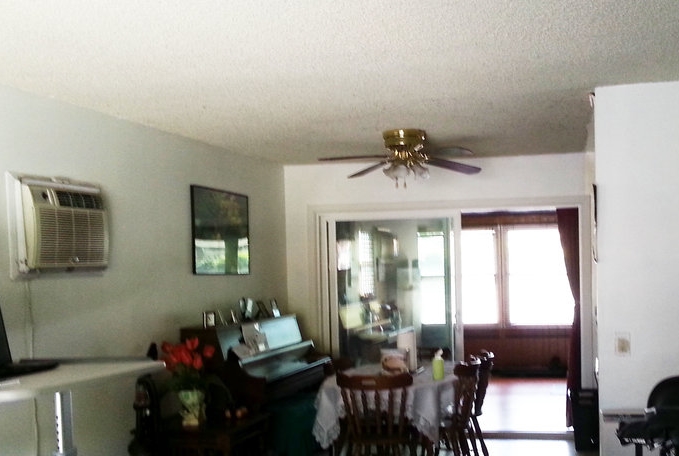
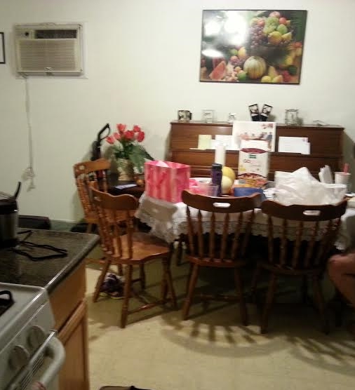
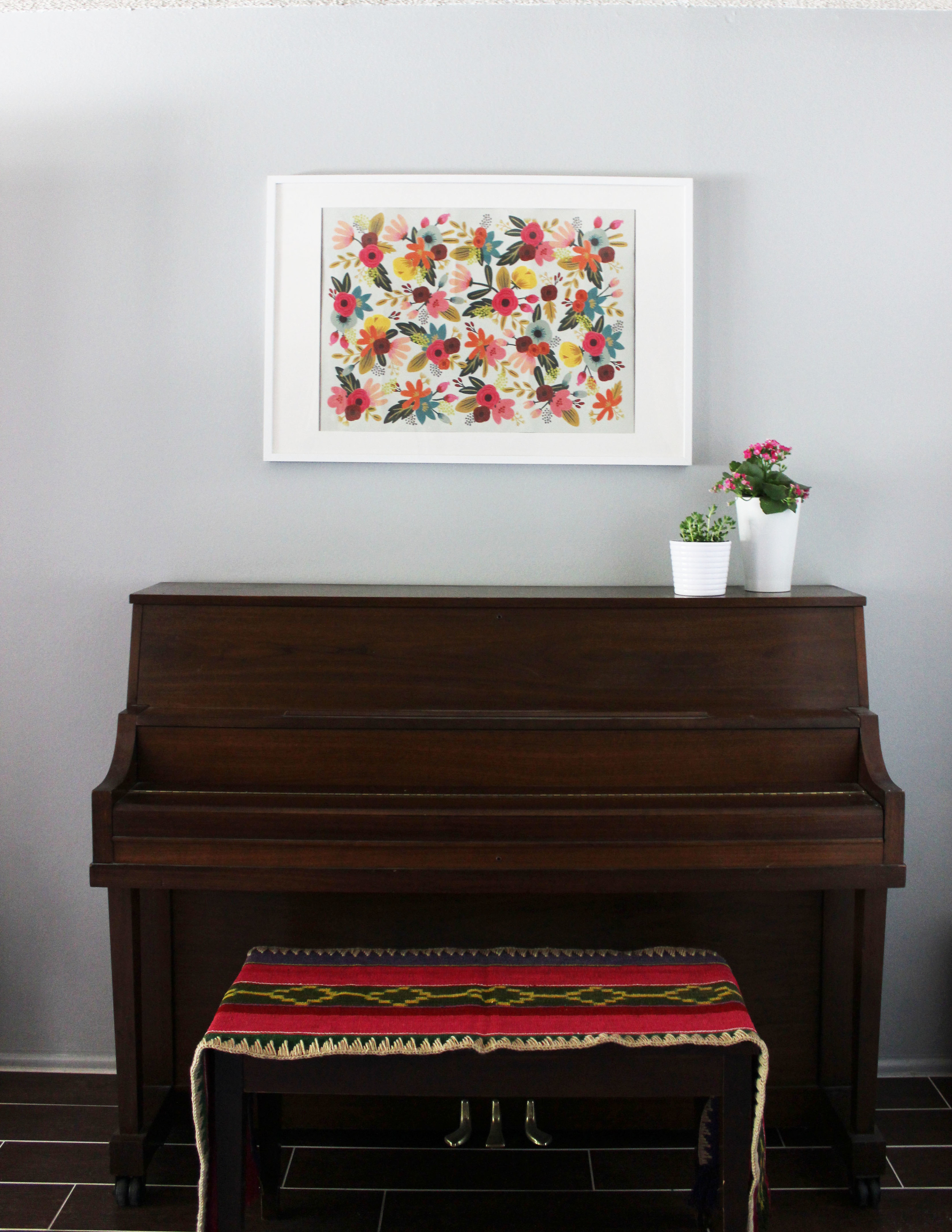
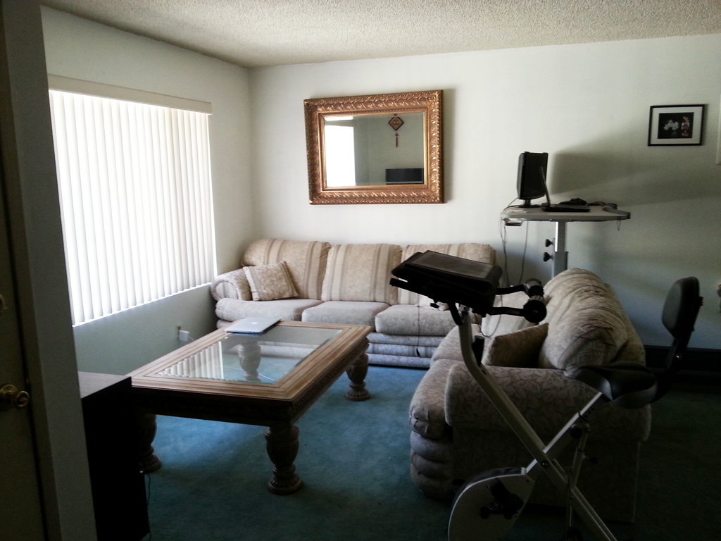
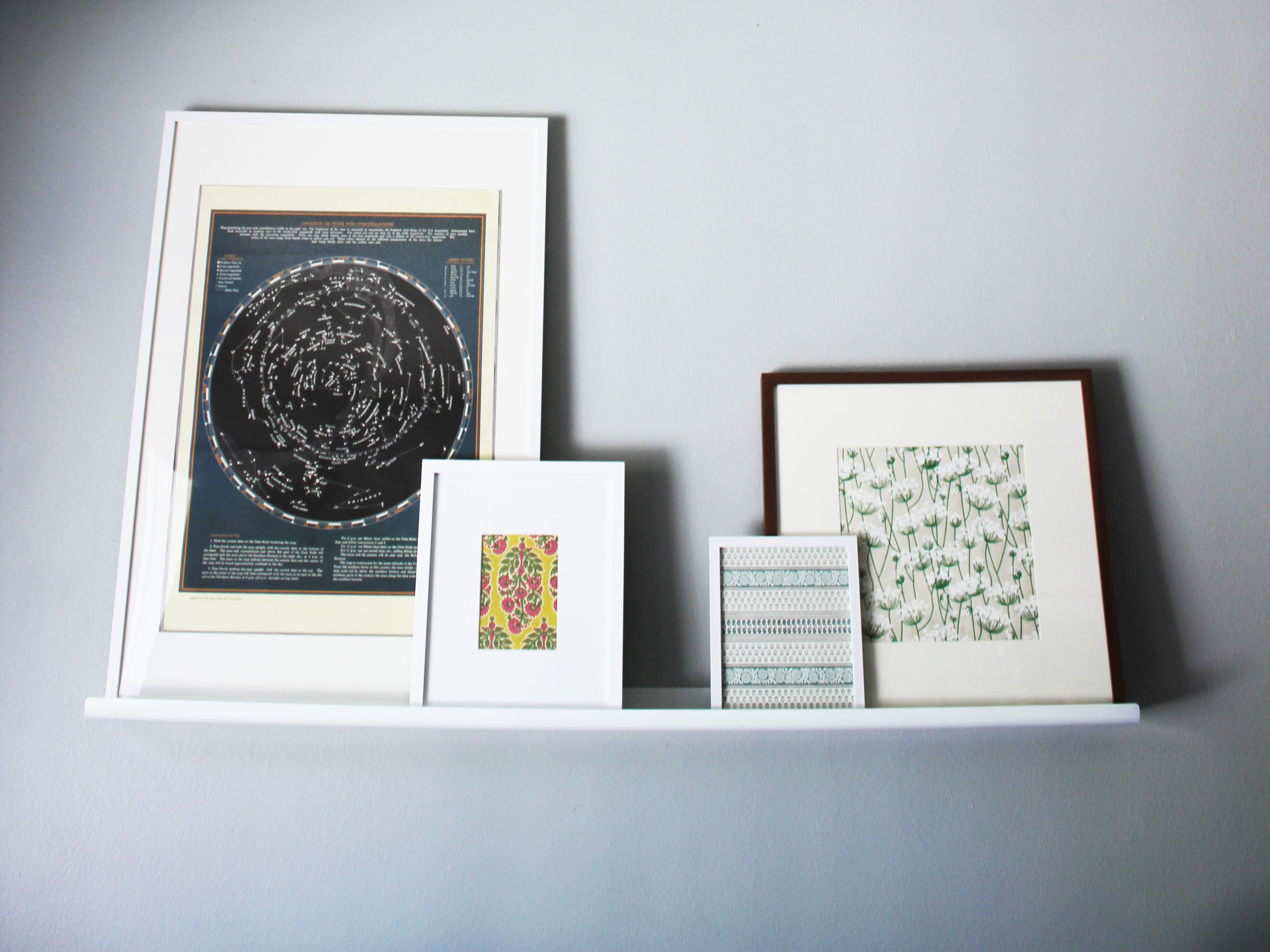
In my first year, I've completed over 40 projects, have worked out-of-state for many of them, have been published in a couple of nationwide online platforms and even received a project request as far away as Australia!
I feel the momentum building. Although this year has already exceeded all the goals I've set for myself, I cannot wait to see what this next year brings. If you know me, you know I'm an open book, and can't help but being sincere with everything I say. So I'm yelling now, THANK YOU from the bottom of my heart for hiring me, supporting me and just sending me good wishes.
xo. Clara