Dark, Moody and Glamorous in Riverdale, NY

Prewar co-op? Why, yes please. Inlaid wood floors? Check. High ceilings? Check. Arched doorways? Check. An abundance of charm? Most definitely. With all these features already in place, this co-op needed just a little assistance to bring it up to its full potential, a way to marry the old school loveliness with the needs of a modern day couple. 

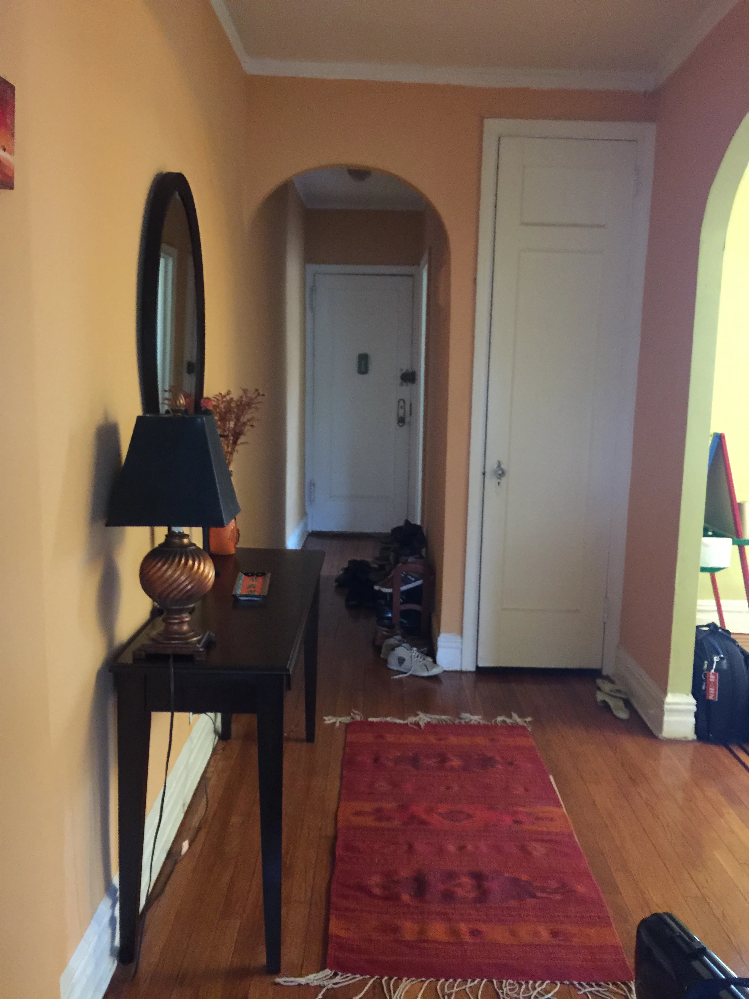
So here we go. For these clients, the dining room was a priority. Directly adjacent to the kitchen, it was clear that this would be the primary hangout area. Below is the before photo with the prior owner's belongings. 

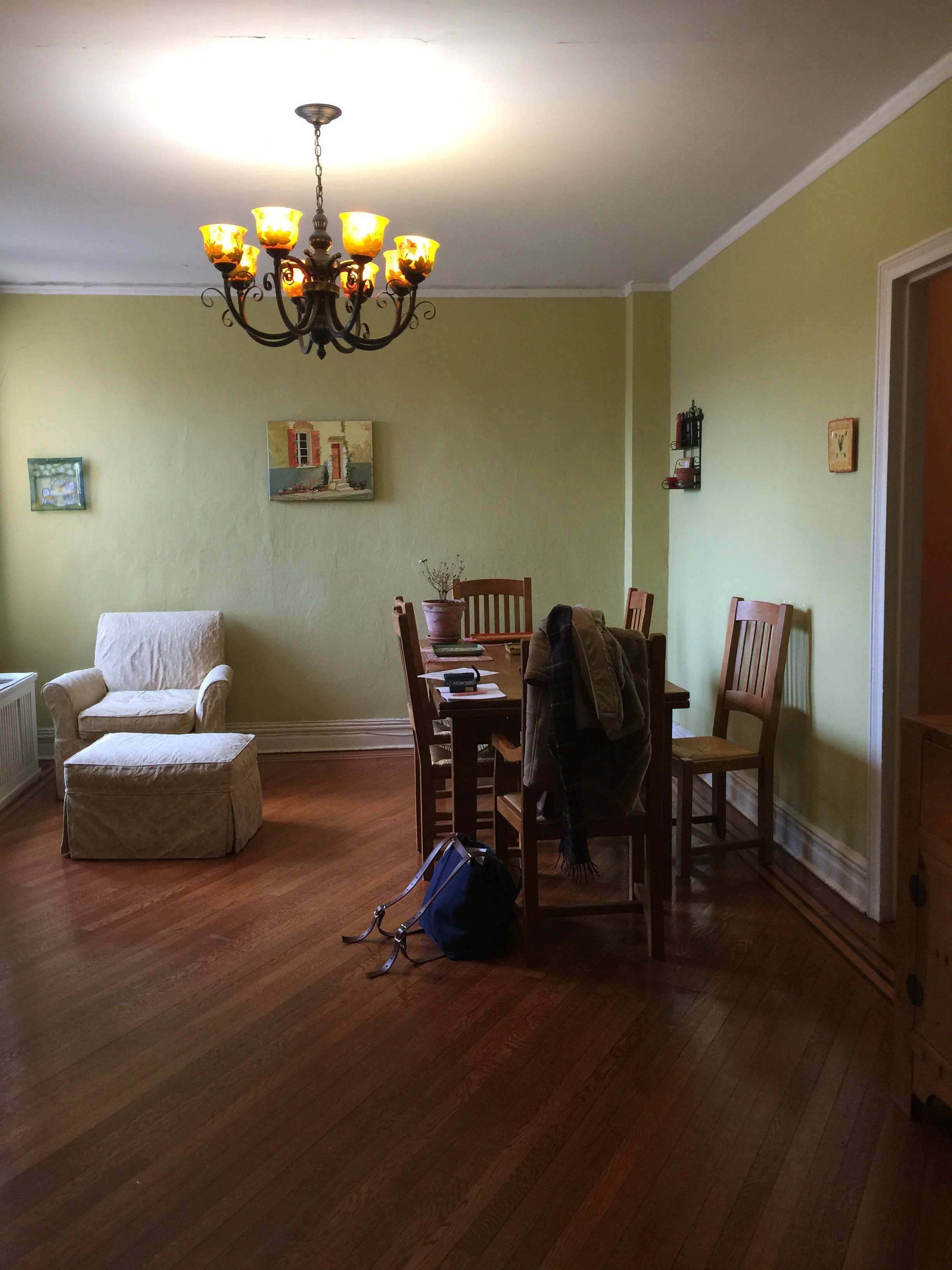
So yeah . . . the paint color. Reminds me of honeydew. Maybe it would work in another space in another home in another decade, but definitely doesn't work here. And the chandelier? Definitely didn't fit with the clients' modern aesthetic preferences. It was time for a change. Below is the after!

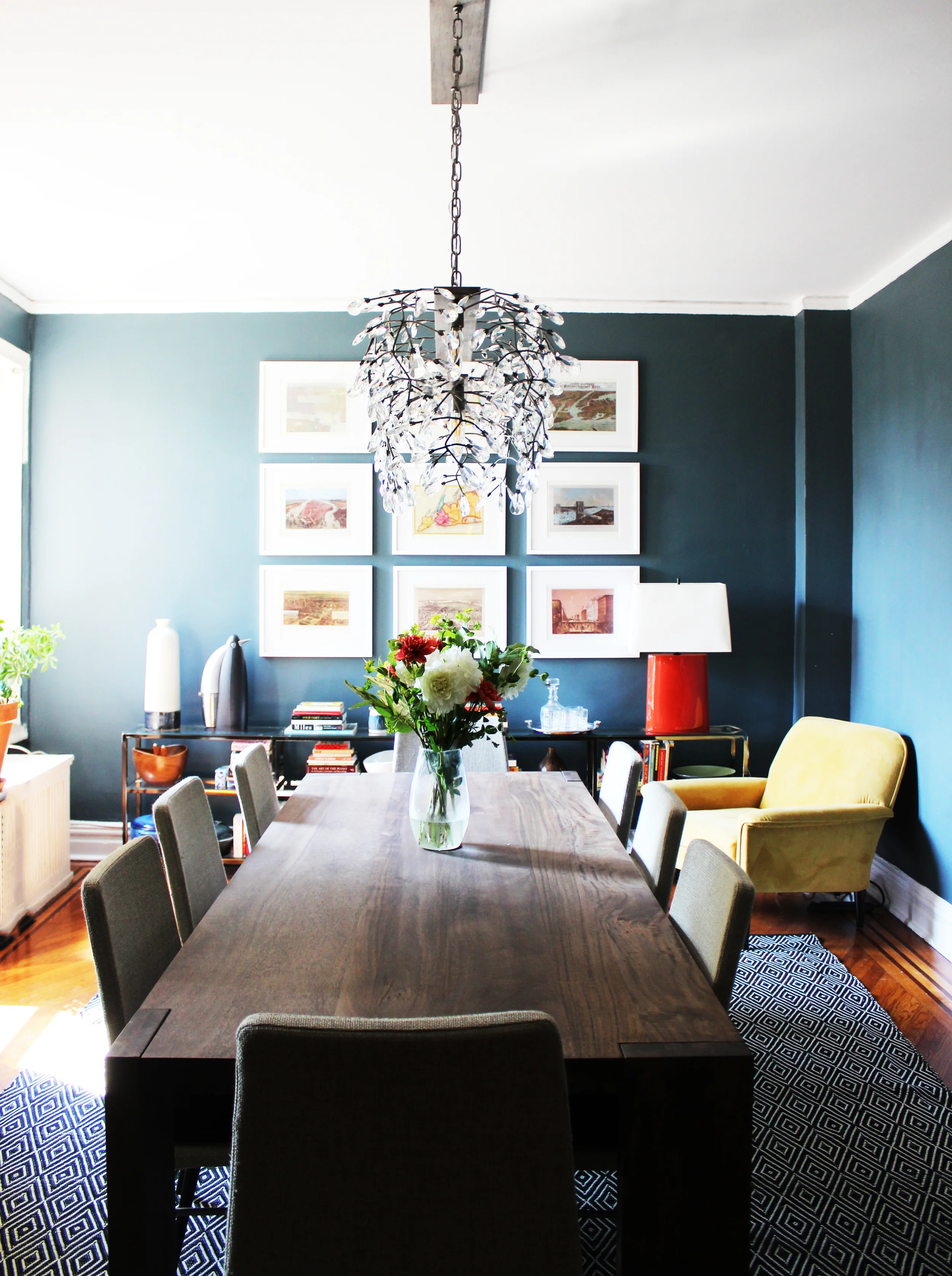
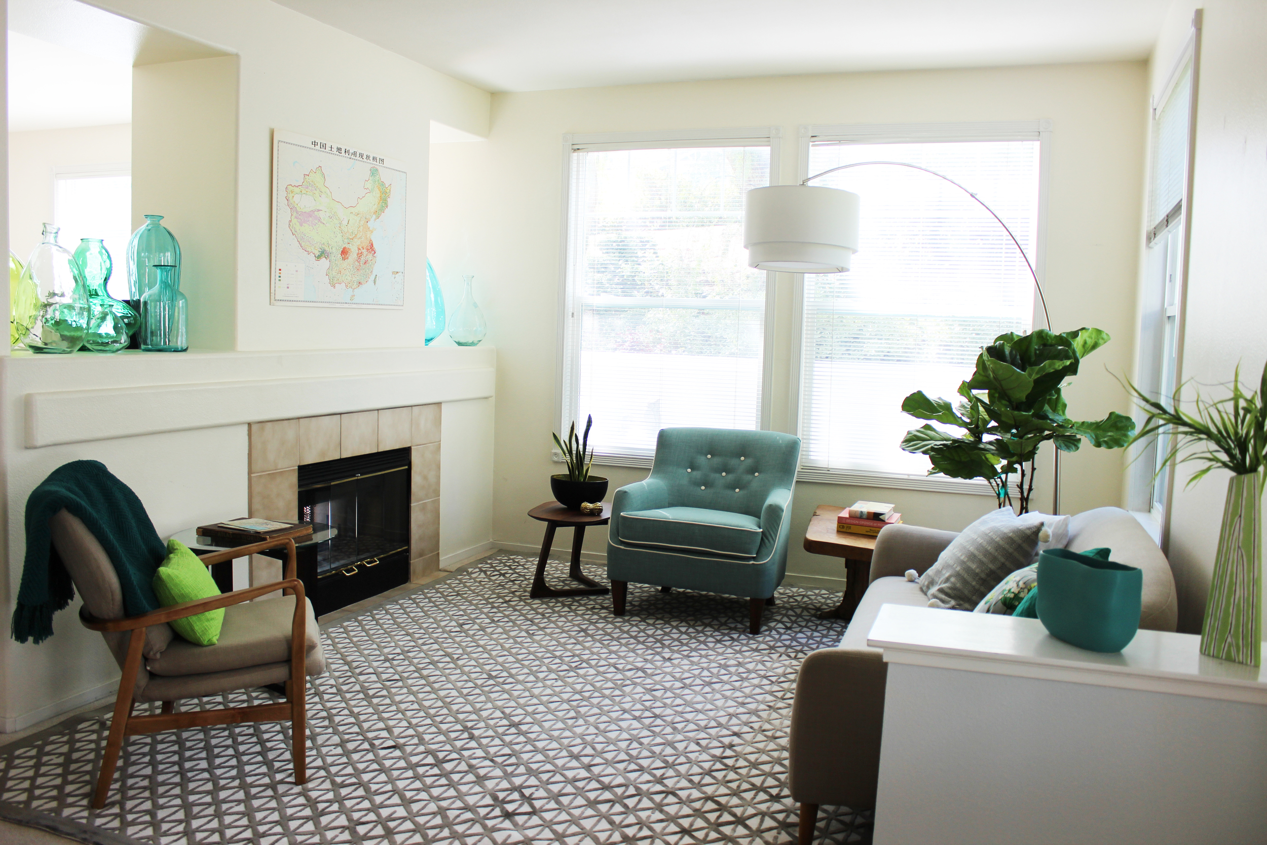
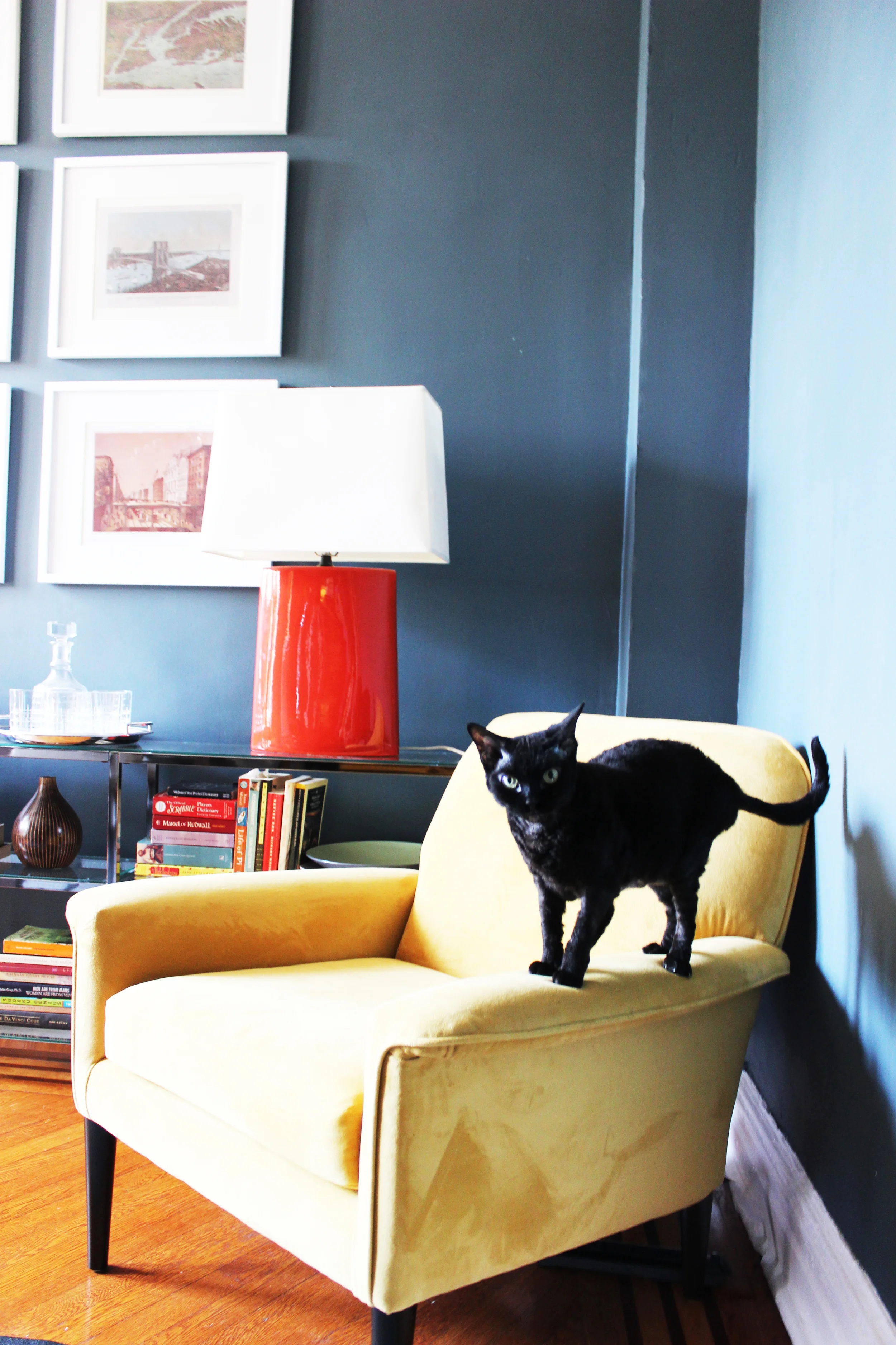
Dinner party ready!  I'm obsessed with this room.  The gray blue walls set the ideal mood. Facing east, the abundance of natural light throughout the day also ensures that this room remains light and bright despite the darker hued walls. The yellow velvet sitting chair provides the ideal reading corner so that the dining room is an attractive place to hang out during the day as well. Clearly, Sydney approves and agrees.  

So I know you're dying to know what's on the walls and a better look at the lighting situation. Take a look below.  

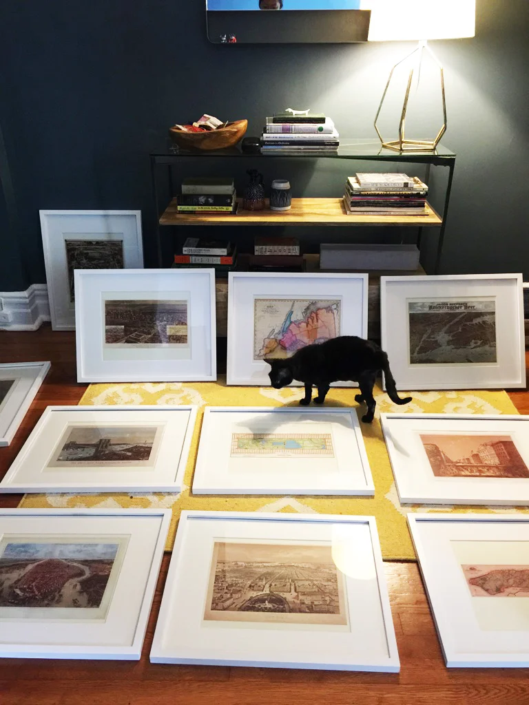
The clients had saved these prints of New York vintage maps and cityscapes to display in their very first home. After having them framed, we laid them out on the floor (with no help from Sydney) to see which configuration would work the best. The color and detail on these maps are amazing. Confession, installing gallery walls is probably my least favorite thing to do, right below assembling Ikea furniture.  But they are often worth the effort as can be seen here.

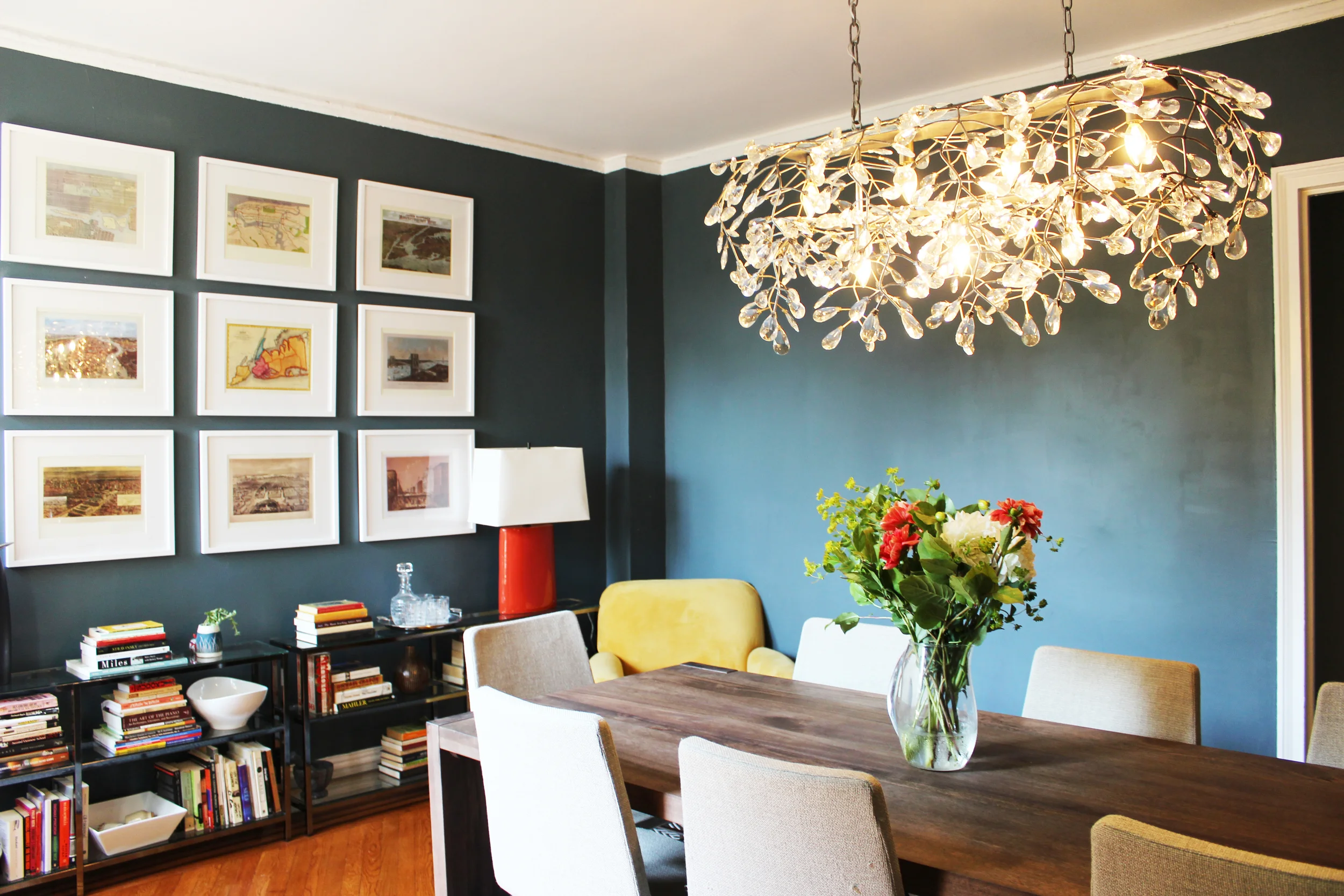
Also that wonderful chandelier that gives off the most beautiful sparkly light? Each of those crystals were hand screwed in by the client and me on one of the hottest most humid New York summer days. To all future dinner party guests, you're very welcome! I know all good things take effort, but we really earned it in this instance. Let's move onto the foyer. Here is the before.   

If you recall the dining room was painted something reminiscent of honeydew. The foyer? Cantaloupe. For obvious reasons, we extended the blue gray paint to the foyer. Without any windows, the same paint in the foyer creates a very different vibe, dark and moody in the best possible way. See the after below!

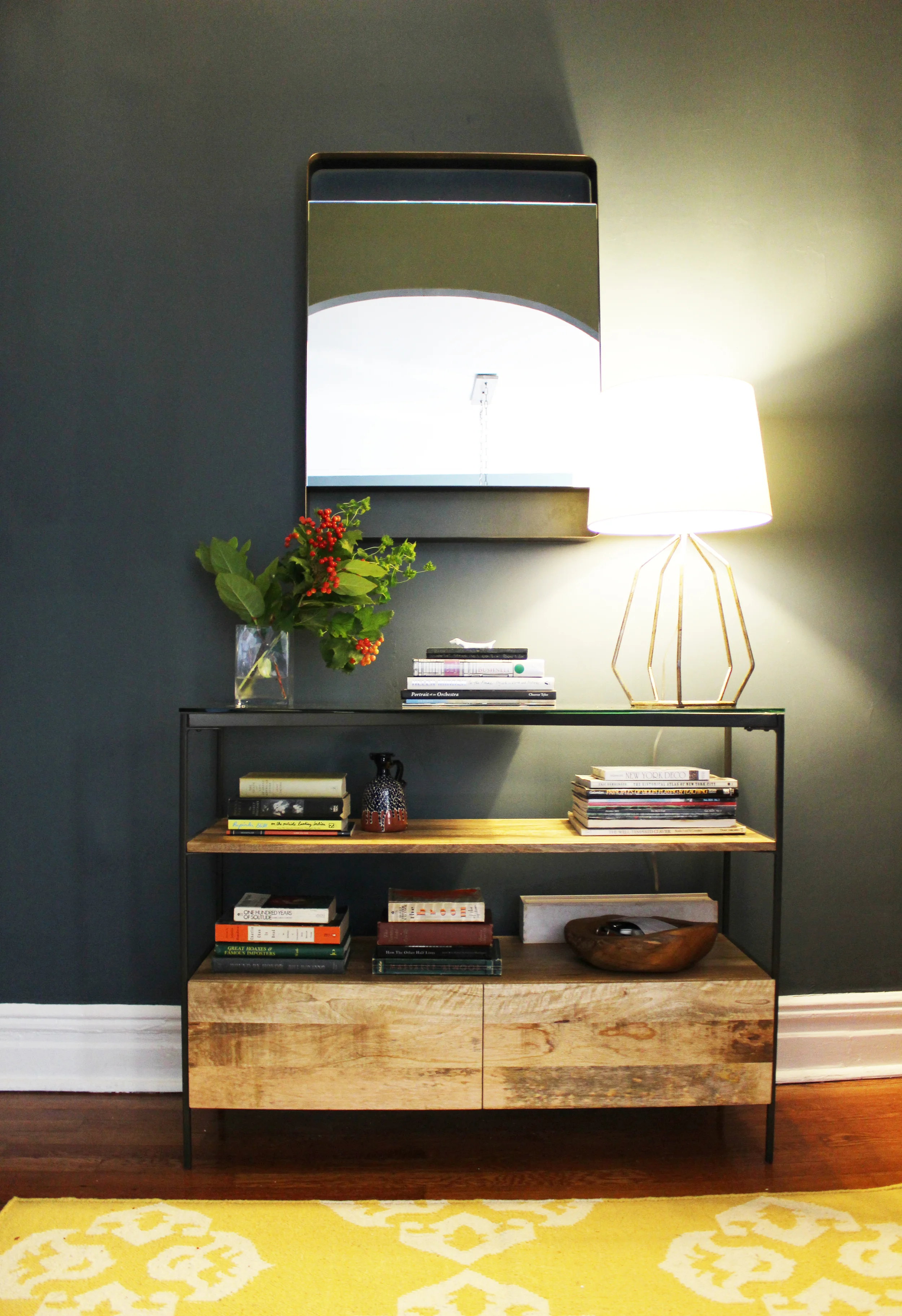
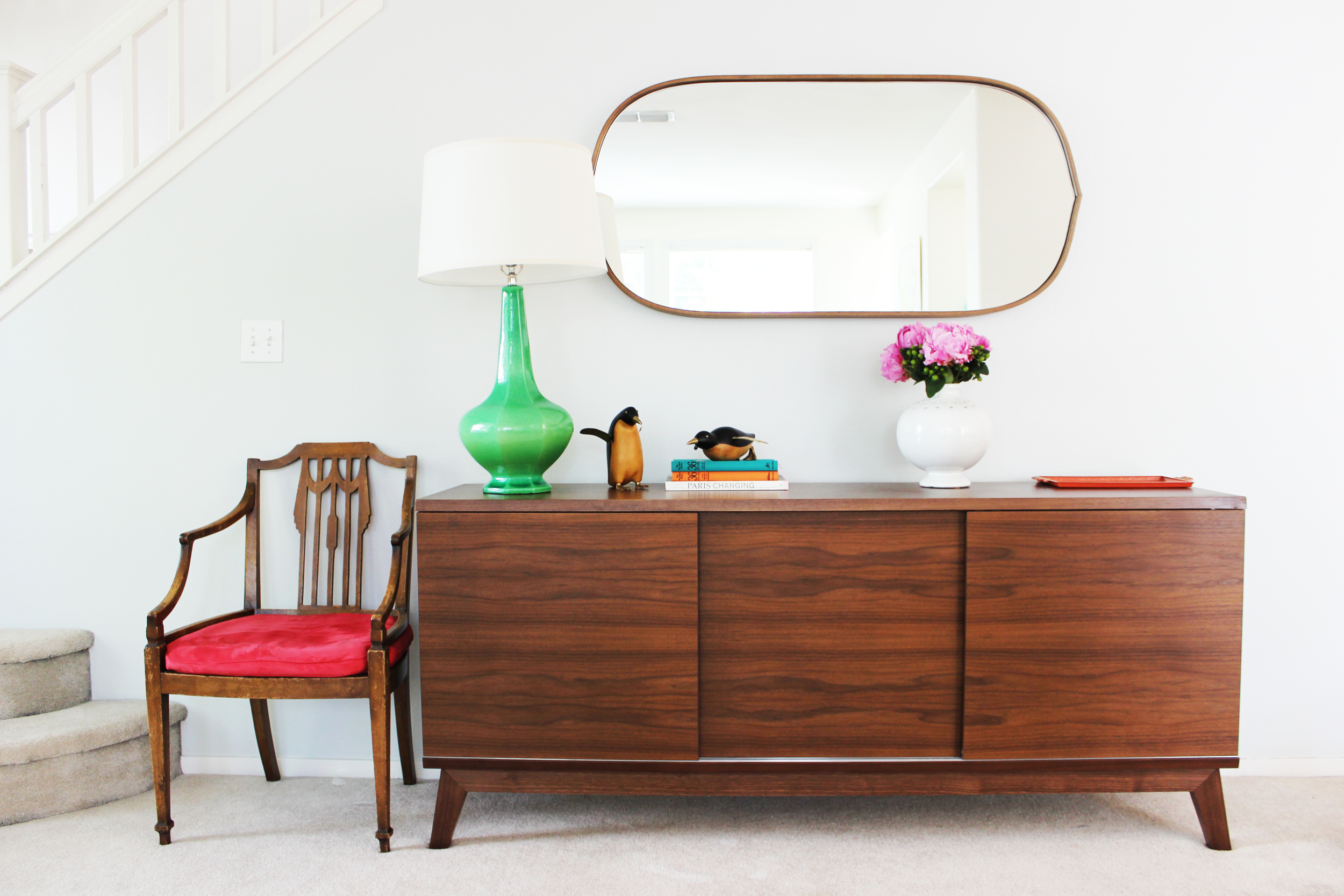
The foyer is open to the dining room. To keep the two spaces cohesive, I placed a yellow accent rug to touch back to the yellow chair in the dining room. The mirror above the console brings brightness and shimmer to this closed space and a great place to check your makeup before heading out! Here is one more close-up. 

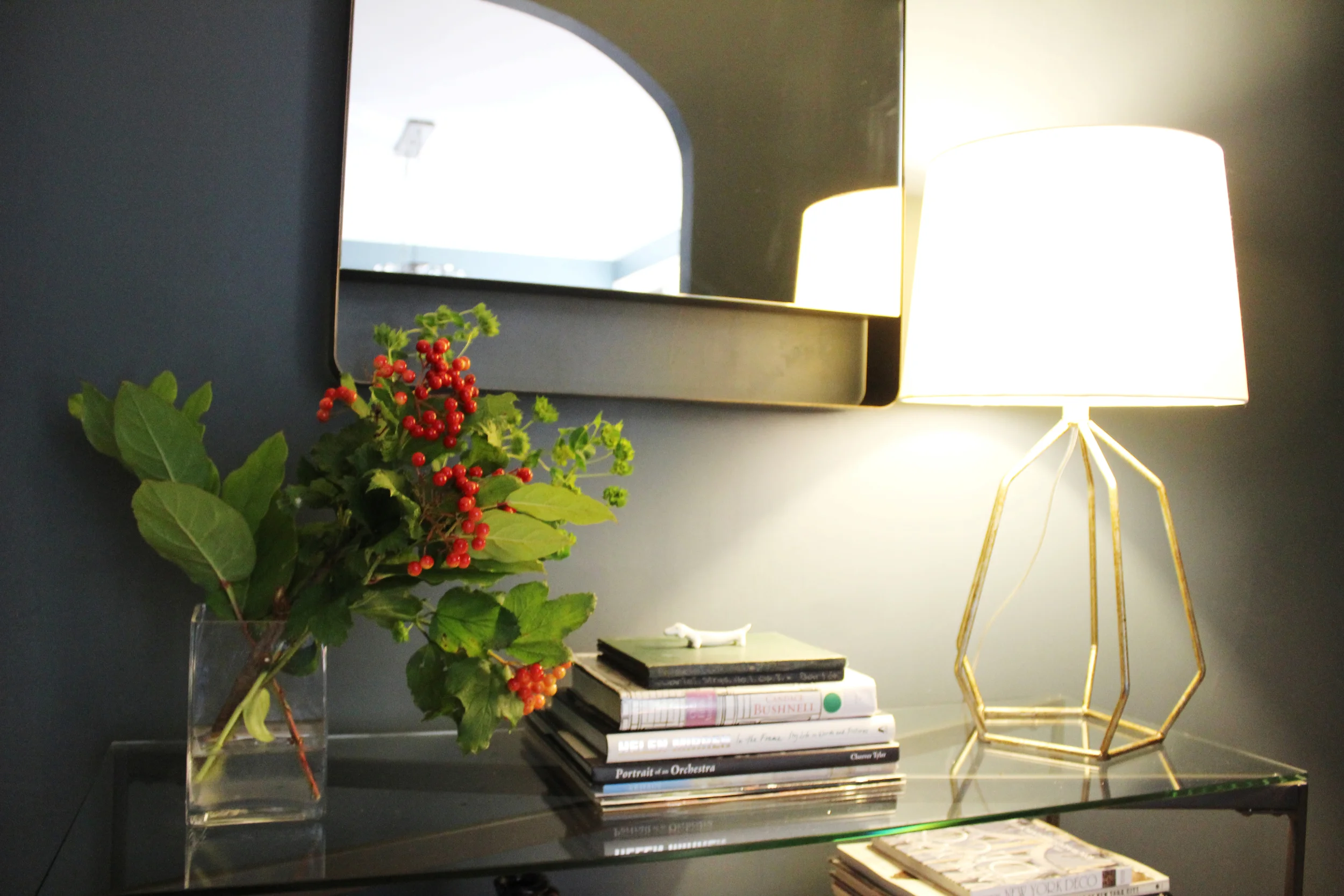
I love this brass table lamp. It pops against the dark walls and it has structure. This foyer sits between the front door on one side and the rest of the home on the other. So the lamp is great in that it not only provides light, but the skeleton silhouette allows for a clear line of sight from the front door to the rest of the home.

A lovely first home. I foresee many dinner parties that run late into the night for these clients, the only way to do it right?  

And that's all folks! Thanks for reading. 

Painting? Don't forget your compass!

Paint selection, although not often discussed here, is often a big part of my projects. Painting a room or several rooms is a big decision, but just a reminder, it's just paint! If the color doesn't work, you can switch it out easily and quickly, so don't treat this as a life or death decision, because it's not.  

If you follow me on Instagram, you know that I own a rental unit and I, or more accurately my contractors, did some light renovations on the unit during a turnover in tenants. I thought this would be a great opportunity to show how the right paint color can truly transform a room, and to discuss how to choose the right one. There are a million sources on the internet for the best white paints, best green paints, etc., this post isn't about showcasing the best paints of any color, but just some general considerations and principles I use when helping my clients to choose the right colors for their rooms. 

Here we go! Here is the rental unit before. I believe it was painted in Benjamin Moore's White Dove throughout. Excuse the floors, we just had some old carpet removed, so now you can admire our subfloors. 

Time to use a compass. 

When I walk into a room to help a client decide on a paint color, the first thing I pay attention to is which way the room is facing. If you don't know, now you have an excuse to finally use the compass feature on your phone. The direction that a room's windows face and the resulting natural light can have a strong influence on how any given paint color will look in that room. That paint chip from the paint store can look very different in a south or east facing room versus a north or west facing room. Of course there are caveats - if your south facing room has a large tree that blocks most of the natural light or an extended porch, the general rules regarding paint for south facing rooms won't apply. 

This rental unit is a first floor unit with all windows pointing north. Although it does get great natural light for a north facing unit, the amount of light it receives is somewhat limited. White Dove by Benjamin Moore is a great white color, a go-to for many designers, but in this lighting, it looks a little sad and grey. It's not bringing the best out of this room.  

For my own projects, I have an affinity for white and gray rooms, and often choose those colors in south and east facing rooms that receive an abundance of natural light throughout the day. The challenge for most of my clients that have north or west facing rooms is that they crave the look of the light and bright living areas they see in shelter magazines and blogs, but in practice white can look sad in their space. 

I'm going to depart from the conventional advice given on the internet and elsewhere to go with a darker color or a paint color with yellow tones. Dark colors in a room can work, and can be very lovely, but maybe it's not your cup of tea. Similarly, colors with yellow undertones can quickly look dated. Most of my clients have a more modern bent that yellow-hued paints don't always match.  

If you have a north or west facing room and want a light and bright space, choose a pale neutral color and forgo the white. Just be aware that the light received by a north facing room can be especially cool, so green and blue undertones are magnified. Does that mean you have to give up on your dreams of a gray room? Not at all. A good compromise is greige, a made-up word that describes the color between beige and gray. It has warm undertones derived from the beige, but is still modern in tone from the gray. I painted our unit my favorite greige, Edgecomb Gray by Benjamin Moore. See below!  

Such an improvement! The living room now looks light, bright and modern without resorting to white walls.  I know the new floors, curtains and flowers help, but seriously, the majority of the work is done by the difference on the walls. 

Choosing the right paint finish. 

The finish is often just as important as the paint color.  

For walls I often opt for flat or matte.  Here, we used matte.  The walls are plaster and although their texture is great, a finish in a higher gloss will highlight any imperfections on these 80+ year old walls. The unit was painted in an eggshell finish before, so if you scroll up and look closely at the before photo, you can see a shine on the walls. If you have walls that aren't in the best condition, I would definitely recommend going with a flat or matte finish. For newer homes, with drywall in good condition, I will on occasion recommend eggshell finish in higher traffic areas allowing scuffs to be magic erased off easily. 

For doors and trim, pearl, satin, semi-gloss and high-gloss are recommended.  

And last but not least, for kitchens and bathrooms, I would recommend a higher gloss finish such as matte or eggshell to keep the walls in the best condition possible for as long as possible. 

Go forth and go bold!

My last piece of advice, don't be afraid to go bold. Here, the front porch for this unit was simply embarrassing. The prior owner, for no reason I can discern, decided to install carpet on an outdoor porch! Unsurprisingly, the carpet didn't age well. Here is the before. 

Even my dog Morgan can't make this sad porch look good.  

I took this as an opportunity to go bold, make a statement and check off an item on my longstanding bucket list to own a home with a blue door. 

It was going to be impossible to match the stairs with the exterior accent color of the door. Instead, I decided to go in a totally different direction, a traditional yet modern blue, Covington Blue. It adds the ideal amount of cheer to a previously drab entry. Try out bolder, more saturated colors in smaller spaces and accent walls, you can take a small risk in a small space and become more confident in your color choices while you do it! 

And just because I couldn't help myself, even knowing it was most likely too twee, I added a rabbit door knocker. Feel free to judge me, I love this bunny.  

I hope this post helps you when you're choosing a new paint color for a room in your home!

The Map House (Part 1)

If you've been following me on Instagram, you've seen some sneak peeks of a long term project I've been working on for the past year, the Map House Project! I'm really excited to share the final product with you. A little bit of background: the clients purchased a second home to be closer to their first grandchild. If you're lucky enough to have a second home - first, I'm jealous. Second, you can take some liberties with the decor since you're not using the home full time.  

The clients are serious DIYers and have a strong sense of style, which I really appreciated. My role here was more advisory, sourcing and editing, which I was happy to do. The inspiration for the entire house was these simply amazing vintage maps my clients picked up at the Alameda Flea Market. We placed them throughout the home to create a theme for the house.

There were a couple of challenges. The townhouse, though in good condition, was a little bit stuck in the 90's, and updating the home on a budget was going to be difficult. Also, since this was a second home, there would be no preexisting furniture - the townhome would start as a completely empty space. Furnishing a three bedroom condo from scratch is no small feat! Thankfully, decisive clients and the internet are great tools to speed the process along. Below are the maps that served as the creative inspiration!

First up, the foyer.  Here is the before with the prior occupant's furnishings. 

If you've read about any of my projects before, you know I love a well styled foyer. It's the first space to greet guests, the gatekeeper for everything you bring into your home, and in some instances the place where you remove your shoes before entering a home. Foyers are important!

Below is the after. 

Such a cheerful space right? The detail on the vintage armchair is everything. After some searching, we finally found the perfect table lamp to give height and additional lighting.  Since the foyer is adjacent to the dining room, the credenza can store additional serveware, dishware and miscellaneous items.

On to the living room, which I like to call the adult sitting room.  A room meant for relaxing and reading.  Here is the before. 

And the after!

An improvement? A resounding yes. The vintage map of China hangs over the mantle. We pulled shades of green, blue and neutrals from this map to style this room. Those weird cutouts above the fireplace are such a blast from the past. We think they were originally constructed for TVs when they were thicker than a few inches. Remember when? I decided that a collection of larger glass jars would be the perfect way to fill in such an awkward space, it retains visual separation of the two rooms but keeps it light.  

LR1.jpg

Yes, that's a Fiddle Leaf Fig tree AGAIN. Guilty. I love them, they add so much greenery to a room with those large lush leaves.  And I agree, sometimes things are too trendy, and we should all take a break. For example, it's going to be a very long time until I can embrace chevron again.  But sometimes things are trendy because they are so great, retaining their longevity, and I think Fiddle Leaf Fig trees fall into this latter category.

The arc floor lamp really works here because the ceilings are so high and the space is very airy. Another tip? When purchasing an arc lamp, buy one that has a shaded bottom so no one feels like they're on a spotlight when sitting down. And, as in many of the other houses I've done, no coffee table so the baby and adults can roam freely without worry. The side tables should be sufficient for the occasional beverage or book. 

Follow me to the other side of the fireplace wall where the TV room is located.  Here is the before. 

And here is the after. 

Comfort is the priority for any room made for some serious TV watching. I think we've achieved that goal here. My talented clients actually made most of the throw pillows, and covered that ottoman. Yes, you heard right. I'm not much of a DIYer, nine times out of ten I prefer to purchase versus making something myself. So they surprised me a thousand times throughout this collaboration when I would send a product suggestion and they would respond by saying we can totally make/sew/build that. 

Come follow me upstairs to the guest room/nursery. Here is the before. 

Just because it's a small room doesn't mean it can't have personality.  Take a look at the after. 

Again using the vintage map as inspiration, this time we used this map of Canada to serve as the centerpiece.  This room was designed for the clients' granddaughter when she comes to visit but can also be used as a guest room in a pinch.  The mostly pink map was apt for such a space. 

BW's Room.jpg

The bolder punches of color and the geometric accents bring modernity into the room and are a great contrast against the softer pink hues. My clients completed this room with some handmade accessories, including this hand painted globe.  

We're not quite done yet, one more guest room for this installment.  Here is the before. 

At the top of the list was painting over the yellow walls, which unquestionably dated the space, See below for the amazing after. 

Another vintage map serves as the ideal artwork for this wonderful guest room. The kelly green campaign dresser is fantastic and adds that nice pop of color to the predominately black and white decor. The vintage wooden bench at the foot of the bed brings in the warmth and texture. We created a little office area in the corner as well - see below. 

I will never get tired of vintage chairs. They just don't make them like they used to. The detail on that back is its own accessory. The collection of sister vases I picked up on one of my shopping excursions. I was hoarding them in my inventory closet for the longest time until the perfect space came along. This little corner was it! This guest room will have a waiting list, I'm sure of it. 

That's it for this post, please come back for the second installment where I'll you show you the magic we performed on the kitchen, dining room, master bedroom and bathrooms. Thanks for reading!