Midcentury Millbrae

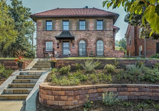
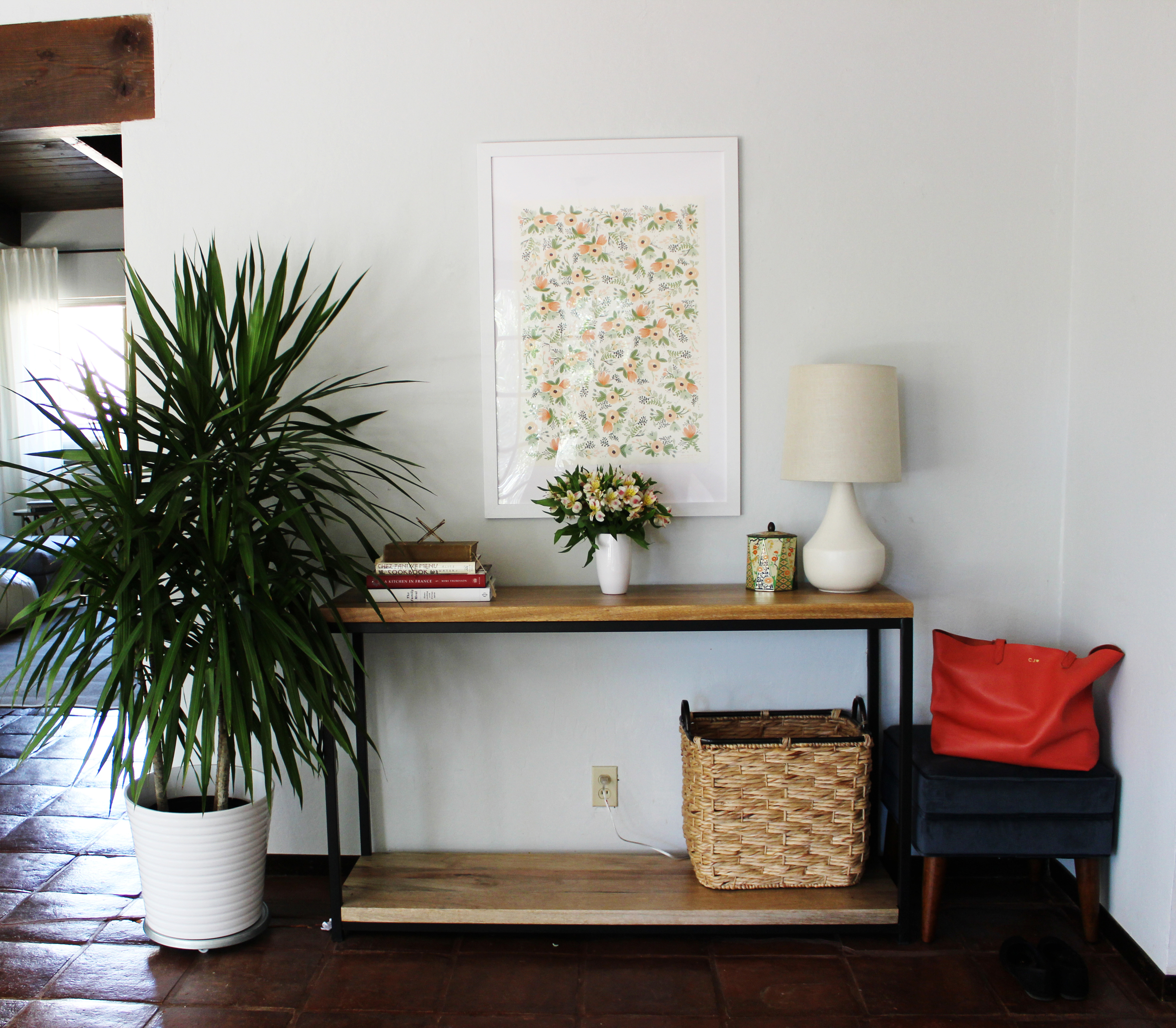
This is a story about a room . . . well, to be more exact, this is a story about two rooms in one. I'll explain more below.

In a house with two busy working parents, it is often the case that the master bedroom becomes neglected. With the impending arrival of a new addition to the family, these clients realized that their master bedroom needed a makeover. In its existing state, the master bedroom would be unable to accommodate a small nursery setup, a necessity until the new baby was old enough to move in with her big sister. I know this is a common problem that confronts many of my clients who live in smaller spaces, especially in San Francisco and New York. I hope this before/after shows you that it can not only be done but done stylishly! 

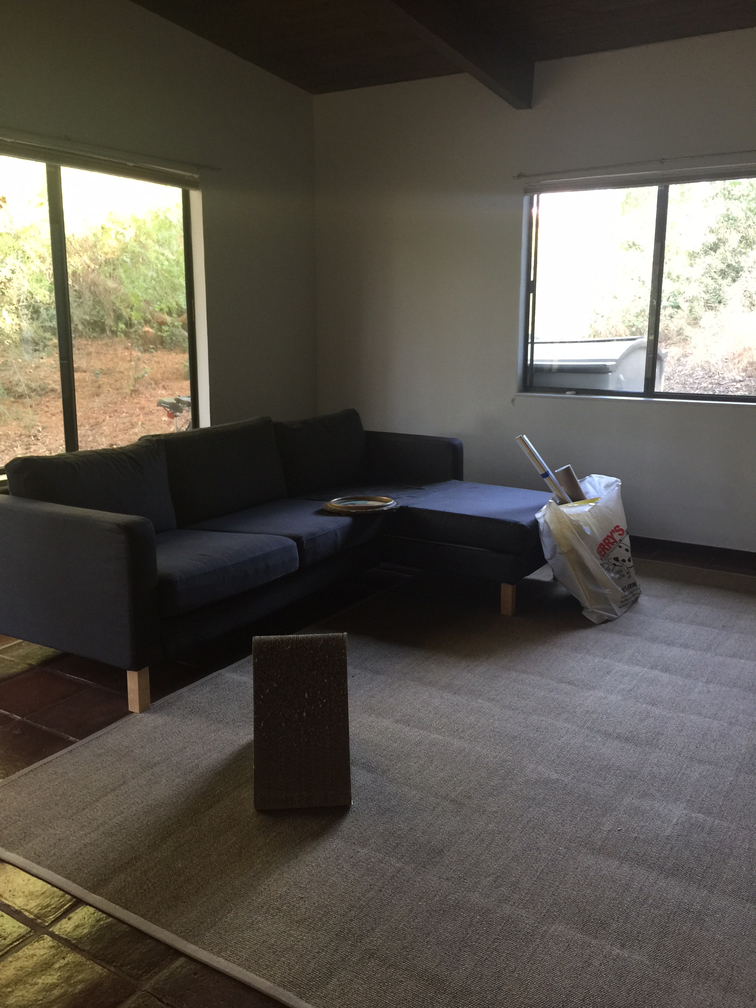
Here are some before photos to give you a sense of the space. 

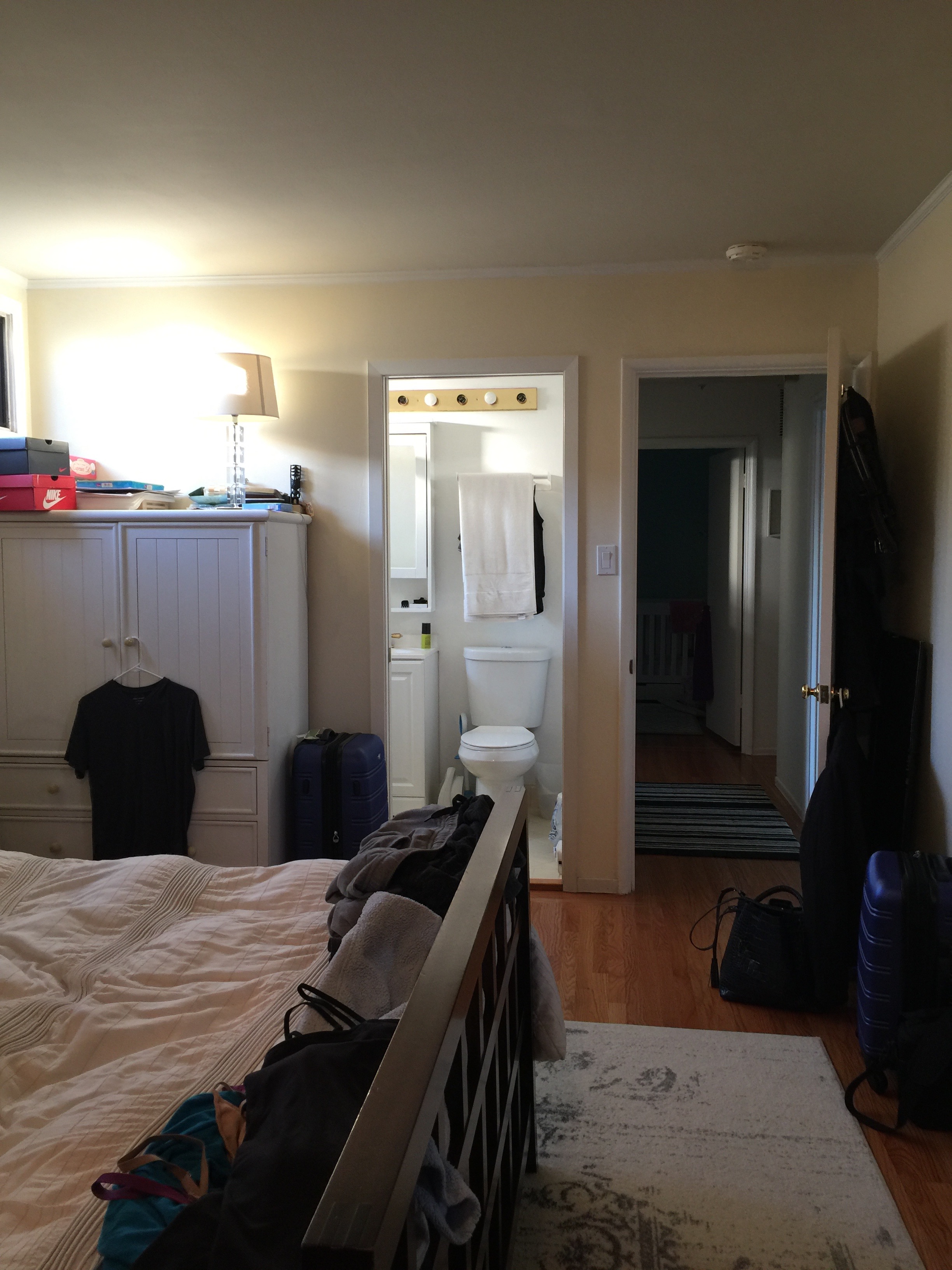
The room isn't small by any means, but it is shaped a bit awkwardly. Directly across the bed is a sliding door which sounds nice in theory. But it made the bedroom visible to the entire rest of the house due to the home's layout, making it necessary for the curtains covering it to remain closed most of the time to preserve privacy. The storage furniture in the room felt a bit oversized and was making the room feel smaller than it was. And somehow I didn't grab a picture of the long row of glass closet doors that covered the entire length of the wall. (Note to self, take better before photos.) The glass closet doors made the entire room feel somewhat dated,. The paint color was an off-white with yellow undertones, which contributed to this dated feeling. We like midcentury, but we want the 2016 version of midcentury if you get my meaning. Here we go! 

To bring in modernity, richness and interest in this room, we wallpapered! See below. 

An improvement, I would say. Remember I mentioned the glass closet doors that extended through the entire length of the room? We replaced them with these off-white heavy curtains.  I was slightly concerned that it might be too much fabric but it turned out so well. Due to the height of this closet, standard closet doors would not fit, and custom doors were outside the budget. This is a great long-term temporary solution. 

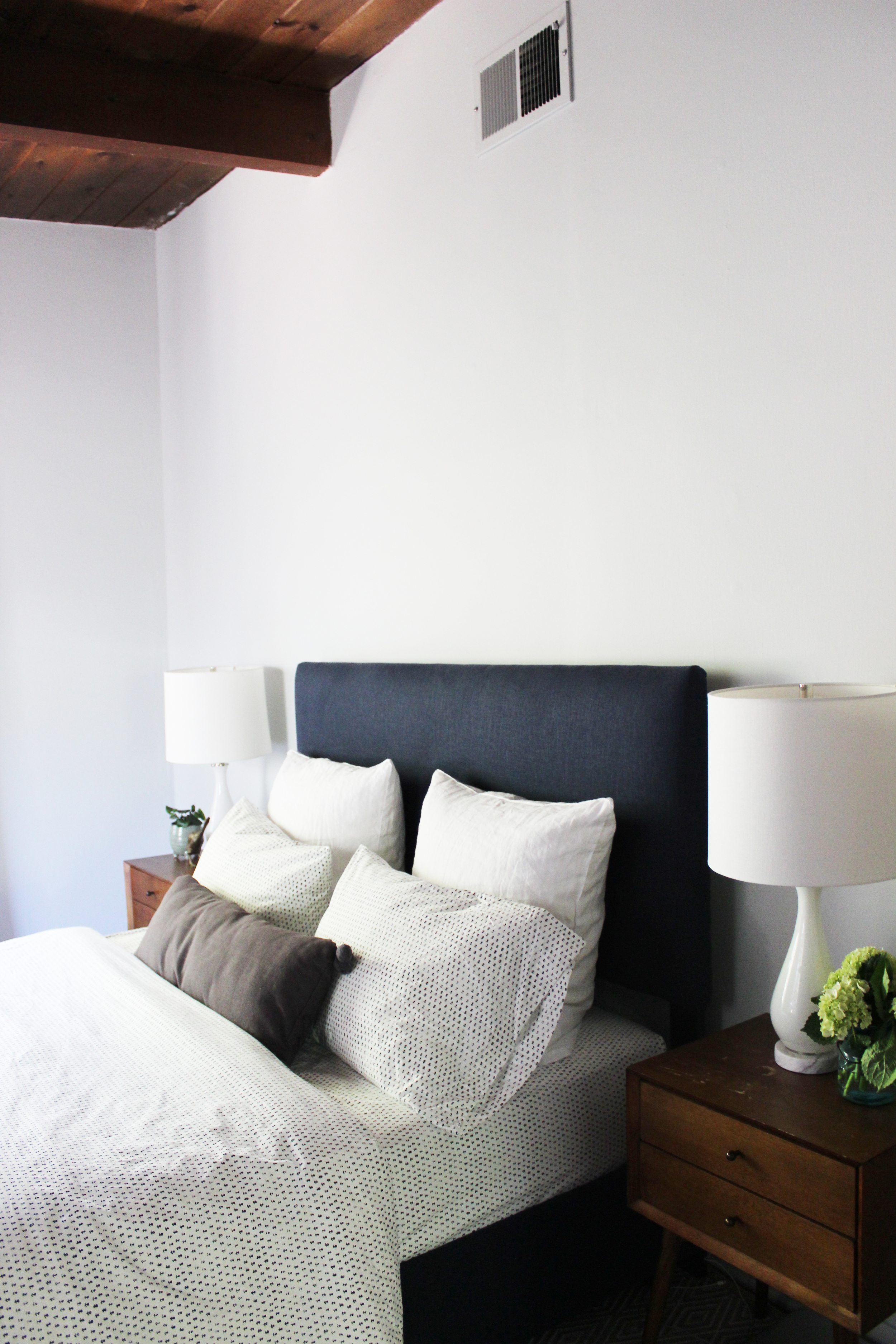
I work really, really hard to collaborate with my clients and find compromise wherever possible.  I also don't push for something unless I feel very strongly about it. This wallpaper was one such suggestion. There was some hesitancy on the clients' part but I knew this blue grasscloth would work so well here and I'm so glad they trusted me. The wallpaper has a sheen and richness that the camera can't truly capture, it adds so much to this otherwise blank canvas of a room. 

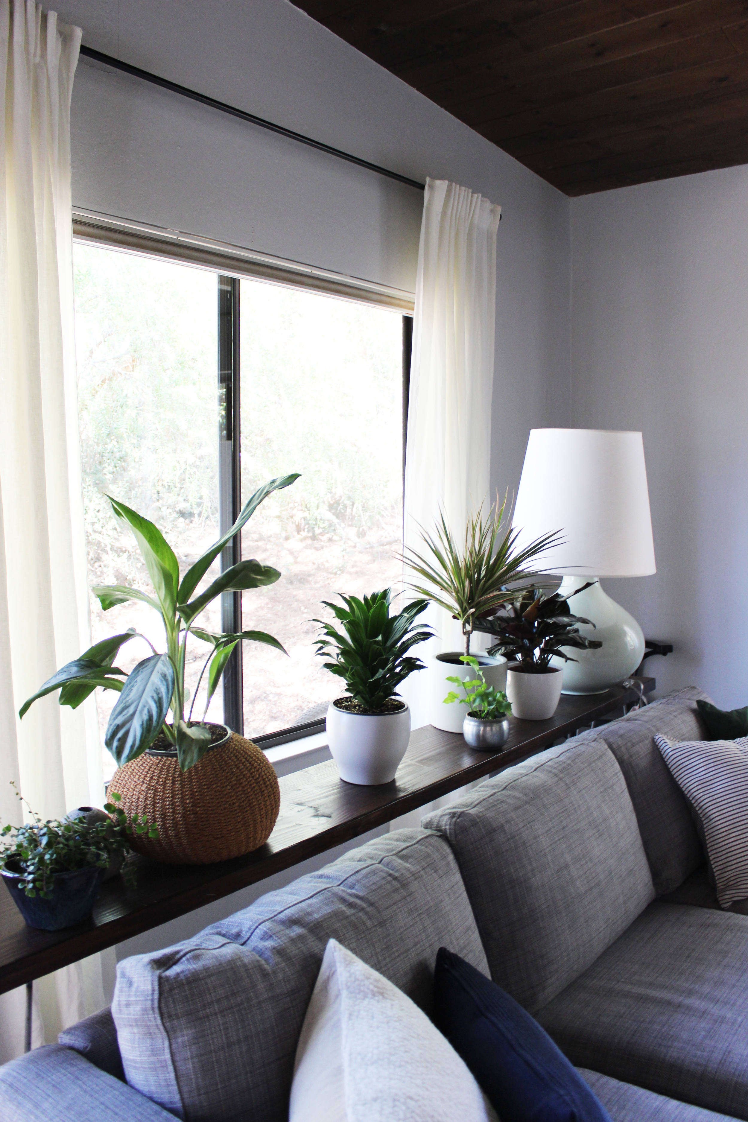
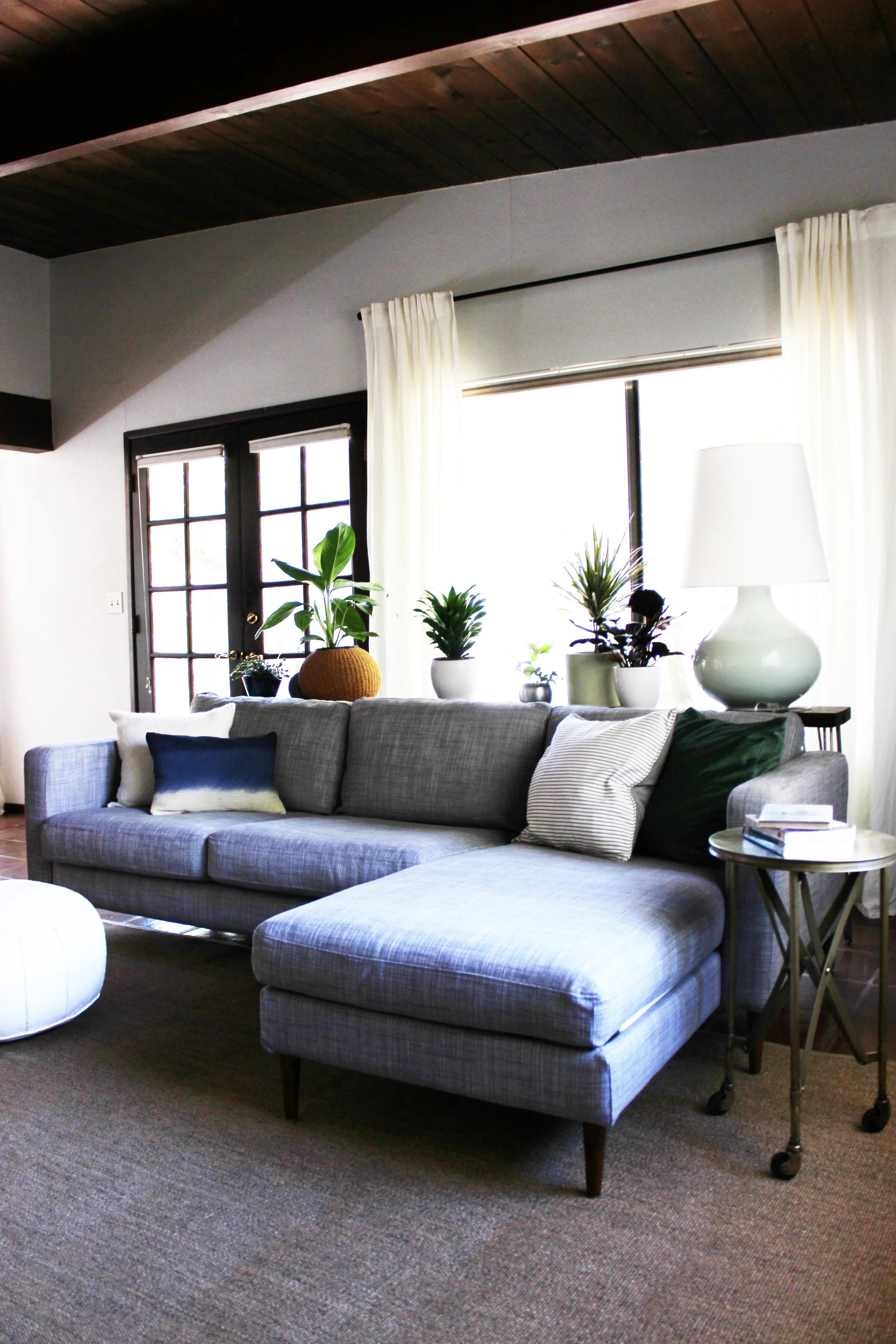
We replaced the rug with one that was bigger and more appropriately sized to the space. Grounding the space with the right sized rug is a principle that is often overlooked but it's really important in creating the right balance in a room. The warmness of the walnut bedframe and nightstands seriously pops against the wallpaper. And there are touches of gold and brass detail throughout the room including these wall-mounted sconces which allow for more surface space on the nightstands. 

Let's move on. This is a very sad corner, secretly dreaming to be brighter and better. 

I think we did this corner justice. We tucked the glider in the corner, as can be seen below. 

Such a sweet corner. Don't worry, the clients are purchasing a roman shade for that window to make sure the newest addition of the family gets proper shut-eye. The bassinet will be placed between the glider and bed, making things slightly tight for a little while but there is still room to move around. 

We just wallpapered the one wall, getting a lot of bang for our buck. We repainted the other walls Grey Owl by Benjamin Moore. It's such a small change but makes such a difference. The cooler tones offset the warm wood floors and create this beautiful contrast. 

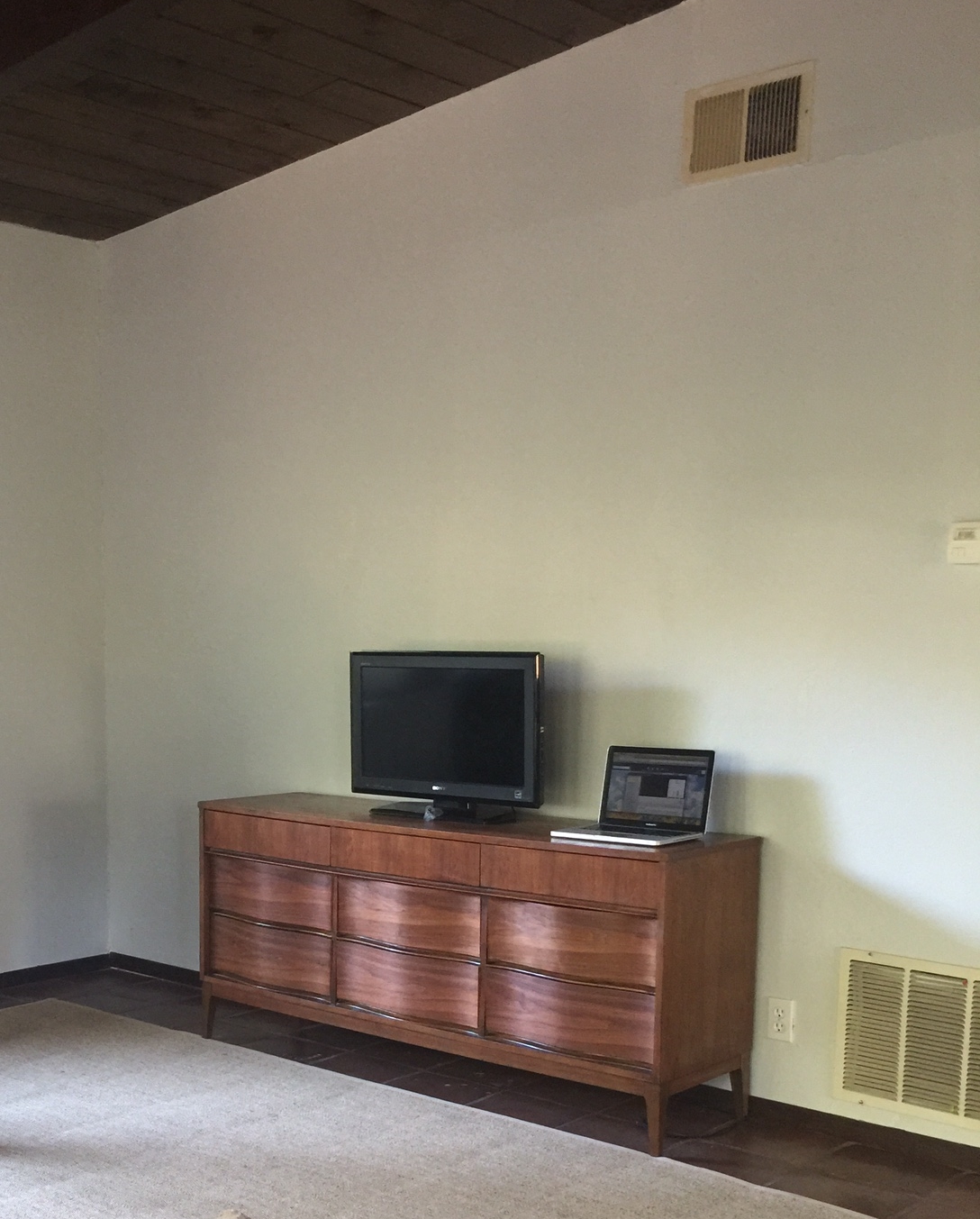
Should we move to the other side of the room? Directly opposite the bed is a slider door as I mentioned above. Here is the before. 

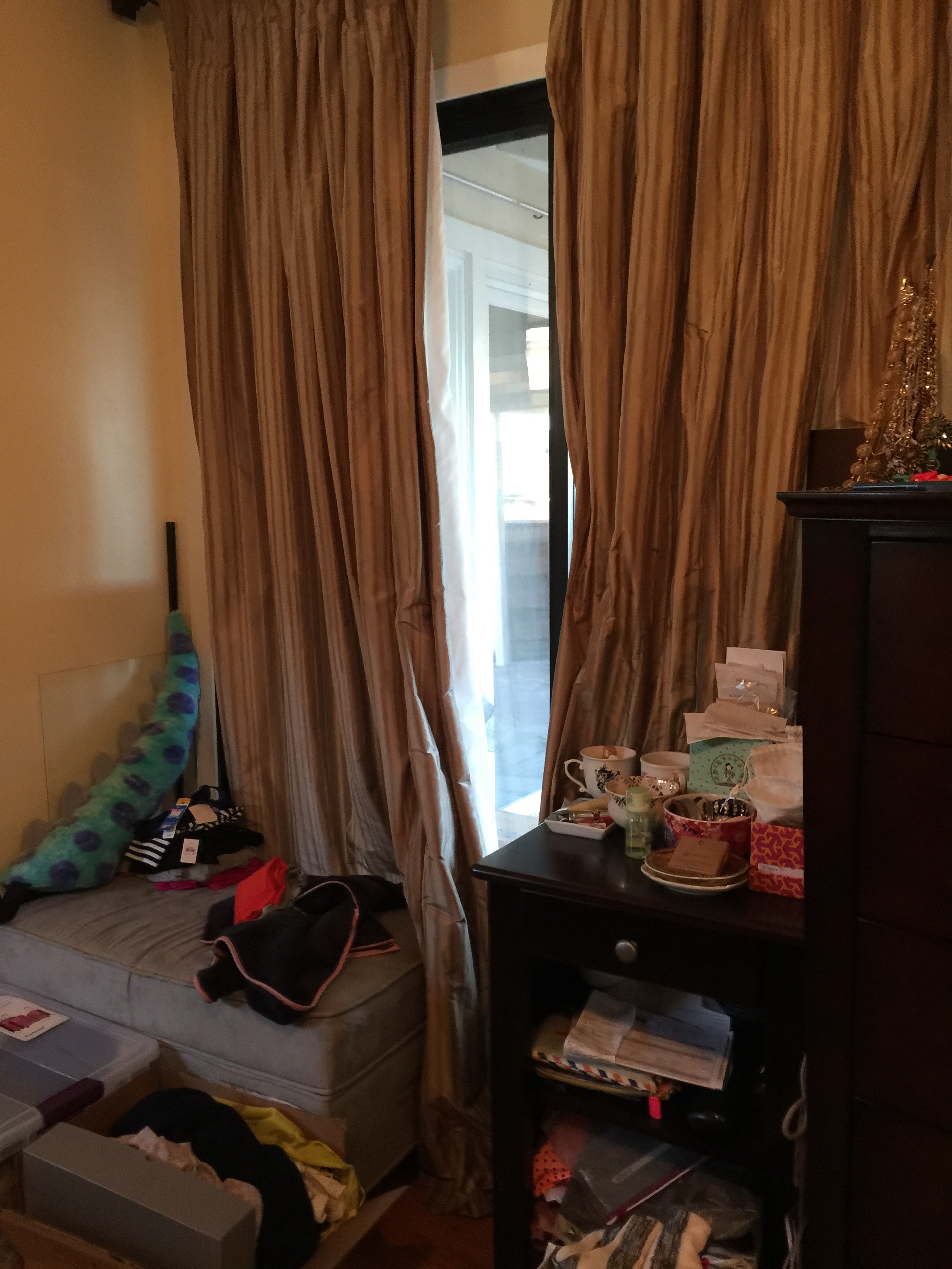
Due to privacy issues, and the fact that the clients never used this sliding door, they placed storage furniture in front of it. I thought the situation could be improved. Below is the after. 
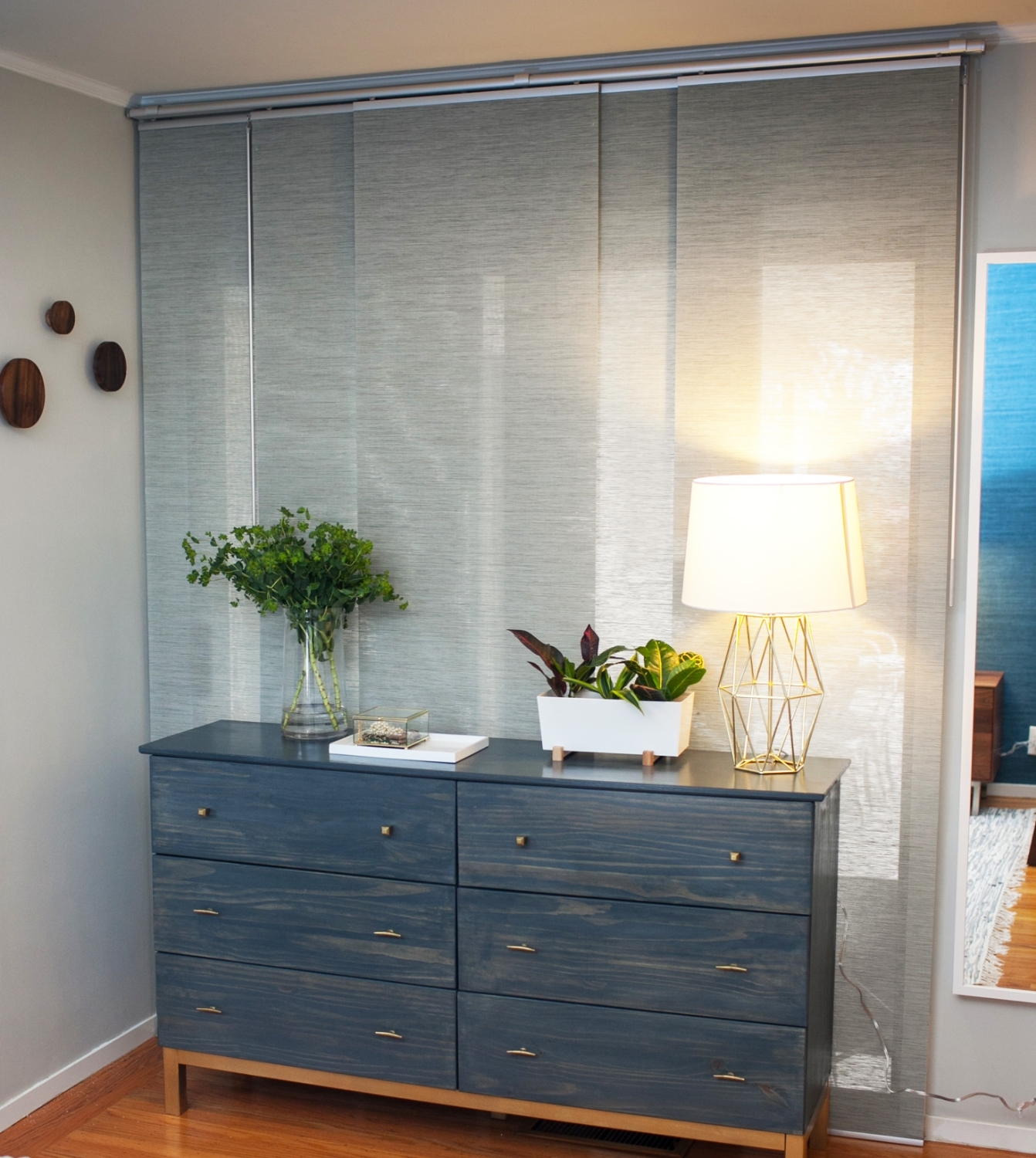
Photo by @mrgregma

Photo by @mrgregma

The existing heavier silk curtains were just not working for the room or the clients. The room felt very dark since these curtains were always closed to maintain privacy. We replaced them with these curtain panels which are the perfect solution. The panels allow some natural light to come in yet preserve a sense of privacy since this area is the primary dressing area.  And before you get up in arms about blocking the sliding door, don't worry, this is a temporary floorplan. Once the glider moves out, the dresser can be relocated to that corner.

As I always do, I brought some plants in to bring in some life and energy. Pro tip? I swear that plants from Ikea are hardier than most. Since I knew my clients are insanely busy, juggling their careers and household, watering plants falls to the bottom of the list. Fingers crossed that these survive. 

Sconces above your nightstand are so on trend right now and you can see why below. They create the coziest and most inviting bedroom lighting. 

Photo by @mrgregma

Photo by @mrgregma

All you parents out there, I know you're busy and you work really hard. You really deserve to come home to a master bedroom that is truly a retreat. Don't forget to take care of your needs as well as your kids. Even the smallest changes can make a big difference as this before/after demonstrates. Let me know if you're interested in changing your bedroom into a sanctuary you deserve. Thanks for reading! 

A Dreamy Denver Project. A Progress Report

It's been a bit quiet on the blog, but that doesn't mean that I haven't been busy, it's more of a sign that I've been too busy. But I'm happy to be busy when it's with things like the Dreamy Denver Project. 

I'm so unbelievably excited to share this project with you. The lowdown, these clients bought their new home last fall. Prior to purchasing this home, they made do with furniture that was past its prime. These clients decided that moving into this new home meant it was time to invest in furniture that they loved. 

We've already ordered the majority of the furniture. And because I'm always candid here and about the process, the first four deliveries from different vendors arrived damaged! Proof that the before/after posts you see on this and many other blogs don't convey how long and stressful a redesign process can be. It looks like magic online, but trust me, it doesn't always work that way. I've been told that it must be easy to be a designer since I'm neither spending money that is mine nor designing for a space that is mine. This couldn't be further from the truth. For my own home, I'm happy to let mistakes happen, and it's actually a place where I can try out new ideas. For my clients, I know that my services are often a luxury and I try to make sure I deliver a perfect product down to the coaster. Sometimes to get there, this means a ton of phone calls, emails and negotiations with vendors/contractors, but at the end of the day I'm happy to say it's usually worth it. And I'm grateful for patient and understanding clients! 

I plan to go to Denver in late February for the final install and to apply finishing touches and styling. For now, here is a brief rundown of the design scheme for each room. Here is the exterior of the home. 

I mean talk about curb appeal. How beautiful is this home? Clearly, no improvements need to be made here. Step inside with me to the living room. 

This living room is big and open. Right off the foyer, it's the first room to greet guests. The furniture pictured in this room and the other rooms were most likely done by a staging company. Staging companies have a challenging job, they need to furnish a home in a way with the broadest appeal with their own inventory. But as you can, the room suffers from too much brown and other muted tones. It definitely needs some color and life. Below is the living room board and the design plan I created for my clients. 

There have been a few edits to this board, but largely the general feel of the room feels the same, a neutral palette with saturated pops of color in navy blue and hints of yellow. I have yet to install this room, but I'm already in love. The marble coffee table offers some texture diversity. The linen colored sofa along with the gray side chairs are cohesive and collected but doesn't feel too matchy. 

On to the dining room. 

Similar to the living room, the furniture in the room pictured above brings out the wrong tones. With the greige paint, there needs to be more contrast, and the rattan chairs are far much too casual for this elegant dining room. Although the chandelier is perfectly fine, I think this room would benefit from a light fixture that would bring in more sparkle and shine. Below is the board for the new dining room! 

The dining room adheres to the clients' preference for an updated classic look throughout the house. However, I've updated the look a bit with a more modern chandelier, dining room chairs with a curved silhouette, and a blue rug that should help offset the dominant brown tones in the wood molding and walls. Since this room is slightly more formal, we opted to go with all chairs instead of using a dining bench. The scalloped wall mirror adds a touch of whimsy and will help the light bounce off the new chandelier. 

Last but certainly not least, the master bedroom. 

Again, like the living and dining rooms, this room also suffers from furniture that is a bit dreary. The furniture also feels a bit dated. With such a large wonderful space, I'm excited to see the final outcome. 

So serene right? Like the furniture pictured in the master bedroom photo, the board shows a design scheme that relies on a neutral palette, but you can see/feel the difference between the two right? The furniture I have chosen although neutral utilizes more whites, especially in the rug, allowing for some brightness to seep in. Also, the gray and blue throw pillows will help change the look and feel of the room, providing great contrast between the walls and the furniture. 

Fingers crossed that the rest of the deliveries arrive safe and sound. I love that this house looks and feels so different from the homes I usually do and although long distance projects are often challenging, they are often the most rewarding. I can't wait to install this project in person!

Thanks for reading!

A Light Filled Sanctuary

It's still early in October but already this month has proven to be crazy busy. When it starts to feel a little overwhelming I conjure the image of this home I just finished. It's the epitome of serenity.

The client's home was a wonderful canvas to work with. It had an abundance of natural light, rich wood ceilings and beams. Even the entrance to the home was enchanting. 

Background. The client and her husband and moved from Brooklyn into this adorable Bay Area cottage earlier this year. She sought my assistance for her home because she just couldn't figure out how to bring it together. I do have my own personal style, but I sincerely believe that when I'm designing for a client, my job is to help guide and edit my client's style. That is what I have done here. This client is a true minimalist, and preferred to bring in color through plants and accessories. The less there is in a room, the better it has to be since the eye will easily pick out flaws. Here we go! Below is the before of the living area.  

This home has so many windows and gets the most lovely natural light throughout the day. The original plan was to replace the sectional. However, in the end, the client decided to get the existing sectional a facelift with a new cover and legs. Here is the after! 

The real challenge for me was to adhere to the client's minimalist preferences while making sure the house felt like a home by bringing in warmth and life. To achieve this, my plan was to bring a healthy number of plants, a variety of different textures and a neutral foundation. Like many of my clients nowadays, this client decided to forgo a traditional coffee table and instead opted for a fun pouf. The console table behind the sectional can also serve as a landing space for beverages. And there can never be enough plants - here is a closer view. 

When a room has a neutral palette, one way to draw the eye's interest is to diversify the textures in the space. This is something that is often overlooked in most homes. Look closely at the plant containers, we have many different kinds of containers (woven, ceramic, metal, etc.) all in the same color palette to keep things cohesive. I've done the same with the throw pillows on the section by including a number of different fabrics (velvet, textured wool, silk, cotton). 

Since we didn't have a coffee table in the space, I found this great side table ON WHEELS! So the client and her husband can move this around as needed, this table is functional and beautiful! 

On the other side of the living room is the TV area. The client already had a vintage dresser we were planning on using. To complete the area, we decided on a gallery wall which I installed. See below for the before. 

I've said it before and I'll say it again, installing gallery walls are difficult and painstaking. But I've never been disappointed after finishing one, you can achieve so much impact at relatively little cost. Scroll down for the after! 

It's the ideal blend of vintage and modern. You may notice something different with this media area compared to most you see on the blogosphere where gallery walls are used to "hide" the TV. The TV here is not centered. The clients are not big TV watchers, actually they rarely use this TV. Instead of building a gallery wall around a permanent fixture in their room that they rarely use, I gave them the option of moving the screen completely when not in use. If I had hung the gallery wall solely around the TV, there would be large unattractive wall space when the TV was removed. 

The lamp was from a pair that the client had on her nightstands. The black frames allow the colors from the prints to jump off the wall and catch your eye. 

Let's move on to the console area. Here is the before, basically an empty canvas waiting to be filled with something great! Here is the before. 

Yup, a sad empty corner. Nothing really to say. Here is the after!

I love this landing space, it's practical and beautiful. The basket to hold whatever you need on hand. The blue velvet ottoman is perfect for taking your shoes on/off or plopping down your bag after a long day at work. We reused the second lamp from the bedroom here. A closer look below. 

And finally our last stop, the bedroom. If it's chaos everywhere else in your home, at the very least, your bedroom should be a sanctuary. I am a believer that your atmosphere truly affects your productivity and well-being and that rings true especially in the bedroom. Here is the before.  

Excuse the extra fabric on the bed, the client was showing me some additional bedding. As you can see, this room was craving for just a hint of color, a bed frame and a little bit of polish. Like magic, we were able to make things happen, see below! 

You can't go wrong with that rich navy bed frame, especially against the warmness of the wood in the nightstands and ceiling. The small bud print on the sheets bring in that little something, the extra detail that makes a room from good to great. To keep things airy and simple per the client's wishes, I chose prints that were smaller in scale as can be seen in the bedding here and the rug below. 

I know, how cute is this kitty? I believe his name is Crispy. His face may not say it, but he's a fan of the new bedroom. 

And one of my favorite parts of this house is this hearth. I added some plants to border it, bringing in some green.  I absolutely loved worked with this client and her home. In some ways, going over the top can be easy, there can be so much going on there is more to hide behind. When designing with the utmost restraint, everything must be placed with intention and thought. which is what we did for this light filled sanctuary.

Thanks for reading!