A Menlo Park Kitchen Renovation, Shades of Gray

This kitchen, although not terribly old, lacked the necessary storage and functionality for this busy family of four. The uppers were around 10” deep, meaning that you couldn’t even fit a conventional dinner plate in there! The island had storage, but no drawers so you would have to kneel down and peer into the darkness to see if you could locate whatever you were seeking. As a gap solution, the clients had built a custom open shelving system which did give them additional storage. Yet, I knew we could do better.

Sterling Kitchen Before 1.jpg

Generally, the finishes in this kitchen were ready for a makeover. The clients wanted a kitchen that was light, bright and classic. We wanted to integrate smarter storage solutions, reducing clutter by making sure everything had a home. A couple of ways we addressed this was to integrate drawers wherever possible, added closed storage to both sides of the island and installed deeper upper cabinets. We also included a larger pantry area in the adjacent laundry room which we will share with you in our next post.

IMG_4780.jpg

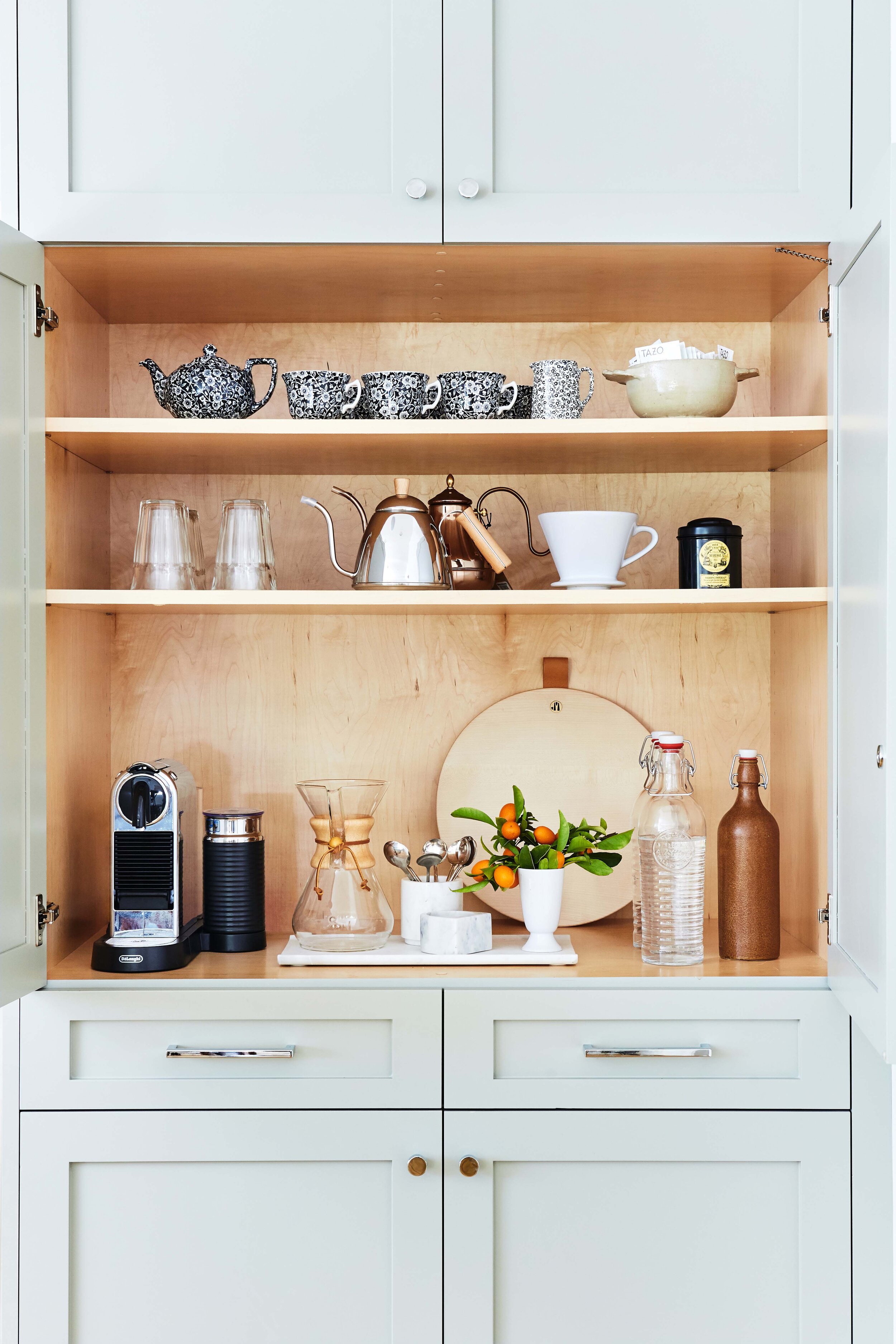
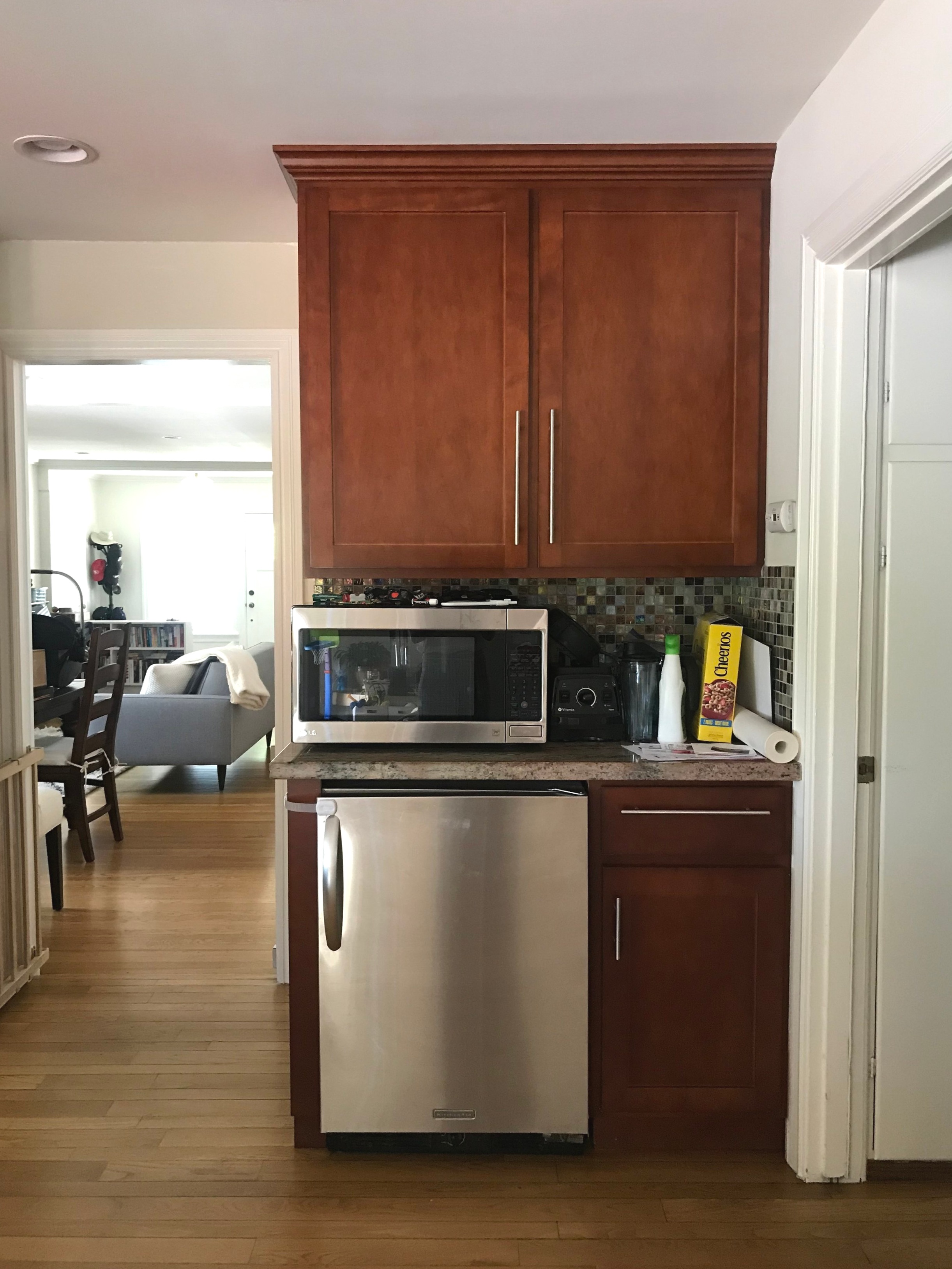
My favorite part? The coffee bar or appliance garage, whatever you want to call it. The corner shown below was underutilized in terms of use. The beverage fridge, while useful, took a significant amount of space. And the space adjacent to the microwave became a place to drop items, collecting dust. We decided to convert this into a full sized pantry.

IMG_5182.jpg

Taking input from the clients, we sourced finishes and fixtures that were traditional and classic. With two young kids, it was also important to ensure that everything we brought in and installed was durable. Below is the design board for the kitchen.

1 / 2 / 3 / 4 / 5

1 / 2 / 3 / 4 / 5

Linked above are some of the design elements we used in this kitchen renovation. We sampled a number of different grays, and landed on Fieldstone by Benjamin Moore. It has a slight green undertone which gives it a different feel from other grays. Benjamin Moore Classic Gray was used for the walls. Herringbone tile is such a classic and timeless pattern, I knew it would give longevity to the backsplash. For the countertops, we used Caesarstone countertops in a honed finish. Based on these selections, we were able to whip together a rendering to help the clients visualize the final outcome.

Sterling Kitchen.jpg

From there, we collaborated with the contractor and cabinetmaker to ensure that the design was executed correctly. There was some finessing, but overall, the final product came pretty close to the rendering above. Enjoy the after photos below!

Menlo Park Kitchen Renovation
Menlo Park Kitchen Renovation, Coffee Closet


Dreamy Denver Project

I finished this project last year, which feels like forever ago, but went back and had it shot in September of this year.  It's very much a classic house, a home you want to visit for a holiday party, so I think it's especially apt to share it now. Plus it's in Denver which reminds me of snow and seasons . . . things we lack in California, not that I'm complaining. It's always nice to VISIT snow, anyway. 

These clients recently moved from Manhattan to Denver. Not only were they dramatically changing their scenery, they had also purchased a new house and needed help with decorating and furnishing. Their aesthetic preferences leaned a bit more traditional than what I usually do, but I was more than up for the challenge.  Ready? I apologize in advance, I only have grainy real estate before photos of the home since I didn't do an initial site visit.  Here we go. Below is the before/after of the living room.

As you can see, although we adhered to a more traditional style, we lightened everything up. The beautiful woodwork framing the doorways and windows in this room are the highlight and we wanted to make sure nothing detracted from that. Since this also serves as the formal living room and the family room, it was important to keep toys hidden but easily accessible. Do you spy those baskets in the bookcase? A bounty of toys lie just behind that wicker, which makes everyone happy. 

Paint does wonders, right? Before, it was very much a beige box with layers of neutrals that didn't really allow this room to shine or allow the special details such as the gilded iron work to stand out. A coat of gray paint with some weathered yet elegant dining furniture transforms this room into one made for holiday dinners and celebrations. The chandelier is statement-making and shimmers so nicely when turned on. My favorite touch is the abstract art, something unexpected that elevates this room nicely. 

Paint does wonders, right? Before, it was very much a beige box with layers of neutrals that didn't really allow this room to shine or allow the special details such as the gilded iron work to stand out. A coat of gray paint with some weathered yet elegant dining furniture transforms this room into one made for holiday dinners and celebrations. The chandelier is statement-making and shimmers so nicely when turned on. My favorite touch is the abstract art, something unexpected that elevates this room nicely. 

For our last room, let's head upstairs to the master bedroom. 

Photography by Chandler Kim

Photography by Chandler Kim

Moving on to the dining room. Below are the before and after photos. 
A true master retreat, complete with a sitting area! It's interesting to see the staged photos of the room and compare it to the current state. The traditional style was implemented in both instances. However, you can see how different the room looks from the before/after photos. It illustrates how interpretations of a style can vary widely. With a soft palette of neutrals and tufting, we've created a master bedroom that is romantic and serene. 

I hope you enjoyed this before and after and I hope you have a great holiday season! 

A Modern San Francisco Haven

When clients expand the scope of a project, I'm happy to oblige. If you recall, I finished reading rooms for Mom and her Mini-me a couple of months ago. After we completed the reading rooms, Mom thought it high time the rest of her house got a makeover. 

The client is a fan of Scandinavian furniture and clean lines, and a lover of whimsy and color. Basically, I love what she loves. Although we were starting with a couple of existing pieces, we we needed to find some new classic foundation pieces for both the living and dining rooms. Also, the key to success here was making sure to find balance in the eclectic design we were implementing in each room. Ready? Here we go. 

The living room is this family's main living area. In San Francisco, space is expensive and runs at a premium so there are no separate play rooms or family rooms. This room has to be multipurpose and remain "adult" enough to entertain guests. Below is the before. 

IMG_8313.jpg

Do you spy that beautiful Finn Juhl Poet Sofa? The graceful curves are so inviting. The client had recently splurged on it. Now she just needed the rest of the room to match. We aimed for a sophisticated collected design, emphasizing the thoughtful use of color. We changed out the rug, larger brown sofa and coffee table. We needed tones to compliment the purple blue of the Poet and the brown sofa just wasn't cutting it. Also, although the artwork on the walls was interesting and captured the spirit of the room, I felt that a couple of larger pieces would be more well suited. We made all of these changes and you can see the transformation below. 

Undeniably stunning. Go bold or go home. And we made this work. We matched the jewel tone of the Poet with this dark canary yellow sofa. To balance the vibrancy of these colors, I accessorized with monochromatic hues elsewhere. The cabled wool rug and the warmness of the wood tray tops bring in different textures and interest. 

Not a fan of yellow? If this room doesn't convert you, I don't know what will. Just the warmest and coziest of rooms. I've never been to any of the Scandinavian countries that produce the furniture that inspired this room but I'm thinking they would approve. Let's move on to the adjacent dining room. Below is the before. 

If you scroll back up to the living room, we moved the Nelson pendant light to the living room.  I thought we needed a light with more impact for the dining room. The rug and table were going. We were keeping and adding to the Eames chairs. With beautiful original built-ins for storage staying, the transformation for this room was easy and swift. See below. 

Yes, you may recognize this rug. I've used it before and in a nursery. But it was just too perfect not to use it again here. To balance the strong colors in the adjacent living room, we kept things here really simple and neutral. Yet we carried over the same principles, clean lines and adherence to Scandinavian design. 

One last space. For the life of me I can't find a before photo of the foyer sadly. But we did do a mini makeover for the space. We cleared out the clutter, hung a large mirror and created an ideal landing space for this busy family. Take a peek below. 

Wrapping up this project felt so good. Everything just gelled together which doesn't happen for every project. This home has magic in the air and if you're ever lucky enough to visit, you would agree. 

As we prepare for Thanksgiving festivities, I hope you're taking pleasure in the enjoyment of your own home. Thanks for reading.