A Polished Feminine Nob Hill Flat

This project has no red and green in it nor is it filled with holiday decor. But its glamour and sparkle embodies the holiday spirit for me, and that's why I've saved this reveal to share it with you in the midst of the holiday season. 

I love San Francisco apartments. The bay windows, molding and coved ceilings provide the ideal canvas for any home decor. This client had just moved into an adorable Nob Hill flat. She had some amazing pieces to begin with, but needed help with edits and new additions. She also had a combined dining and living area, which can be a bit tricky. You have to make sure there are two distinct areas but keep them cohesive. This challenge is made harder when the space you're working with has a smaller footprint. By integrating the existing furniture and bringing in some new pieces we've turned a fine San Francisco flat into a fabulous haven.

Below is the before right after move in. As you can see, she has a beautiful brass media console along with great coffee table.

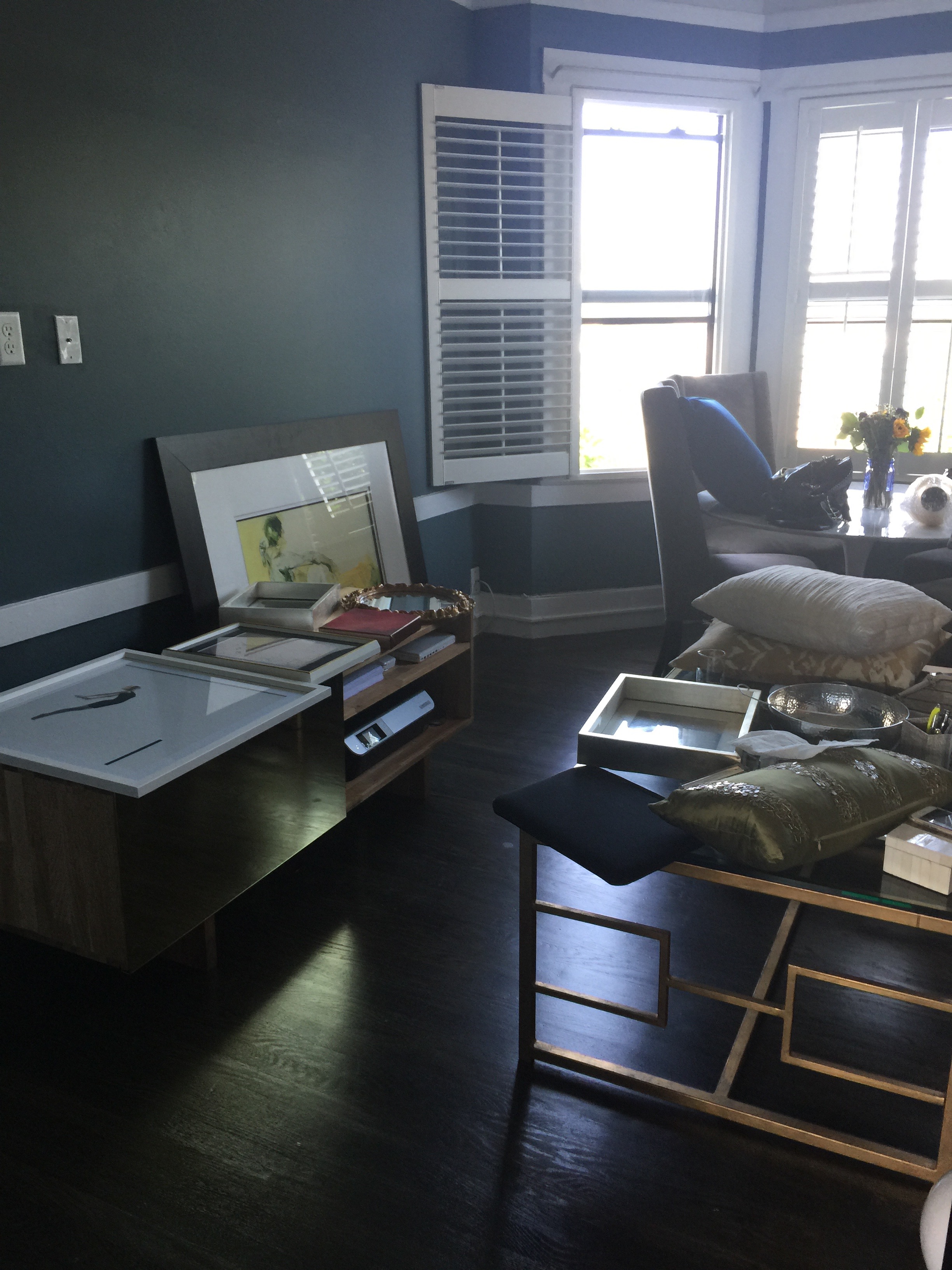
The foundation we were starting with was very strong. The client's existing pieces revealed some detail about her personal style voice, and it was immediately clear to me her what kind of pieces we needed to bring in to make sure that style was amplified and elevated.

Here we go. Seating was a priority. The client's previous couch was too large for the narrow staircase so that was the first order of business. See below! 

Polished and perfect. The sofa had to be petite to not only fit up the narrow stairway but also to make sure it was to scale with the rest of the room. This sofa is ideal for this space. It is small but very deep, making sure it's a great place to curl up for TV or reading. And in a pinch, it can squeeze in three people.

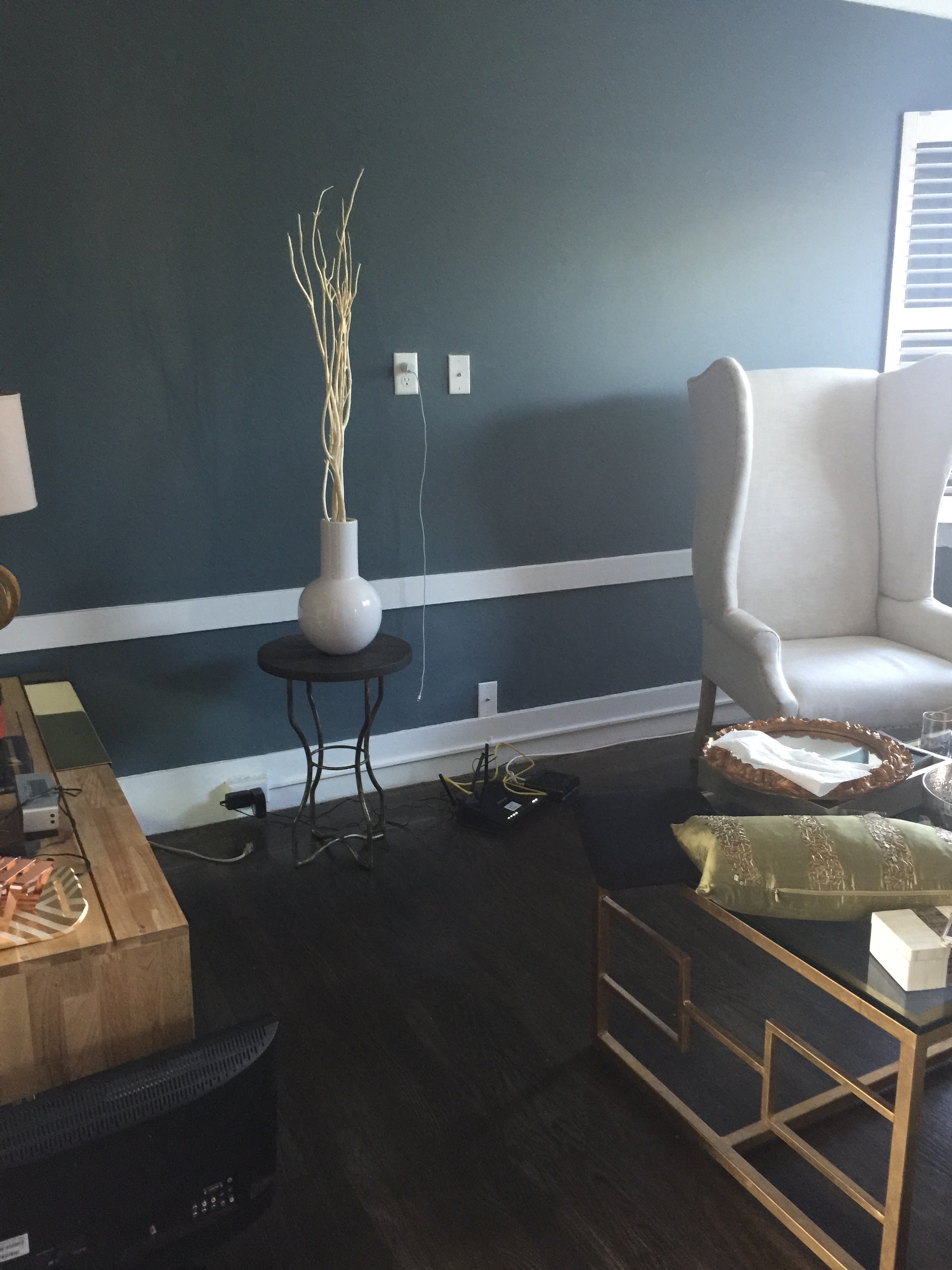
The client confessed she had a difficult time bringing color into any room. I eased color in with the coral throw pillow and a similarly colored print.. These are minor elements in the room but they bring in warmth and the necessary pops of color. Opposite the couch is the media console, see below. 

If you look carefully, although the living area is small, the pieces in the room are large and functional. When I come into a smaller space, people often have many small pieces throughout the room. The thinking goes that a smaller space needs smaller furniture. That may sometimes be true, but too many small items can actually make a room feel more cluttered and chaotic. Larger foundational pieces grounding a small room can create a more tranquil and cohesive atmosphere as exemplified above. 

My own pet peeve is to walk into a room and it feels too much like a paint by numbers. It comes off a bit cheesy and obvious. But I do think that to make a room feel polished and complete, repeating patterns, textures or colors help. The key is to do it subtly and with a touch of sophistication. To echo the geometric design of the coffee table,  I chose a rug with similar lines and pattern. Take a look below. 

On to the dining room! Here is a closer look of the before. The client owned a classic Saarinen style marble table and taller upholstered dining chairs.

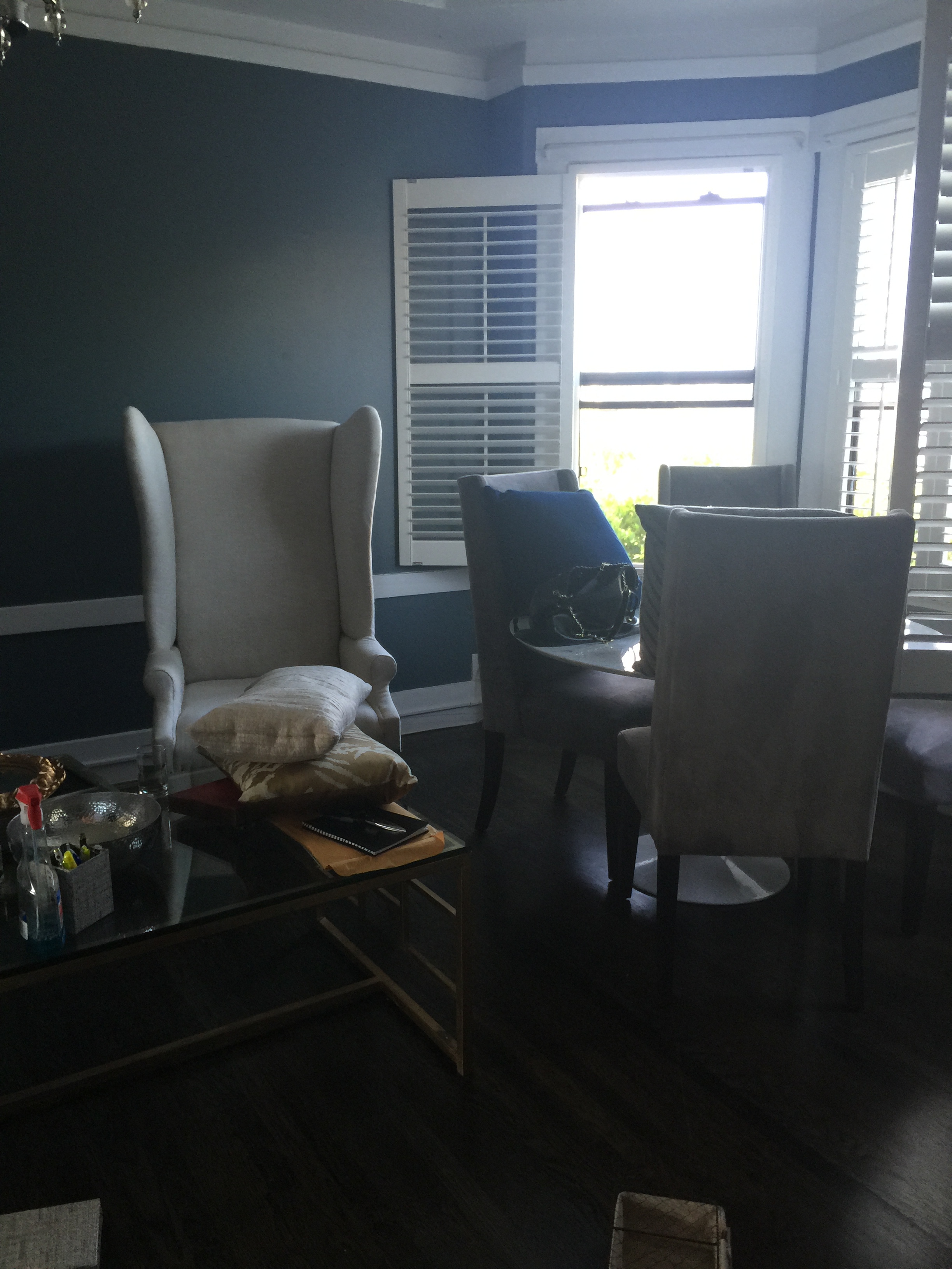
As I mentioned above, the Saarinen table is any design enthusiast's dream, we were definitely not replacing that. But the chairs, though in good condition and beautiful, were ill suited for this space. They were much too tall for the bay window alcove. We switched out the chairs, installing ones that were more appropriate in scale to the space and the rest of the room. 

The nailhead detail on the chairs are the icing on the cake. And the curve of the chair is so inviting that you can immediately imagine long dinners spent around this table. 

A mirror next to the dining area will provide additional shimmer and light into the rest of the room. 

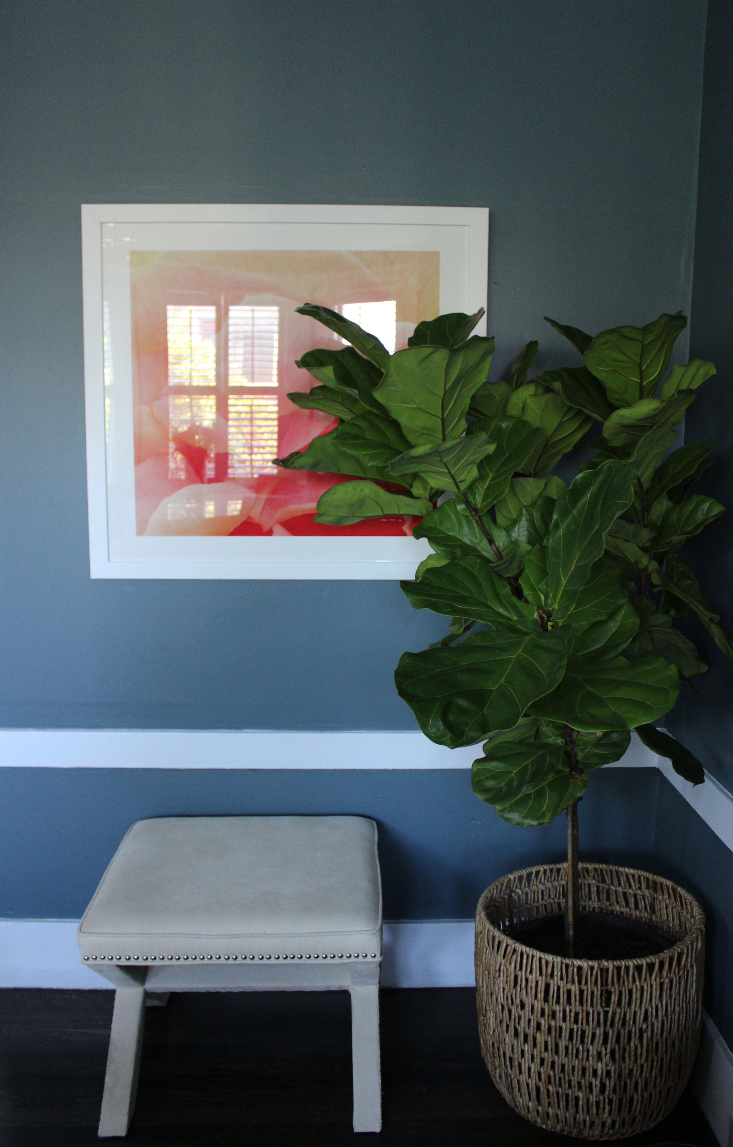
And although the client always has fresh flowers in her home, it's nice to have a plant or two to bring life into a room so we added a fiddle leaf fig. To give additional flexible seating, the x-bench is the ideal solution. 

Blue, coral and gold is not a palette that you see often in design. I hope you agree that not only does it work here, it works beautifully. This flat is sophisticated with a dose of feminine charm. I'm so excited for this client and the many good things to come. Thanks for reading! 

A Comfortable and Cozy Castro Cottage

You know what's important in life? Mentors! That's not where you thought I was going did you? I only bring this up because this client happened to be one of my mentors when I summered at a firm during law school. And while working with him recently, I've had the opportunity to reflect how important and valuable mentor relationships are. He was not only a great mentor but an incredible client, trusting and flexible, making the whole process smooth sailing. 

You know the drill, here we go!  My client has lived in this Castro Cottage for several years and it's just perfect. It's in the midst of the action but still set back from the street creating a little oasis. He had been wanting to update the space for a while and had already purchased a new couch and dining table. He needed my help to implement a cohesive design scheme and bring all the different elements together. We wanted to lighten the space up a bit and optimize it for entertaining and relaxing.  

When I first walked into the space, I immediately knew what could be changed. It was the color tones imbued throughout the room. The lovely green walls were accented by orange, brown and darker tones throughout. Orange and brown can and often do play well with green. Here, the orange/brown tones weren't bold and bright but more muted which just wasn't working with everything else. Below is the before. 

As important as color choice is, also remember the tone of a color is just as crucial and can make or break a room. The coffee table was a bit heavy and too large for the space. But do you spy that lovely leather couch? Just beautiful, it actually glistens. I knew we could give it a better backdrop so its full potential could shine. See below!  

Scroll back up to the before, then back down to the after, then do it again.  Do you see/feel the difference? The rich blue rug against the black and white throw pillows on the sofa brings completes this very sophisticated color palette. This living room isn't trying hard, it knows it's cool and everyone wants to be its friend. The lightness of this new glass coffee table makes the space feel a thousand times bigger. The wood legs and midcentury silhouette is in harmony with the clean lines of the sofa, floor lamp and the adjacent dining room (which you'll get to see below). Let's change perspectives and see what's on the other side of the living space. Below is the before. 

That TV stand was sad. This living space is fairly petite so every inch needed to be used in purposeful way. I can't say it enough but closed storage is everyone's best friend! Below is the after. 

LIving Room3.jpg

Great right? I love that media stand and I've been eyeing it for a while, hoping to use it in the perfect space for the right client. The brightness of the white plays against the soft green walls so well. And I know you've been appreciating the floor lamp. The faux bois pattern on the shade brings in interest. 

Did someone say art? I don't purchase art for my clients but rather give them a list of sources. This client gave me a list of artwork he liked and I helped him whittle it down. This fabulous wall is what we ended with. That raven print makes such a bold and sophisticated statement. 

The layering of the artwork behind the floor lamp creates depth which is often a forgotten aspect of design. Depth is a good thing in both design and people. :) 

One last close up below. 

A magazine holder never looked so good. I tend to understyle all my projects, allowing the client to bring in meaningful pieces over time. The accessories I do bring into a room are things that are timeless like this magazine holder. It brings some elegance to the otherwise boring profile view of this sofa.

Shall we move onto the dining room? Just take one step backwards and you're there, here is the before! 

There is the beautiful marble dining table the client purchased prior to hiring me. It needed some chairs. The sideboard behind the table was the catchall surface that needed some love. Below is the after! 

Those chairs. Maybe you've seen something similar before, but these are the real deal. Made from walnut and covered in the softest leather, they should last forever. The wood grain on the curve of these chairs are just incredible. Below is a closer look. Also note the low profile of the chair which is crucial for this open concept space. When you walk into the home this is the first space that greets you and it was important to me that the line of sight remained clear to preserve that airy feel. 

Where to next? The adjacent sideboard. It just needed some organization and pieces to help the client keep it organized even when busy. The before below. 

Just a little sprucing up is what this area needed. I also wanted to replace the torchiere floor lamp with something more modern and off the floor to create more space for foot traffic. Here is the after! 

Let's start left and move from there. The plant is one of my favorites, mistletoe! Low maintenance, hardy and their round leaves contrast nicely with the straight lines on the adjacent tray. Don't forget to clean off leaves with a moist paper towel when you bring one home as I did here. It helps the plant to absorb the sun better! 

The textured light green tray gathers everything neatly. The marble teardrop bowl is for spare change and keys. The black vase for flowers and when empty can be used to hold sunglasses or pens. The brass bookends are another one of my favorites, Last but not least, this cement table lamp, super modern and beautiful. 

A little insight into my design process, when I come to do an installation, I come armed with numerous plan Bs, Cs, etc. Hence, the wagon and the 17,000+ steps on installation days. The first choice in my head may not always work in the actual space. Design is definitely something that requires hands-on work and attention. For example, I brought two table lamps with me, the cement one above and the wood one below. Both lamps are beautiful but clearly the winner here is the cement one.  

The wood lamp is sleek and warm but the rough surface of the concrete table lamp brings in modernity and something unexpected. 

One more close up before because those dahlias are glorious. 

You might have noticed the addition of the giraffe. I was washing my hands and spotted in in the kitchen, immediately grabbed it knowing that it had a new home here. 

If you think we're done you're mistaken. One last stop. This client has some amazing outdoor space, especially in one of the most crowded cities in the country! Here is the before. 

thumb_IMG_3204_1024.jpg

San Francisco doesn't have LA weather for sure, but when it does get warm everyone embraces it. I knew that if we brought in some patio furniture, it would be used. Since the client was throwing a Halloween party shortly after the install, I thought it would only appropriate to do a tablescape as well. Scroll down for the after. 

And that's all! I hope you enjoyed viewing this project as much as I enjoyed working on it! Have a great Halloween!