My Very "Grown-up" Bed

At the age of 35, I've finally achieved what I consider a very grown-up bed.  Finally, right?  I blame grad school for delaying this achievement even longer.  From college to my 20's and admittedly into my early 30's, I didn't invest very much in my bed, linens, pillows or my mattress. I thought there were more important things to spend money on and I was moving every year or so. But when you think about how important sleep is to your health and well-being it's a bit nuts that we don't invest more in all the elements that allow you to sleep restfully.  

In my former career as an attorney, I was a walking zombie. I was so stressed that it would take me very long to decompress and I would wake up frequently in the night. I was averaging 6 hours of sleep or less which isn't good for anyone. When I changed careers, I made the conscious decision to also focus on my overall health as well, including sleep and my sleep habits. 

So what steps did I take?  Here are my prerequisites for a very grown-up bed:

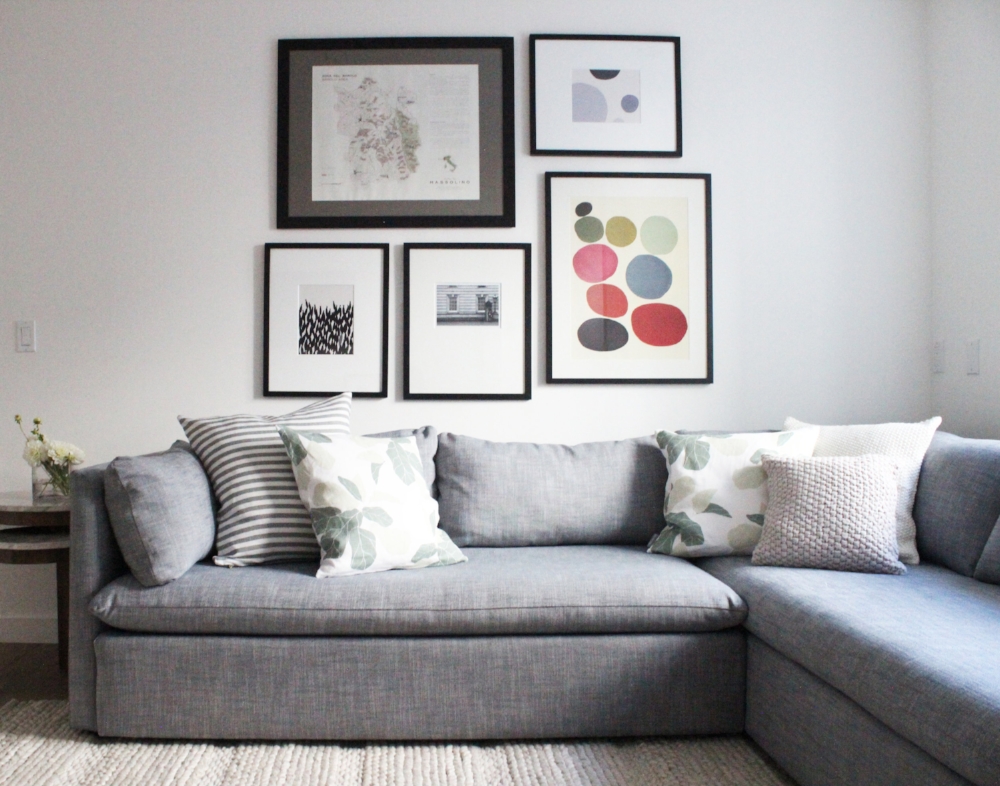
1) Bedframe. Invest in a bedframe you love and that is suited to your lifestyle. Do you like to read in bed? A higher upholstered bedframe is probably a good idea so you can sit and read for long periods of time. Do you have allergies? Weird question I know, but you might want consider getting a bed raised off the ground, so you can clean all those dust bunnies on a weekly basis.  Do you have a dog that sleeps on the bed with you? Might want to forgo a frame with a footboard so your furry friend can hop in easily.  You get the idea. My recommendation, stick with a frame that is timeless in both color and design. 

2) Sheets. Invest in quality sheets that feel great on your skin and ones that let your body breathe. Stick to natural fibers like cotton and linen. I swear by my linen sheets, I know some people find them a bit too scratchy, but they get softer with each wash. It took me four months to save up for my linen sheets and worth every single penny. Thread count isn't everything as numerous articles have stated. If your budget allows, focus on companies that have a good reputation and are known for their linens. I've heard good things about Parachute and Rough Linen

3) Mattress. Perhaps the most important element, purchase a mattress that is well made, comfortable and provides the right amount of support.  When we first moved to San Francisco, my mother-in-law gifted us with a really expensive tempurpedic mattress. I didn't have the heart to tell her that I woke up sweating every night. Apparently, this is a common problem. When we moved to Oakland, we placed that mattress in the guest room and since we just purchased a house we spent $300 on a mattress and that's what we had been using until Tuft and Needle gave us a mattress to try. The first couple of nights, I wasn't quite sure if it was firm enough for me, but a week in, I can confidently say I'm a convert. And a plus? No sweaty nights. The firmness and support level is ideal for my husband and me.  What's so surprising is that we have differing opinions of what makes a mattress good for sleep, and despite the lack of consensus, the Tuft & Needle mattress has suited our needs and wants equally.  The lesson? Find a mattress that's right for you. I also don't think you have to spend a ridiculous amount of money to get that perfect mattress. There are so many options out there today, go forth, do your research and try some out! 

4) Pillows. Similar to mattresses, pillows are so basic but so important. Are you a side sleeper? A back sleeper? All those things matter when choosing the perfect pillow for you.  Do you have allergies? You may want to avoid down pillows and stick with synthetic fillings. There are even pillows for those with back/neck issues or people that are prone to snoring. Your partner just might end up thanking you for that pillow switch! Similar to mattresses, the sky seems to be the limit on how much one can spend on just one pillow, but order some and test them out prior to committing. 

For fun, I've created two bed looks, one for those in your 20's and another for those in your 30's, both from current projects I'm working on. Hopefully these looks can inspire you to start investing in your bed, sleep and sanity! 

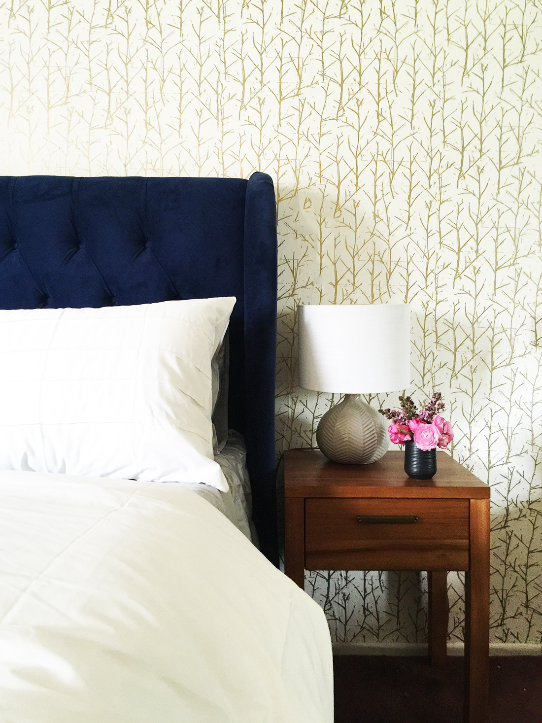
In your 20's, it's often the case that your budget is a bit tighter so I've sourced items that look great and are affordable. 

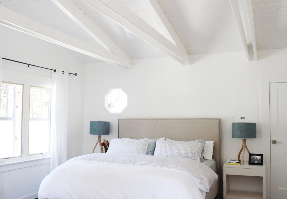
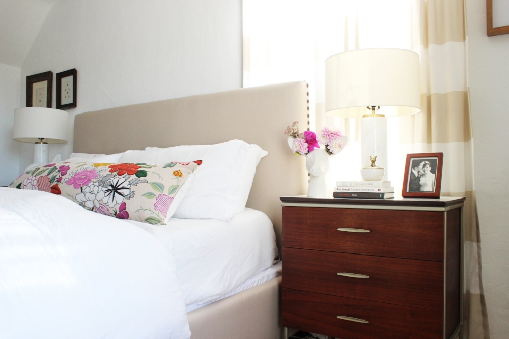
I recently finished a project with the most inviting bedroom. It's the ideal design for those in your 30's, armed with a bit more disposable income, to create that sanctuary you deserve.  All sources below! 
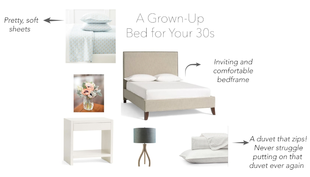
 I started a bit late in obtaining my grown-up bed, and I have major regrets. Learn from my mistake. There's nothing better than crawling into your own bed, especially if it's beautiful and comfortable. 

Our mattress was generously provided by Tuft & Needle. All thoughts and opinions are my own.


Mill Valley Project, Part Deux

Finally here! Mill Valley Project, Part Deux. If you want the background, rewind and read all about it here.  It feels like we've been working on this project for a while, but not so. We tackled this large transformation and completed it about two months. Whew. Just tired thinking about it.

Quick recap? The family was moving into this new home within 30 days because the newest addition to the family was dying to come into this world, basically 2 weeks after move-in. We tried to accomplish as much as we could in a month despite a host of logistical hurdles. And for the most part we did! But as is the case with projects like this, we needed more time to perfect things. This post is about my second installation where we finished the rest of the rooms and put finishing touches on others. 

We saved the best for last, ready? Here we go. 

Let's start with the kids' rooms. Here is the before of C's room with the staging furniture. 

Granted this was with the staged furniture and staging is a very hard job, but I definitely wasn't feeling the curtains or the red pendant light, especially for the cutest girl I know. With good bones and a clean canvas, this room was relatively easy in terms of design. We wanted to make sure it was a room that C could grow into. So for curtains and lighting we chose items that were slightly more traditional. For accessories, we had more fun.  Below are the after photos. 

Decor above cribs can be challenging. I long to hang a gallery wall or even just a nice framed print but in California I would never dare. Earthquakes are a reality. A great solution? A colorful garland can cover that bare wall in a beautiful way.  Here, C can stand in her crib now so I hung it a bit higher so she can't reach and pull it down. Safety first. 

This guy's name is Floppy and he's just perfect. He was just a digital file that I printed out so nothing too valuable or precious. Floppy's monochrome colors tone down the cuteness level just a bit to the right level of sophistication. 

Onward! Let's move on to H's room. Below are the before photos with the staging furniture. 

LIke C's room, very much a blank canvas that was crying for some fun and personality. Here are the after photos. 

As most of you know, for the first few months, a nursery may remain empty while the baby stays with mom and dad. I wanted to make sure H had a room he would enjoy and love when he was ready. Adhering to the minimalist theme throughout the house, I kept things clean, bright and modern. Mom and dad can fill things out with all the baby necessities when H is ready for his own room. 

On to the TV room. This room sits outside the kids' room and will be primarily be used for family hangouts and play. Accordingly, we chose comfortable and kid-friendly seating along with minimal accessories to keep things clutter free. Here is the before again furnished by the stagers.  

We can do better right? We want a kid friendly lounge area but not one that is literally screaming that this is for kids only. 

The coziest corner. I kept everything neutral and soothing so that when there is a huge pile of toys on the floor, it won't be so bad. The long bench cushions also keep things visually clean and attractive. 

With no coffee table, it was important to provide as much landing spaces as possible for coffee, water and wine. These nesting tables were an ideal solution. A secret? These aren't actually marble but they look so real. Even better for a space dominated by kids, right? No need to worry about watermarks or etching. 

Last but not least, let's head upstairs to the master suite. Below is the before, again with the staging furniture. 

The clients were ready for a change. Their old bedroom furniture was dark wood that felt a bit heavier. We wanted to start with a clean slate, bring in some modernity with a mix of classic. Below is the after. 

So fresh and so clean. That about sums it up. With those beams and all that natural light pouring in, I would never get out of bed if I lived here. The neutral headboard and nightstands are mainstays, a good foundation for any bedding. The lamps are different in both shape and color and add interest. The ideal sanctuary for busy parents. 

Thanks for joining me on this Mill Valley journey. Hope you had as much fun as I did!

Looking Lovely in La La Land. Part Deux.

If you have been following for a while, you may remember I finished Looking Lovely in La La Land (Part 1) almost a year ago. Thrilled with the final product, the clients kept me on to start work on the bedrooms and the guest bathroom. I was happy to oblige. 

What is the big takeaway from this project? Bringing character into any space can be done even if you're on a budget and even if your home isn't blessed with the many architectural details we often lust after. This home was built in the 1970's ranch style, complete with popcorn ceilings. The bedrooms are white boxes that were dying for some personality. 

Let's start with the guest room. Here are some before photos sent by my clients. 

Before.jpg

As you can see, the guest room was being used as an office. It was also a catch-all for leftover furniture throughout the rest of the house. In a smaller space, there was a ton of furniture in here. But I could see the potential. We removed the blue carpet for something more neutral and also removed the popcorn ceiling. 

Photo by Clara Jung

Photo by Clara Jung

The clients are considering renting out this room periodically so I kept that in mind when drafting the design concept for this room. I absolutely adore this tomato soup colored headboard. Everything else in the room is soft and serene, I wanted to put something in this room that made it memorable and fun so guests would want to return!  After the removal of the popcorn ceiling we painted it a very light blue to add another subtle but distinctive touch. 

There is a petite workspace that is functional and inviting. Since the window has a less-than-optimal driveway view, I installed this vibrant cactus print as an alternative. Also, because we had to squeeze in a work area and a queen size bed, there was little room left for a nightstand. It's true, a nightstand isn't a need to have item but it's definitely nice to have. This "nightstand" may only hold a glass of water and/or your phone but gets the job done. 

And for any guests who are lucky to stay in this room, also have the continued good luck to have the use of a renovated guest bath. Below is the before. 

A pretty drastic transformation. The clients really miss their seashell shaped sink . . . nope, that's not even remotely true. The freshly-painted blue walls capture the essence of what every bathroom should be, a serene and clean environment. We painted which made the biggest impact but we also replaced the vanity, lighting and fixtures which only helped. 

Moving on to the Sailor Moon room.  

20150303_205648.jpg

If you can look closely you can see at least three Sailor moon posters strewn throughout the walls. Many a girl growing up in the 90's can appreciate the power of Sailor Moon. And although I was sad to bring these posters down, they had seen better days.  This room was now going to be a game room for the hubby. A retreat for him to play board and video games with his friends. 

Playful and colorful, this room strikes the right tone for some long game nights with perhaps a finger of whiskey. Creating a design that was very "man cave" yet appealing to everyone was my primary focus. Do you spy the homage to some classic video games?  When I found those I was over the moon. These prints are simultaneously artistic and encapsulate the entire theme and purpose of the room. 

Last but certainly not least the master bedroom. Here are some before photos. 

There were some challenges to this space. The biggest one being the burgundy colored carpet. The clients had just installed it so weren't replacing it but coming up with a design scheme that downplayed the redness in the carpet took some creative thinking. Below is the Cinderella like makeover. 

Master Bedroom.jpg
Photo by Clara Jung

Photo by Clara Jung

Like all the other rooms in this project, this master bedroom was also a straightforward blank box with no details that immediately jumped out. To bring in character and charm, we used wallpaper with a subtle shimmer to bring in that bit of oomph every room needs. 

The natural jute rug breaks up that burgundy carpet a bit, softening it so it's not terribly obvious or dominant. The blue bedframe juxtaposed to the gold wallpaper is a classic color combination. The simple mid-century nightstands contribute to this sophisticated and curated feel.

When you're confronted with a room that has very little to say in terms of its architecture, take that as an opportunity to be a bit more adventurous than you normally would. Spin it, there are no historical details holding you back, it's literally a blank canvas and like some things in life, the bolder the better. 

Photography by Jen Sosa unless otherwise noted.